Brand Identity · Brand
A recognizable look that helps you stand out and sell
We create the logo, colors, typefaces, graphics and the rules for putting them together on any touchpoint. Your team and contractors produce new materials faster, and the brand looks consistent everywhere.


DOGMA’s position
The logo is only where brand identity begins. The value lies in a system of rules that lets a new product, post or package come together without a separate design project.
When you need it
Sound familiar? That’s what clients tell us when they come in.
Every new layout gets approved from scratch
Each contractor does it their own way, and our style has fallen apart
We look cheaper than our services actually cost
We have a logo and nothing else, so every touchpoint gets reinvented
What you get
What you’ll have in hand
-
Logo and mark
The primary version, a short version and a mark for small formats and avatars.
-
Colors and typefaces
A palette and a type pairing with rules for where and how to combine them.
-
Key touchpoints
The materials your business runs on: website, social media, packaging, presentation or signage.
-
Guidelines and templates
Rules and files your team and contractors use to build new materials on their own.
How we work
Concepts → System → Touchpoints → Guidelines
Stage 01 of 04
Concepts
From the positioning we develop several visual directions and show each on real touchpoints, so you choose by the idea.
- Your part
- Session to choose a direction
- Stage output
- The chosen visual direction
Stage 02 of 04
System
We develop the direction into a logo, palette, typefaces and graphic language, and look for the detail that makes the brand recognizable from a single element.
- Your part
- Feedback on interim versions
- Stage output
- Logo and visual language
Stage 03 of 04
Touchpoints
We test the system on real materials, from business cards to packaging or a website, and fix it wherever it breaks.
- Your part
- A list of the touchpoints you use
- Stage output
- Layouts of key touchpoints
Stage 04 of 04
Guidelines
We document the rules and hand over the files and templates, so you can develop the system on your own.
- Your part
- Handing files to your team and contractors
- Stage output
- Guidelines, files, templates
How we think
The principles behind the result
Idea before form
Every visual element rests on the positioning. That way design can be judged by what it tells the customer.
The system matters more than the logo
People recognize a brand by a recurring language: color, rhythm, graphics. The logo is one part of it.
Tested on the hardest touchpoint
We test the system on the materials where it struggles most. It has to hold up in tiny label type and on a giant billboard alike.
What changes
- 01 Every layout gets approved from scratch New materials follow ready-made rules
- 02 The style depends on the contractor The brand looks the same in every channel
- 03 Every new product is a separate design project New products launch within a ready system
Business resultYour brand is recognized in every channel, and new materials come out faster and in one style.
Discuss your challengeCases
Where it has already worked
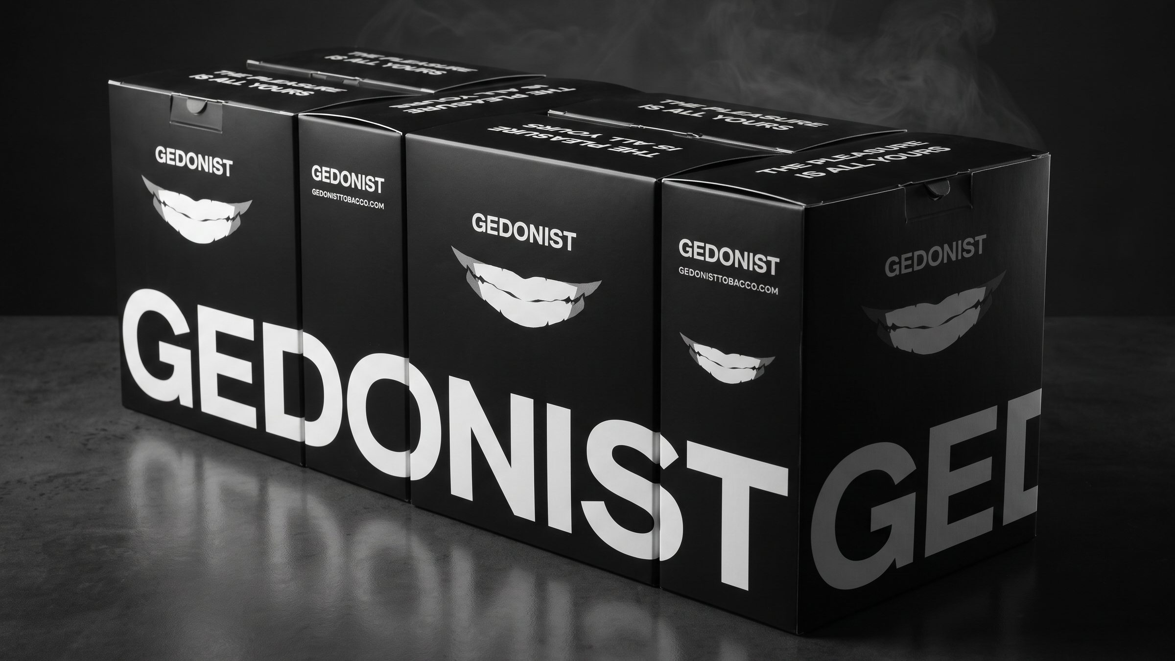 One system: 100 g and 200 g tins, boxes, a drop and merch Gedonist A hookah tobacco brand born as Egoist, with a packaging system that survived even a change of name Gedonist got a full system: a name and positioning, the smile mark, a wide logo, flavor numbers and rules that assemble packaging for any format, from a 100 g tin to a limited drop and merch. The system has already been tested by reality: it survived a name change, and new flavors and formats are added without rework. Read the case
-
 From a price-list business card to a website that sells partnerships DEEPLOYALTY Strategic session, customer interviews, design system and a website with an admin panel: infrastructure for bank and retail partnerships
-
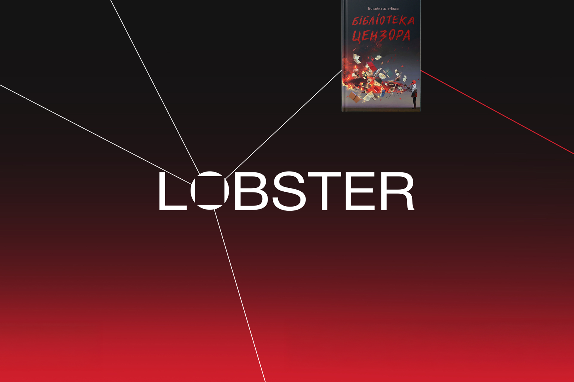 Positioning and identity LOBSTER Publisher rebrand
-
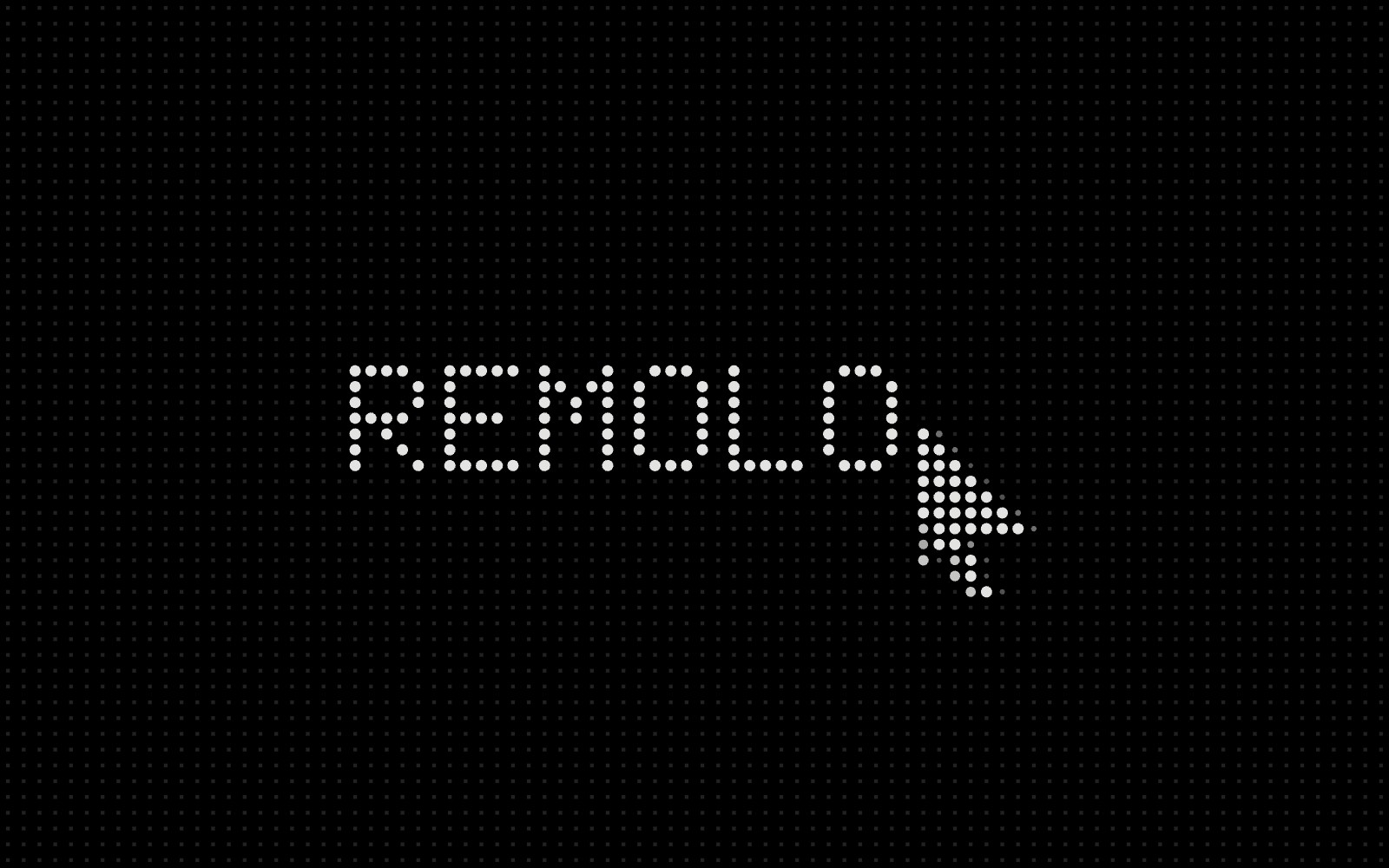 Strong both at home and away Remolo DOGMA’s own product: a remote desktop for Mac you control by touch
- The human way. The business way. Dilova Kovbasa Rebrand of a wholesale supplier
-
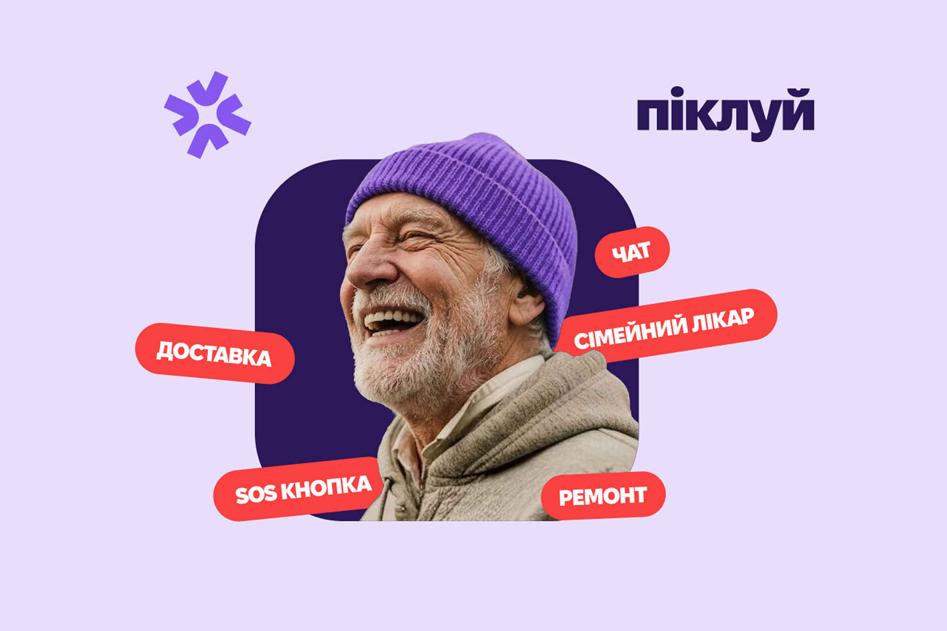 Brand platform and identity Pikluy Brand creation
-
 “Quiet Strength” in an aggressive market PERESVIT From local leader to an ideological symbol built for expansion into the US and EU
Questions
What clients usually ask before we start
Can you refresh the style and keep our logo?
Yes, if the logo carries the brand idea. Then we build a new system around it: colors, typefaces, graphics and rules.
How many concepts do you present?
Several directions, each with its rationale and shown on real touchpoints. We agree on the number at the start, based on the task.
Will our designer be able to work with the system?
Yes. We make the guidelines and templates for the people who carry on after us: your in-house designer, contractors, social media team.
What’s next
Clients often continue with