Dilova Kovbasa from a wholesale supplier to a business partner with a human face
In brief
A family-run sausage hub at Kyiv’s Stolychnyi market had one of the widest selections in its category and no reason for anyone to choose it. We found what wholesale buyers really pay for and built the Dilova Kovbasa brand around it: positioning, a face, a voice and a service strategy that finally makes the service visible.
Overview
“The human way. The business way.” came from the clients: these are the two things they named themselves
The human way.
Honesty about expiry dates, knowing clients by name and being the first to say “yuck” to a bad product, so the client never has to.
They told us what to take now and what to leave for later. We put together our first order with them.
TetianaThe team explained everything in such detail that I decided to work with you on the spot. And you’ve never let me down once.
InnaI feel at ease: if I need help, they’ll help and advise me.
Zhanna
The business way.
Clear logistics with same-day dispatch, reliable supply and zero stress for the client.
The price difference is small, UAH 5, 10 at most, per kilo. I’m ready to pay more because I can buy everything in one place.
KaterynaWhatever question I came with, they always solved it.
AnyaIf they also had delivery, I wouldn’t have to think about anything at all.
Owner of two stores, Kyiv region
Clients were paying for people who know the product and for supply without surprises. We simply named these two things and turned them into the brand promise.
Brief
The widest selection in the pavilion, and nothing to make it stand out
Positioning
Find a reason to choose the business beyond price and range.

Brand
A face and a voice for a family business with a ten-year history.
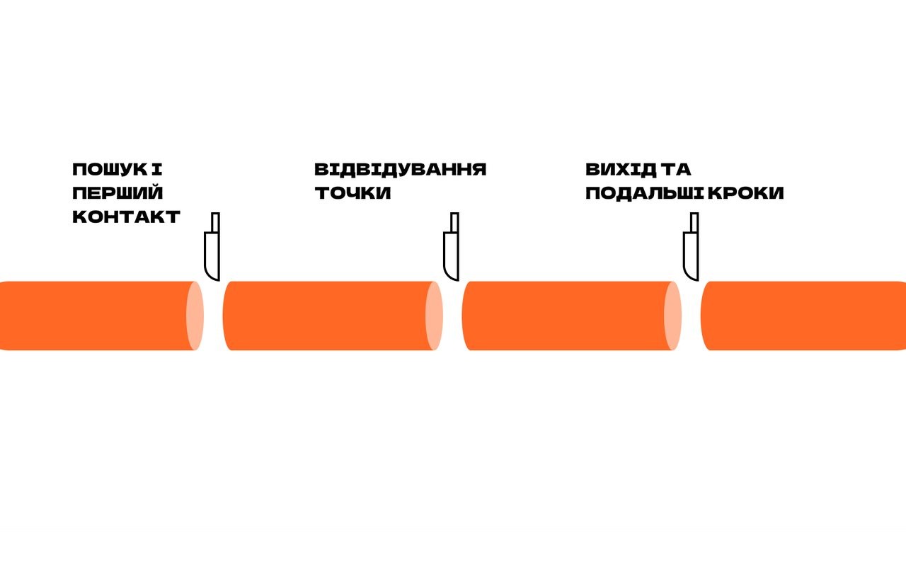
Customer experience
Walk the customer journey and find where the business loses new buyers.
Goal: 10 new wholesale clients every month
- 01 A name with no promise
“Svit Kovbas” (Sausage World) described the inventory and gave no reason to come.
We validated the name Dilova Kovbasa proposed by the owner and made it the foundation of the brand.
- 02 An 18-page price list
The range lived in a file; online, the business barely existed.
The customer journey exposed the gap, and we proposed an online catalog as a hypothesis.
- 03 The strongest point went unspoken
The team tastes every item before buying it and never mentions it anywhere.
Tasting became the core of the positioning.
Research
The market first. Then the people who pay in it.
- 4
- supplier categories: wholesale depots, distributors, cash & carry and producers
- 5
- in-depth interviews with store owners and managers
- 6
- pain clusters, from delivery to minimum order size
- 4
- competitors we went through as mystery shoppers
A wholesale buyer is looking for the supplier they can stop double-checking.
Positioning
A wholesale partner for your store that checks everything it delivers
- 01
The market competes on price. We compete on humanity
Competitors fight on price, range and logistics. Nobody competes on humanity, yet that is exactly what clients name.
The marketa depot price lista random sales repprice as the only argumentDilova Kovbasawe taste it firstwe know you by namewe adviseno hard sell - 02
Honesty
No hard selling, no expired goods, no relabeled dates. Ever.
- 03
Responsibility
We check every product before we offer it.
- 04
Humanity
We know our clients by name. We tailor the range to each store.
- 05
Taste
Everything in the range has been tasted by us. At the very least, it’s delicious.
Name
The owner had the name Dilova Kovbasa (roughly, “the businesslike sausage”) in mind back when the company still traded as Svit Kovbas. We tested that name in research and kept it. It works on two levels: a pun people remember the first time they hear it, and a promise the business can deliver every day. So we backed it and built the positioning, the character and the voice on it.
Logo
The mascot steps out of the letter “O,” as if from a market sign
 Primary logo
 Dilova Kovbasa Premium
 Premium, simplified
 Premium icon
The logo combines the strength of the word with the character’s personality: the sausage steps out of the “O” and gives an “all clear” sign, which is how the brand works with clients: simple, clear, no fuss. The name is set in dense Dela Gothic One and holds its shape even on a bright background.
For the premium line there is Dilova Kovbasa Premium: Latin lettering, a black background and orange glasses.
Mascot
A character that does real work
01 / 04
All clear
The gesture from the logo: simple, clear, no fuss.
- logo
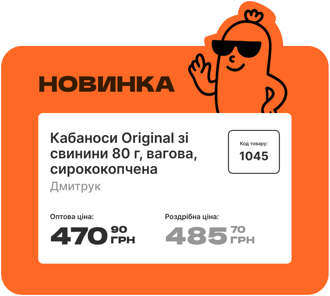
- “New” and “Sale” price tags
- “Wholesale here / Retail here” signs
02 / 04
Confident
Hands on hips, glasses, a smile: knows exactly what she’s doing.
- base pose for brand materials and animation
03 / 04
Business delivery
The running character: dispatch the same day.
- “Same-day dispatch” poster
04 / 04
Recommends
Thumbs up: we’ve already tasted it, go ahead and take it.
- “No bag needed” poster
- promotions
The name already held a character that clients pictured in their minds. We gave it a face: a confident sausage in glasses with a soft expression, unpretentious and expert. You can see in her both the manager who “gets things done” and the partner who is first to say “yuck” to a poor product.
Guide for the client’s team
We gave the client a guide for scaling the character without an agency: an English prompt template where only the scene changes, and a new illustration in three steps.
prompt.txt
Create a PNG illustration in a minimalist cartoon style. The character is the sausage with glasses from the reference images — same proportions, same line weight, same calm smile. Scene: the sausage runs with the ball. Transparent background, black-and-white line art, no text. 1024×1024 px.
…Scene: the sausage runs with the ball. Transparent background, black-and-white line art.

Same style: the character stays recognizable in any scene.


Take the PNG into Figma or Photoshop, then into a banner, post, sticker or animation. Background — from the brand palette.
Colors and typefaces
The whole meat shelf is red. We stepped out of it
Primary palette
- Orange
Hex: #FF6825The main brand color. Confident, energetic, appetizing.
- Graphite Deep
Hex: #2E2E2EDark graphite: stable and high-contrast. Ideal for text, buttons and the logo.
- White
Hex: #FFFFFFAir between accents: the background for price tags, materials and pages.
Secondary palette
- Apricot Bold
Hex: #FF9324Closer to classic orange. Warmer and softer, for micro-accents or backgrounds.
- Sunny Mustard
Hex: #FBB216Suited to backgrounds, accents and infographics. Reads well with black and white.
- Berry Red
Hex: #FF5F7CThe color for alerts, deals, promos and sales. Bright without being aggressive.
- Bubble Blue
Hex: #84B5FFFresh as sausage from the morning delivery. Works well as a counterweight to warm tones.
- Light Blue
Hex: #C6EBF7 - Green
Hex: #7EE86B - Dark Grey
Hex: #A3A3A3 - Grey
Hex: #E5E5E5
- Display typeface Dela Gothic One
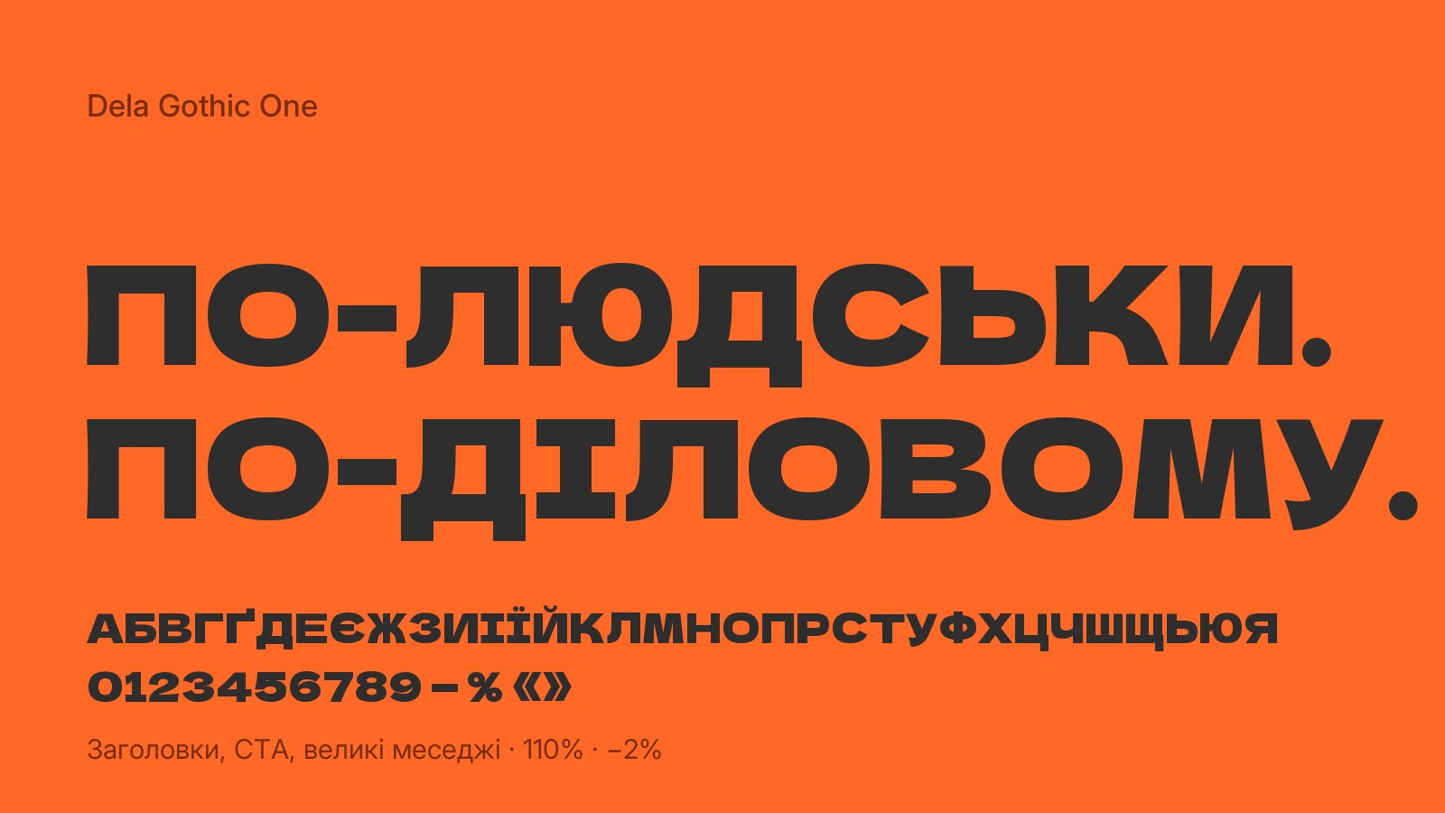
Headlines and key messages. A dense grotesque with soft geometry: it works equally well on a label and a billboard, and it begs to be read aloud.
- Text typeface Inter
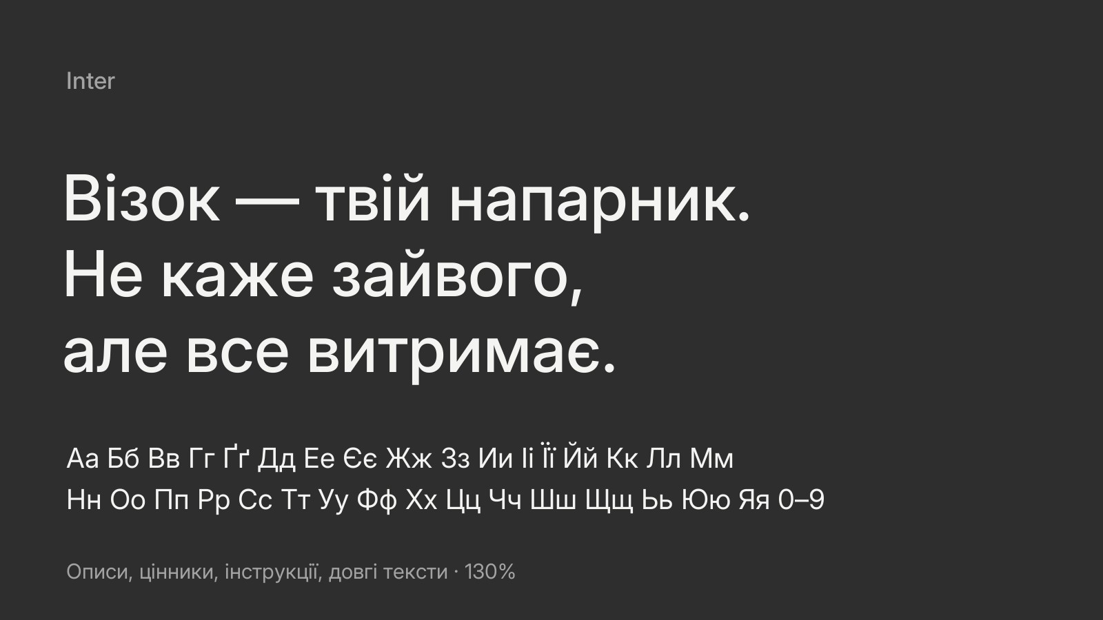
Descriptions, price tags, instructions and long copy. Neutral and easy to read, it keeps the brand’s tone clear and professional.
Tone of voice
We talk the way people behind the counter would
-
✕ Bureaucratese✓ Simple and human
“Dear customers, you may complete a purchase of goods by means of placing an order via…”“Want to pick it up? Sure. Want delivery? We’ll do that too.”
-
✕ Overfamiliarity✓ Businesslike, with humor and respect
“C’mon, bro, grab that one, it’s the bomb!”“No hard sell. We advise you the way we’d advise ourselves.”
-
✕ Dodging a stance✓ Direct and to the point
“This sausage has its quirks, but overall it’s fine.”“We don’t stock this one. It doesn’t taste good.”
-
✕ Empty promises✓ With real expertise
“We can do anything, we’ve got everything.”“This sausage sells well in villages. And this one in Troieshchyna. We’ve already checked.”
Design system
One mascot, nine colors, endless layouts
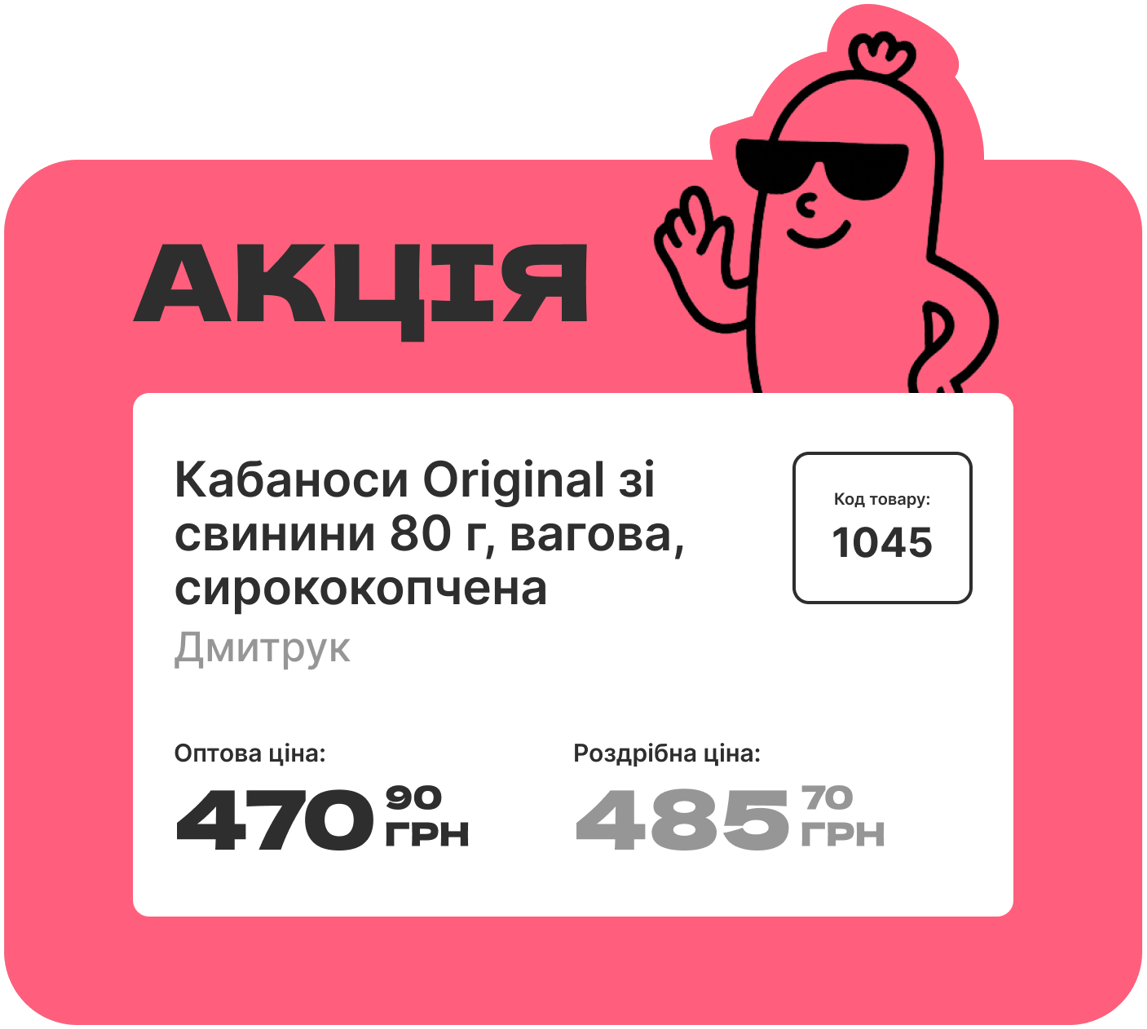
The mascot, the Dela Gothic One typeface, a sausage-shaped label and nine colors. Each color comes as a set of background, text and accent, so any story can be built in any color and format and still reads as Dilova Kovbasa. Pick a color, format and story, or press “Show the system.”
Color: background, text and accent
Format
Story
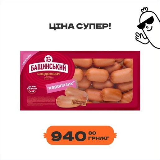
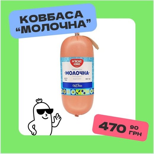
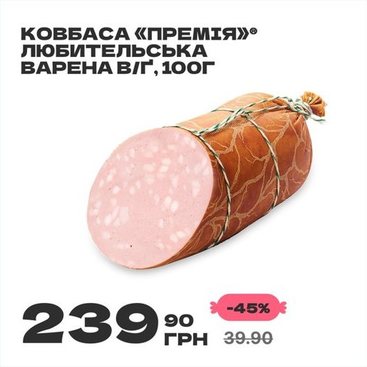
Super price
Grab tasty deals while summer’s in full swing!
No fuss. No extras. Just a good deal.
Same-day dispatch.
The human way. The business way.
Wholesale here →
if you’re buying “for the store.”
No hard sell. Just good advice.
The human way. The business way.
We’re hiring
Our kind of people
Cashier-consultants and loaders: people who know sausage has to be carried with care.
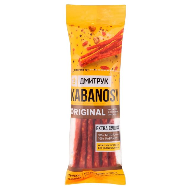
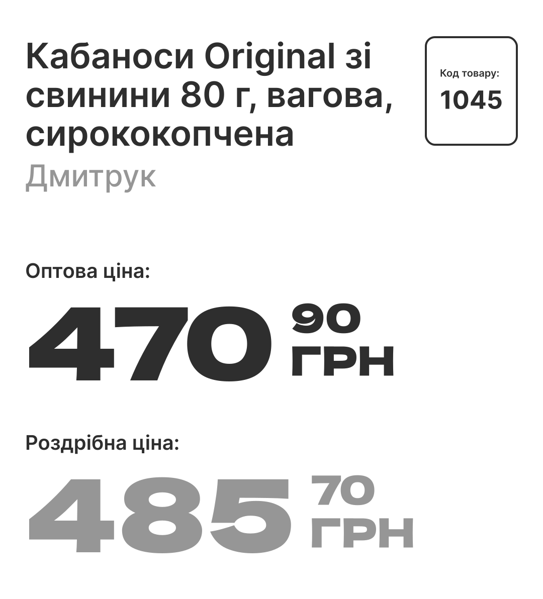
New
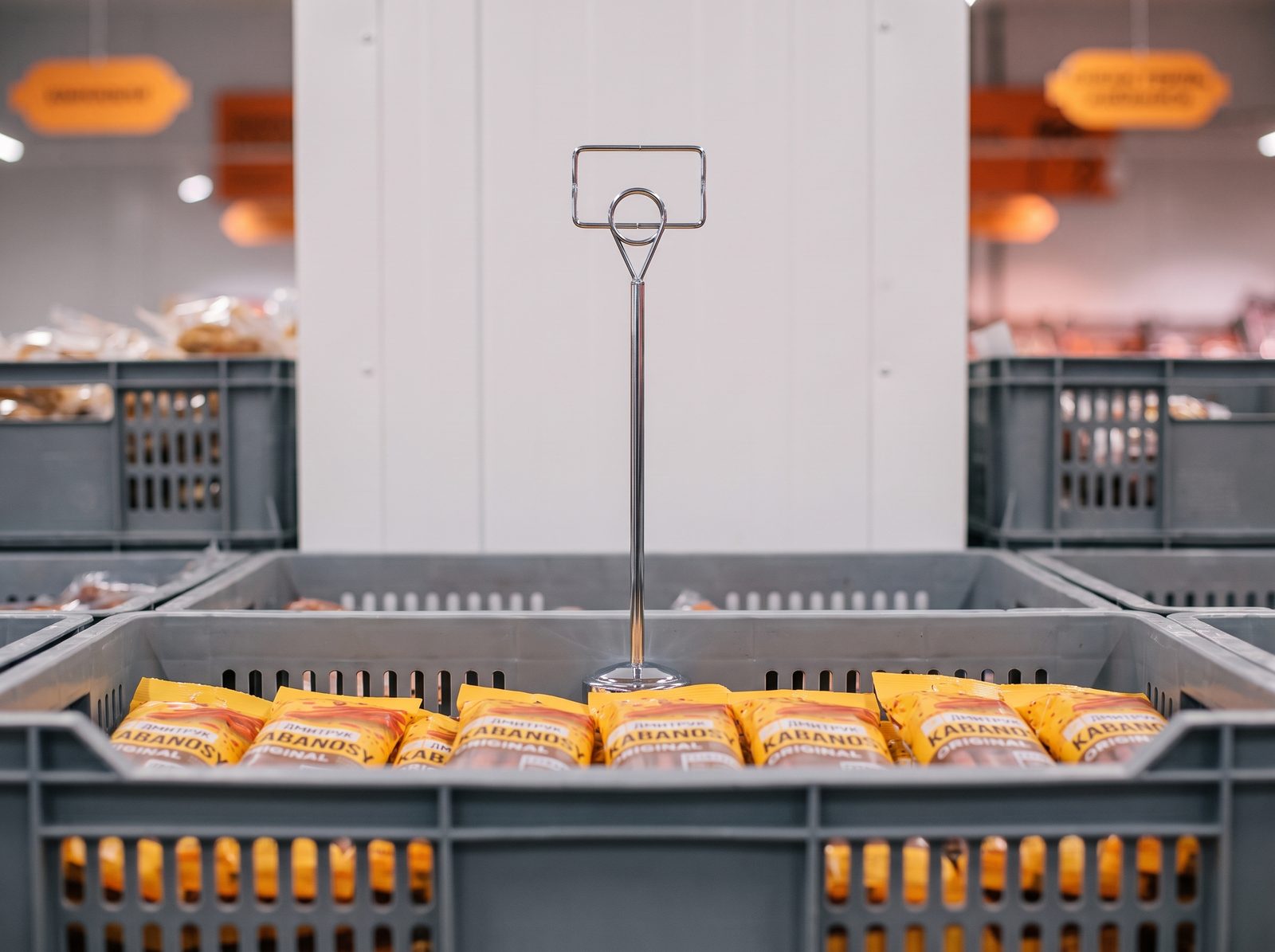
Kabanosy Original
Dmytruk · dry-smoked, 80 g
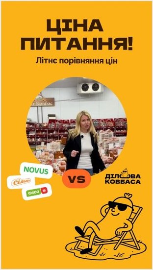
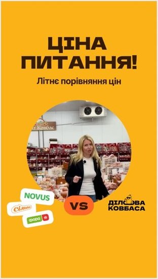
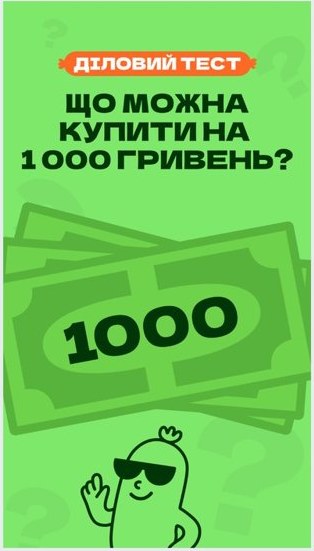
Business test
What can you buy for UAH 300?
We compare a basket here and at the supermarket.
More stories: same system, other colors
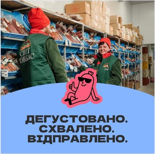
The feed: tastings, “business tests” and prices with no fine print

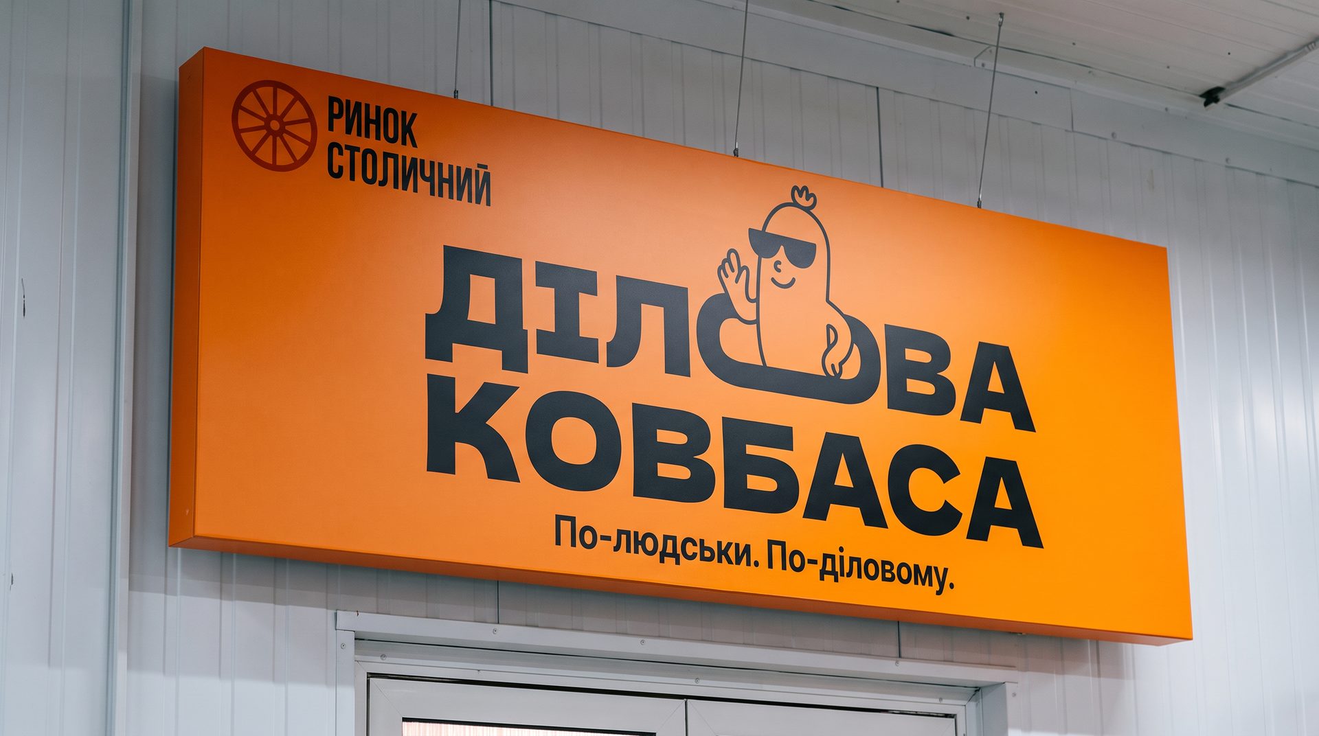
Pavilion
The brand is visible from the entrance all the way to every shelf
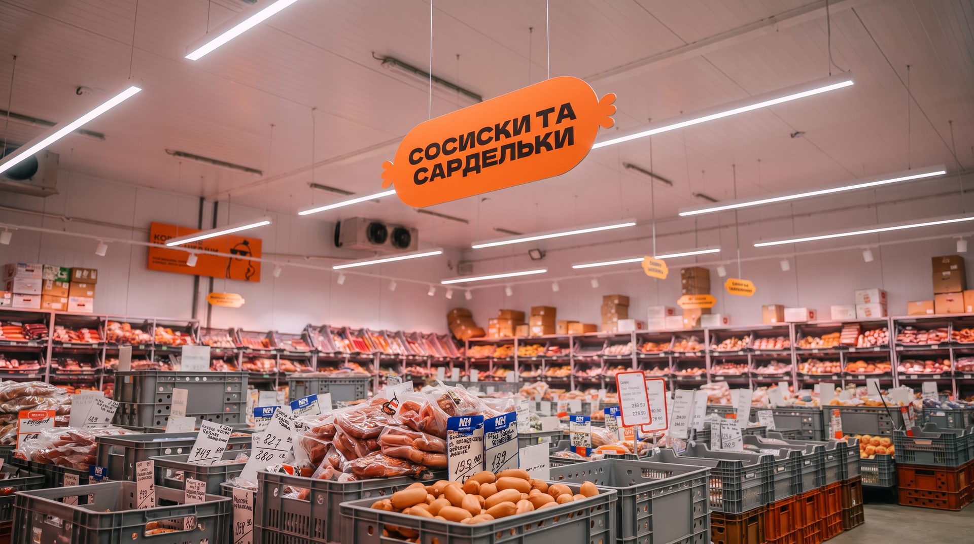
Posters
Pavilion rules in plain human language
The posters skip bans and lectures: the mascot explains how things work here, and people recognize themselves in it.
-
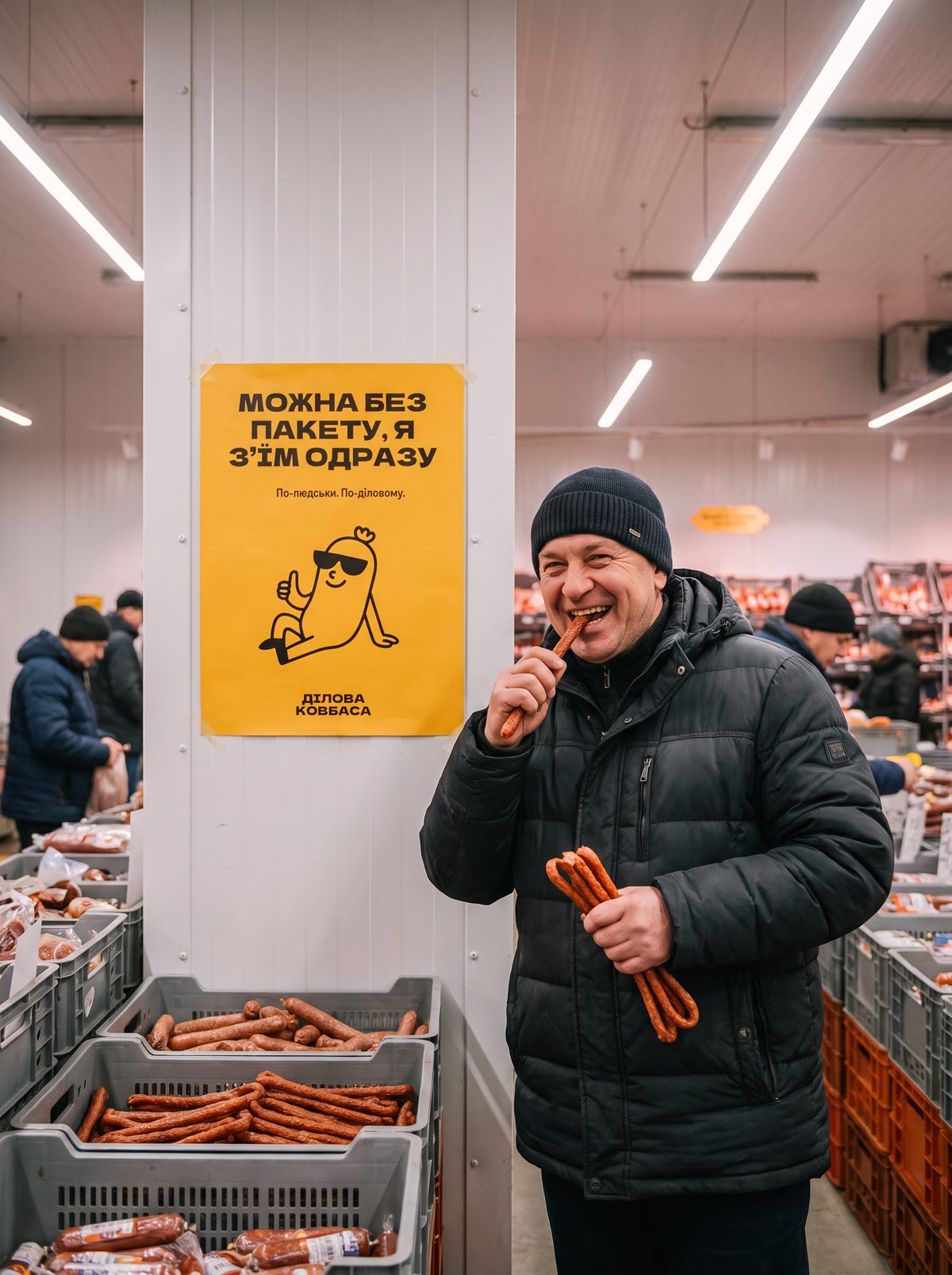
01No bag needed…I’ll eat it right away -
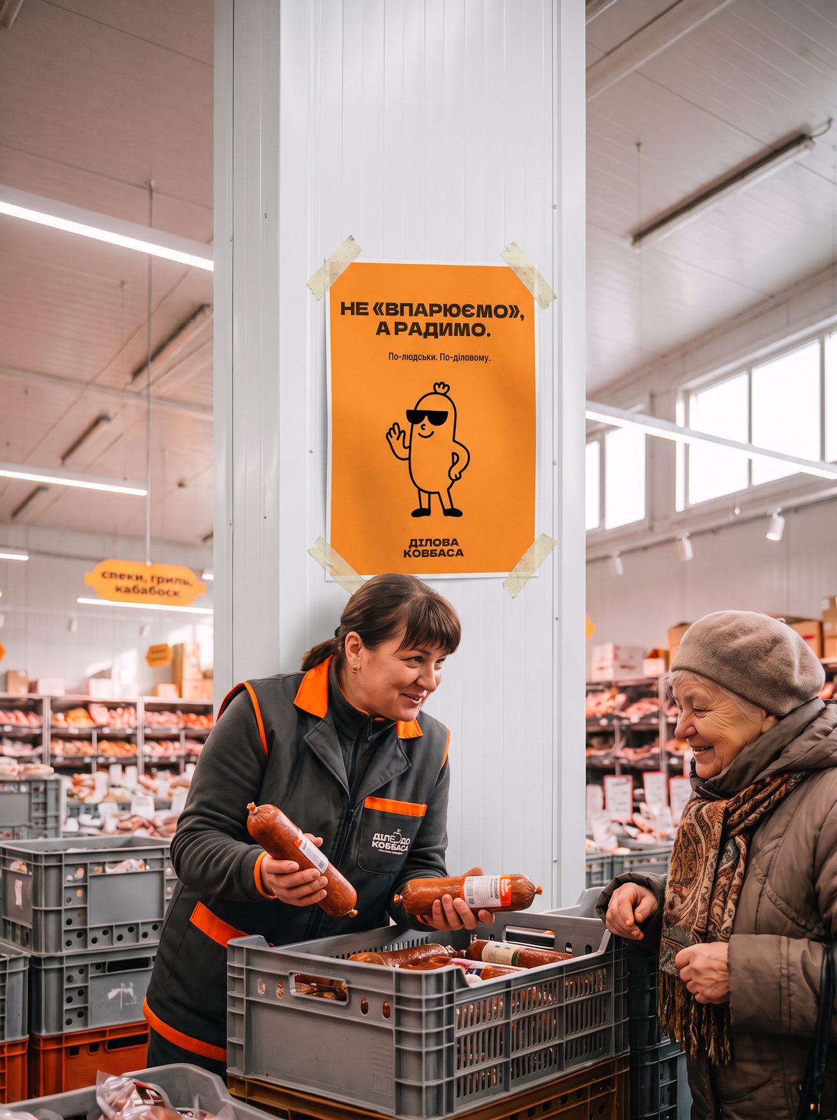
02No hard sell…just good advice -
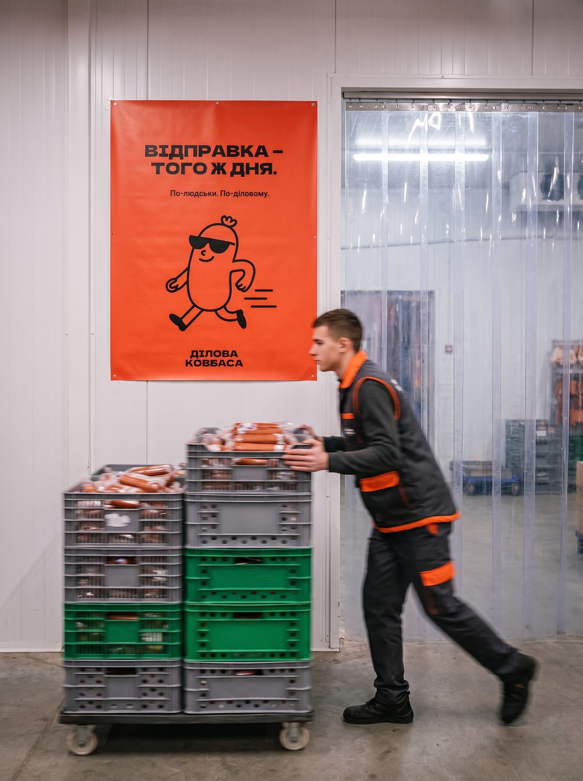
03Dispatch…the same day
Brand materials
What the client holds in their hands
Trolley, basket, bag and the order on its way: on each one the mascot speaks the same language as the seller behind the counter.
-
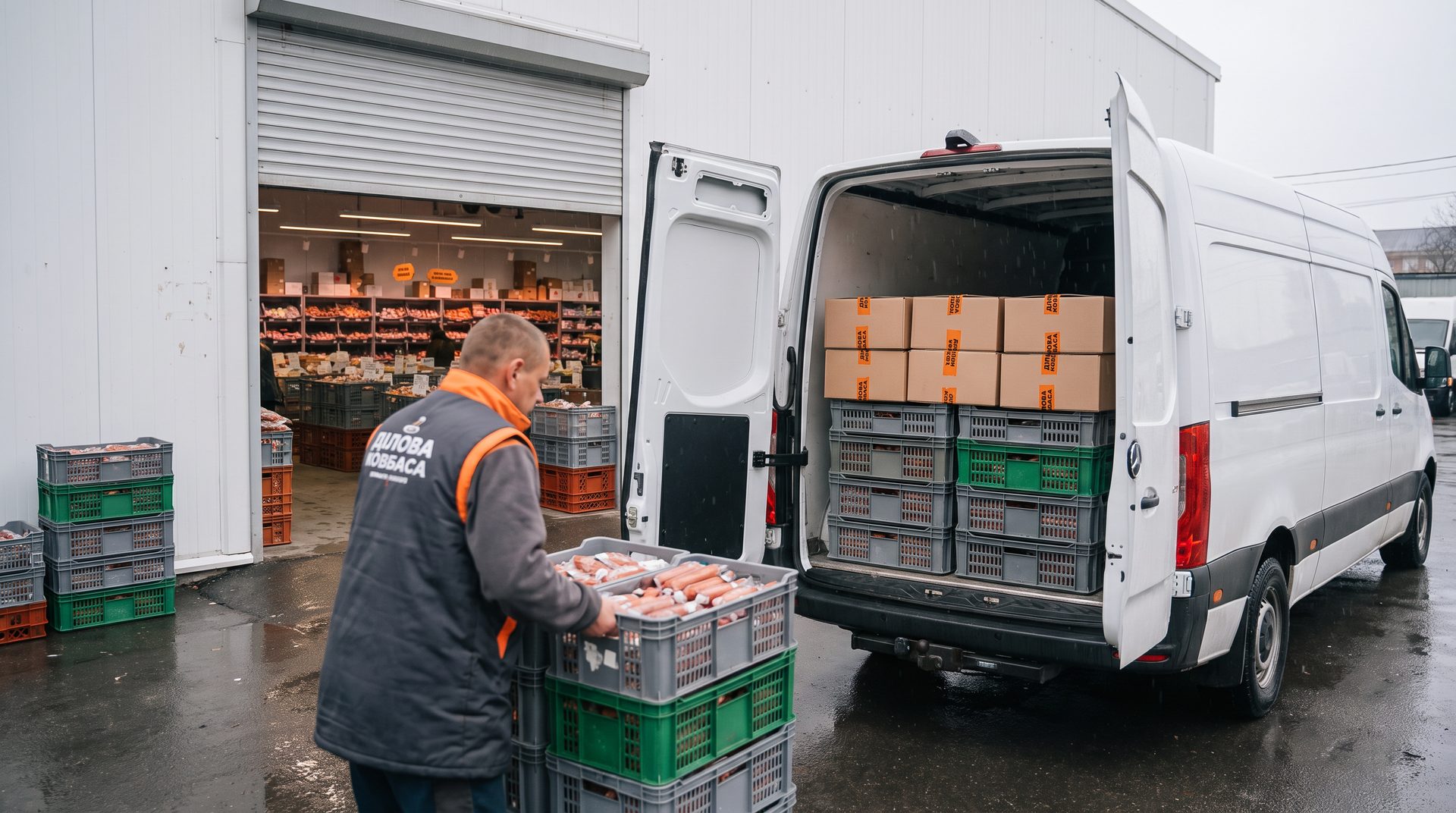
01Same-day dispatchThe order travels to the store in branded crates sealed with branded tape -
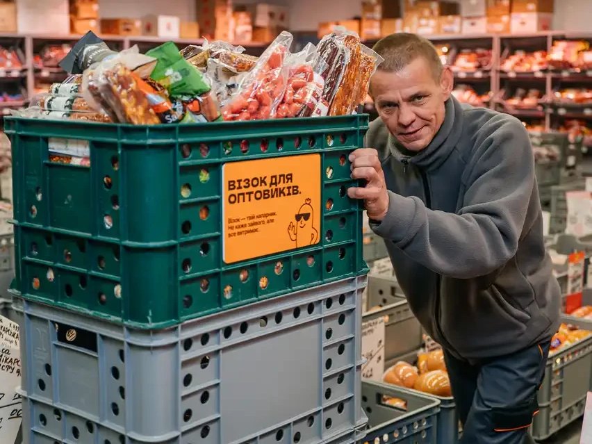
02Trolley for wholesale buyersA real trolley in the pavilion: “Says little, carries everything” -
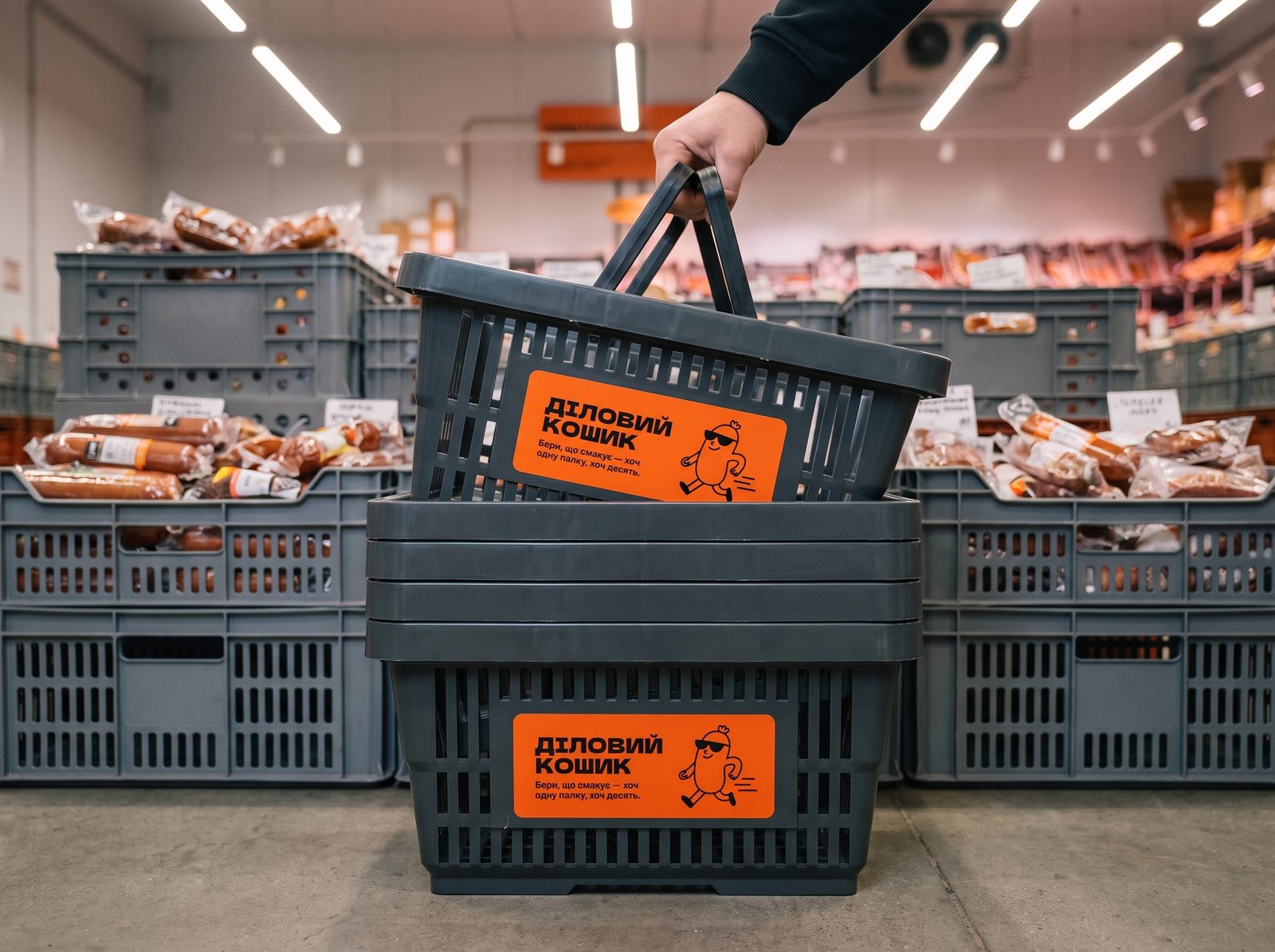
03Business basketTake what you like, one stick or ten -
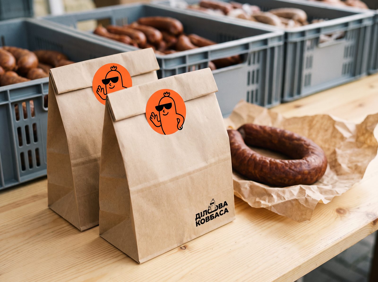
04BagKraft paper and a mascot avatar sticker -
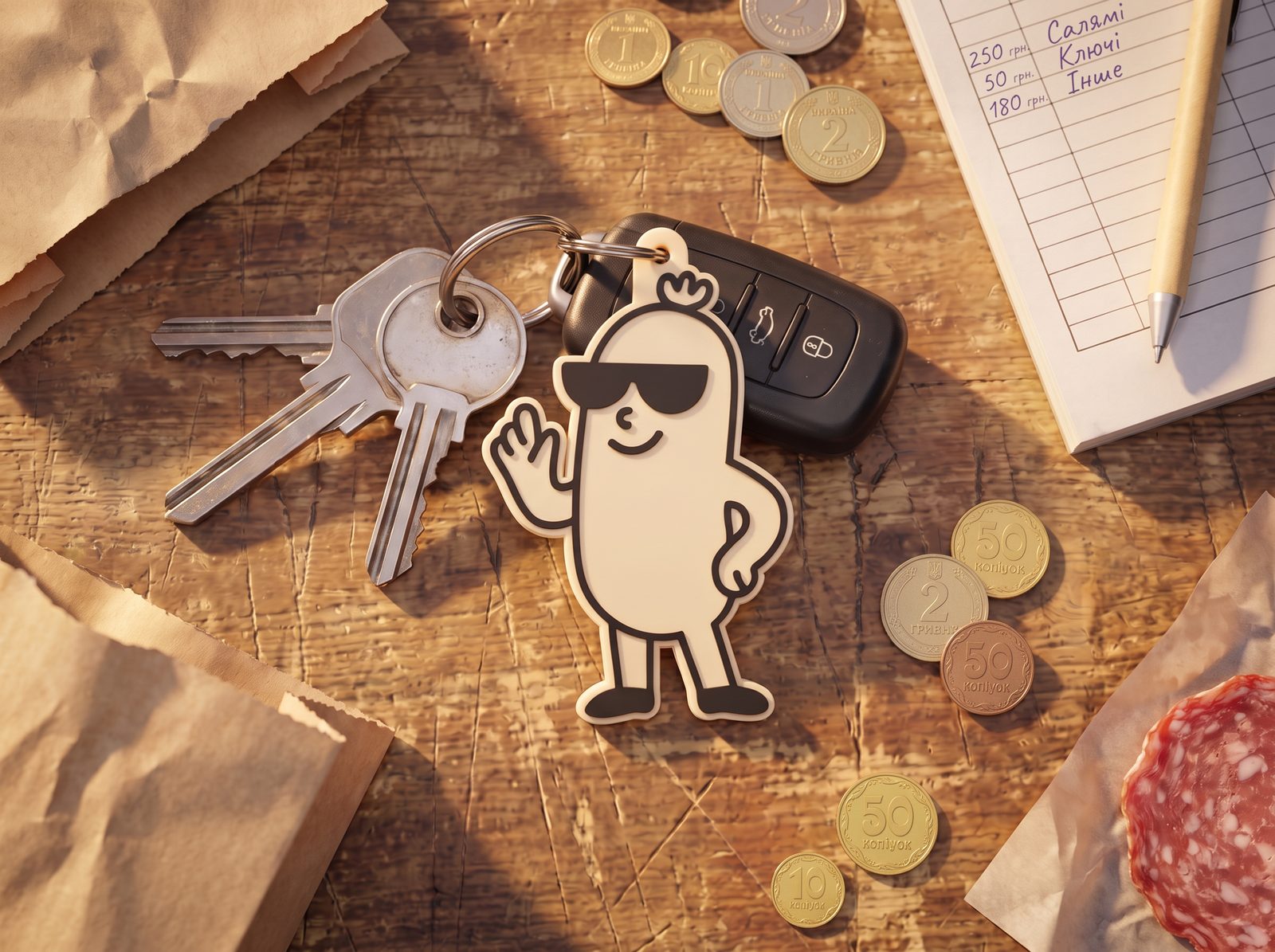
05KeychainA mascot people want to carry around
Team
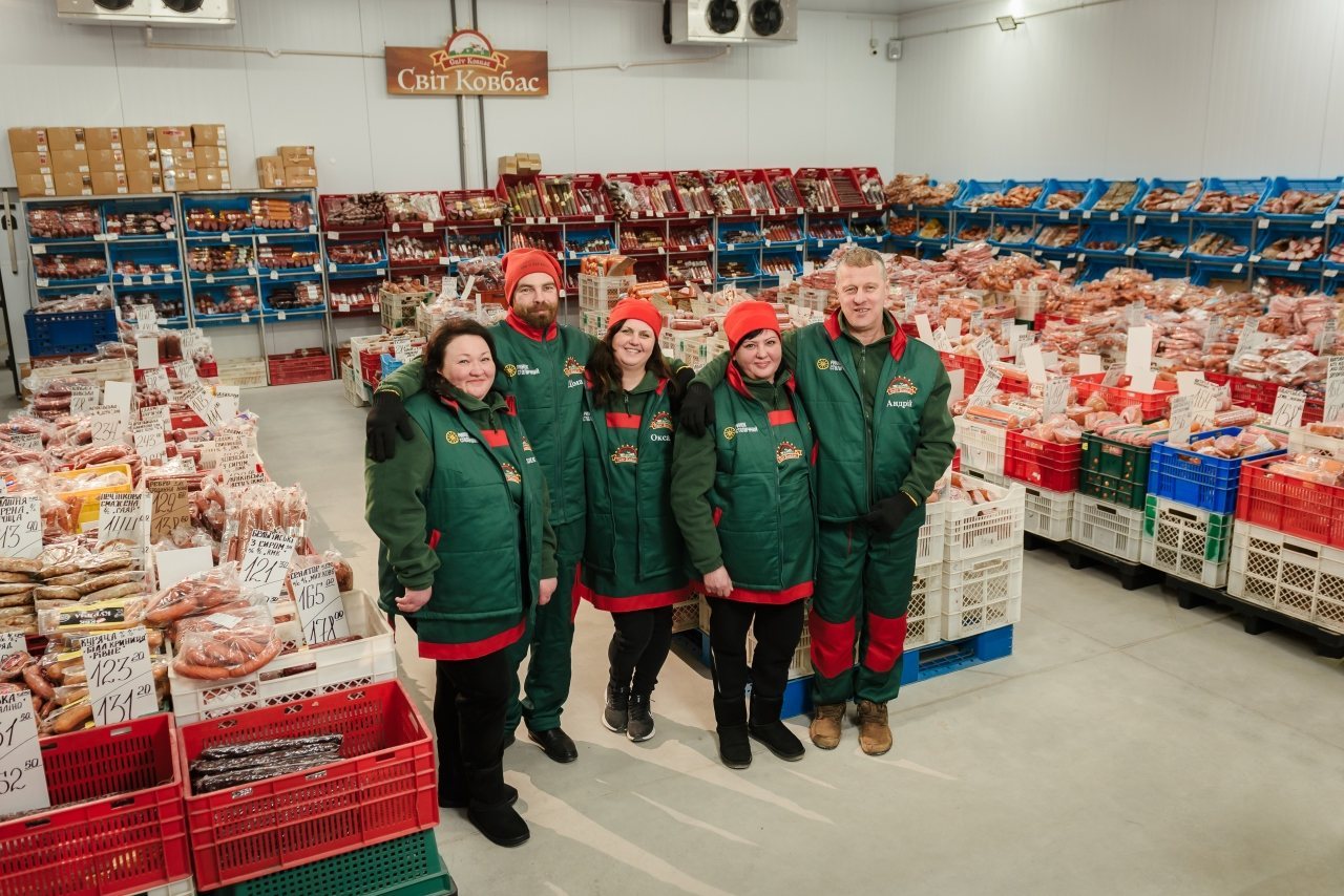
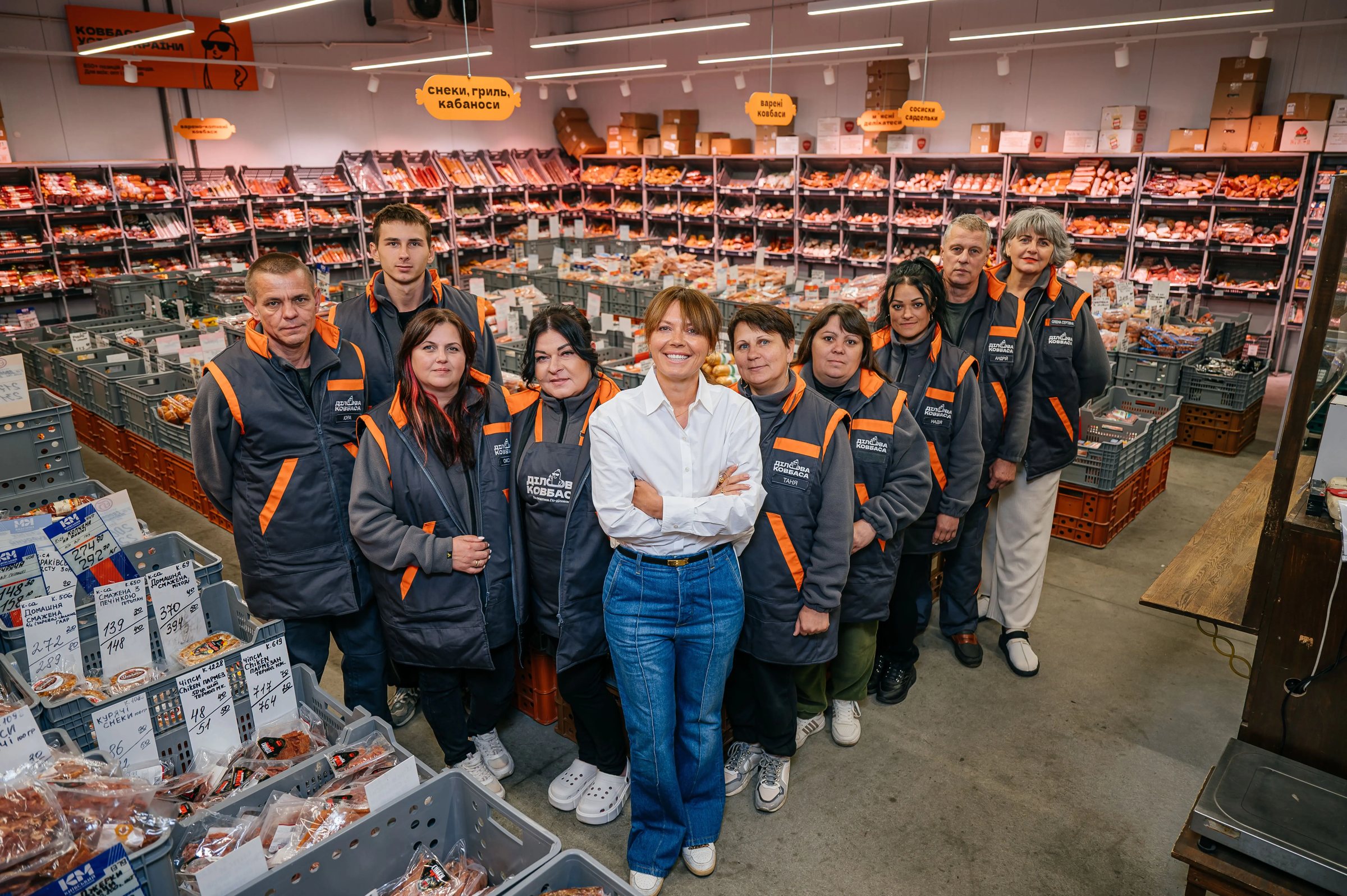
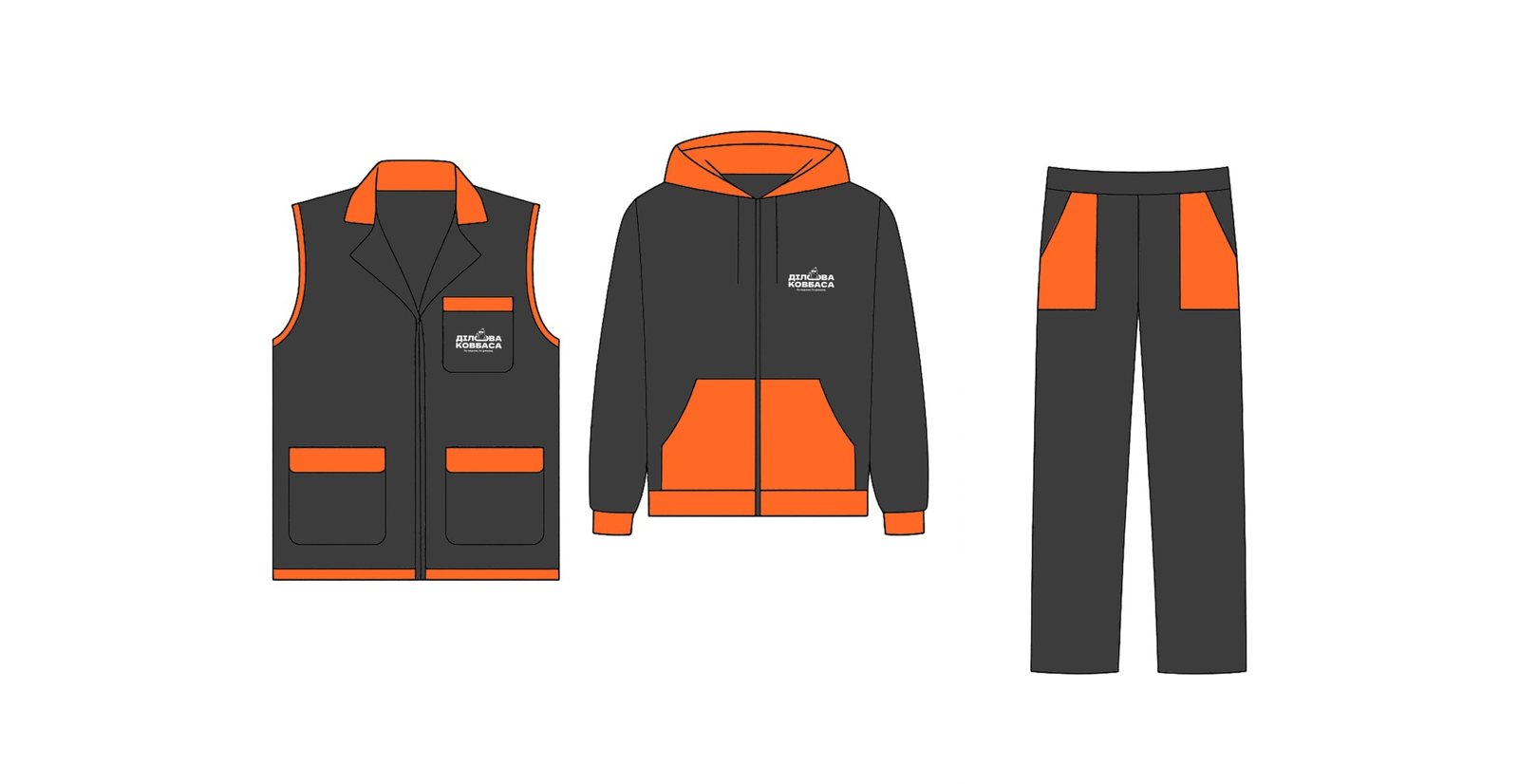
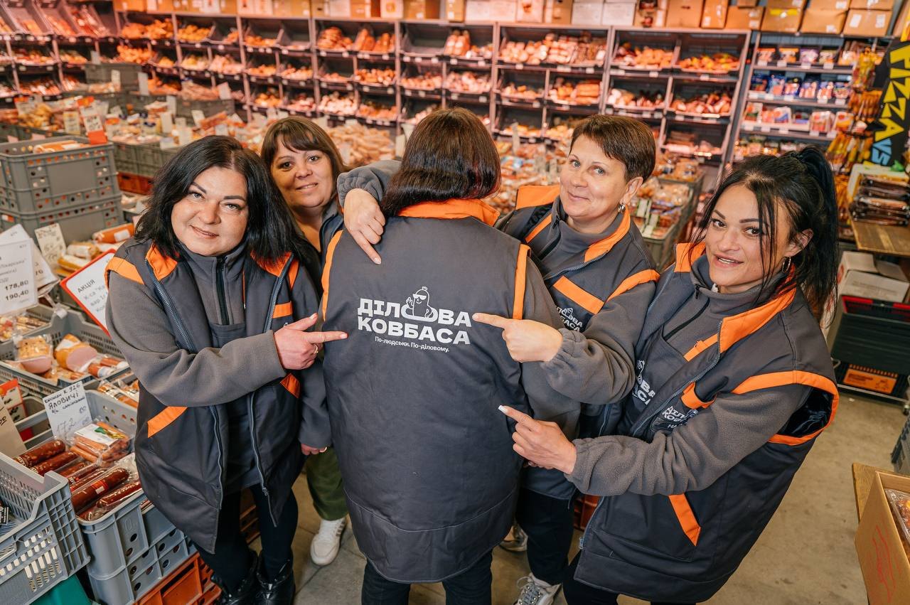
Humanity is the brand’s main advantage, so it has to be visible. Branded uniforms that make the team recognizable from the other end of the pavilion, and photos of the people clients know by name.
Customer experience
We walked the customer journey as mystery shoppers, at the client’s and at competitors’, and found where the brand stays silent
The range isn’t online, so a client can’t judge whether the supplier is a fit.
Show the range online, at least the main items or without prices.
No photos: product names mean nothing to a new client.
Quality photos of key items.
The website is Russian-only, with a limited range.
A Ukrainian version of the website and a full range upload.
The website lists one number, but callbacks come from another.
A single number for every client interaction.
Nowhere does it explain why to choose this supplier.
A presentation with the USP, top items and terms after the first contact.
A new client doesn’t know what to buy.
“For newcomers” selections, hits of the week and top tasting scores; greet everyone at the entrance.
Handwritten price tags: price, name and code are hard to see.
Printed price tags in one style.
The range is a stack of 18 pages.
A person who knows the range guides the client and takes down the order.
The tasting protocol is never mentioned.
A mandatory point in the conversation script.
The human side is barely visible.
Team photos on the walls.
Delivery and deferred payment go unmentioned.
Communicate them as strengths.
Cramped space and visual noise.
Taller shelving, aligned crates, less color chaos.
After the visit, the client gets no list of what to order.
The full range with prices, plus a separate list of what they picked in store.
The next touchpoint comes two weeks later.
Follow-up within 24 hours of the client’s last action at the latest.
An indifferent tone and impersonal communication.
A human tone and a personal manager who signs with their own name.
Orders stall without a close.
A standard close to every conversation, with a next step.
No summary after the conversation.
A short recap message with an offer.
Hypothesis: online catalog
The catalog remains a hypothesis. The customer journey pointed to it: the range lived in an 18-page price list, and a new buyer couldn’t even see what was on sale. We proposed an online catalog as a hypothesis and described how it should work. Below is a prototype of that logic.
Prototype
The storefront the business never had
Top orders
Kabanosy Original, pork, 80 g Dmytruk 🔒 Price after sign-in Kabanosy Original, pork, 80 g Dmytruk 🔒 Price after sign-in Categories
Code: 1069
Kabanosy Original, pork, 80 g Dmytruk🔒 Price available after sign-in
Request sent to a manager…
Wholesale 39.10 ₴Retail 45.30 ₴
Selection
Starter set For a first order: the best sellers in neighbourhood shops.- Cooked sausages
- Frankfurters & wieners
- Dry-cured
- Holiday delicatessen
Scan the QR on the price tag
Result
The business entered the project with the widest range on the market and no other argument. It came out with a brand it can show, name and sell: positioning built on checking every product itself, a validated name, a character and a voice.
It also got a customer experience strategy: more than 30 solutions across three stages of the journey, from printed price tags to 24-hour follow-up, plus the online catalog hypothesis.
The sausage stayed the same. What changed is what clients pay for.
What we’ll do for you
A brand people choose for more than price
For when your product is strong, yet clients choose you “because it’s nearby” or “because it’s cheaper.” We’ll start with the people who pay and finish with a brand and a service strategy that prove it.
- 01 Market and customer research Competitors, in-depth interviews and mystery shopping.
-
 02 Brand strategy Positioning, values, tone of voice and name validation.
-
 03 Identity and character Logo, colors, mascot and a system for how it keeps living.
- 04 Customer experience Customer journey, scripts and solutions for every stage.
Team
- Agency
- DOGMA
- Client
- Dilova Kovbasa