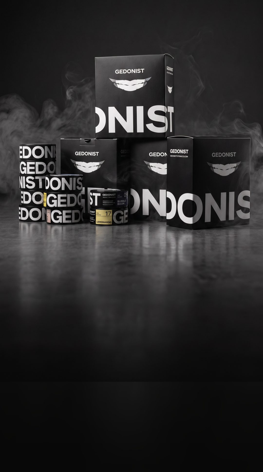
Gedonist a hookah tobacco brand born as Egoist, with a packaging system that survived even a change of name
In brief
The client came to us with a line of hookah tobacco, the working name Egoist and a request for packaging.
We started with people. Conversations with hookah smokers showed that the packaging had to be recognizable in any form, from a small tin to a box. So instead of a single label we built a modular system.
Midway through, it turned out the Egoist trademark was already registered. We proposed a new name, Gedonist, and shifted the positioning. The system absorbed the new name without a single rework, and it still scales to new flavors, formats and merch.
Brief
Packaging that’s recognized in any form
Hookah tobacco sells in tins of different sizes, boxes and sets, and there are dozens of flavors with new ones added all the time. The task was a set of rules that makes any new pack recognizable at first glance.
Research
Pouches are for trying a flavor. People buy tins
For a smoker, the tin is something they keep on a shelf and collect. Yet the line would still live in many formats. The design takeaway: a modular system that lets packaging vary and stay recognizable whatever the form factor.
“I buy only tins. Small pouches are just for trying a new flavor. My friends and I are totally against pouches.”
“I smoke at home. What drives me crazy is liquid leaking even through a sealed film, so everything has to close tight.”
“Tins are convenient. Even when I buy a pouch, at home I pour it into an empty tin from my last tobacco.”
“Once I bought a box and put it in my backpack. The pouch tore and everything leaked. Since then, only tins. I keep the empty ones at home.”
“It’s easier to take it out of a tin, your hands stay cleaner. Pack the bowl, close it, put it back.”
Name
Egoist became Gedonist, and the system held

“Be an egoist”: choose the best for yourself. A strong position, but the trademark turned out to be taken.
We proposed “Gedonist” and shifted the positioning from “only for me” to the art of enjoying the moment. The same pleasure, minus the “at others’ expense” undertone.
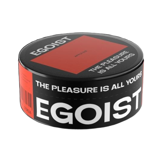
- Smile markA smug grin with teeth: confidence, pleasure and a touch of cheek.
- Big logoA wide typeface across the full height of the pack: stability and strength.
- Flavor numbersFlavor names can change, the number stays. A favorite flavor is easy to remember.
- SloganThe pleasure is all yours. It fits both names.
The name changed at concept stage and the system stayed intact: the mark, typeface, modules and slogan never depended on a single word. Trademark clearance sat with the client and we didn’t duplicate it, and this was exactly the moment that proved how robust the system was.
Logo
A grin recognized without words
 Grin · chosen
 All teeth
 Predatory
 Fangs
 With lip
 Skull
The mark survived the rename: going from Egoist to Gedonist changed only the word. The grin, the typeface and the rules stayed the same.
System
The number is fixed. Flavor, color and format vary
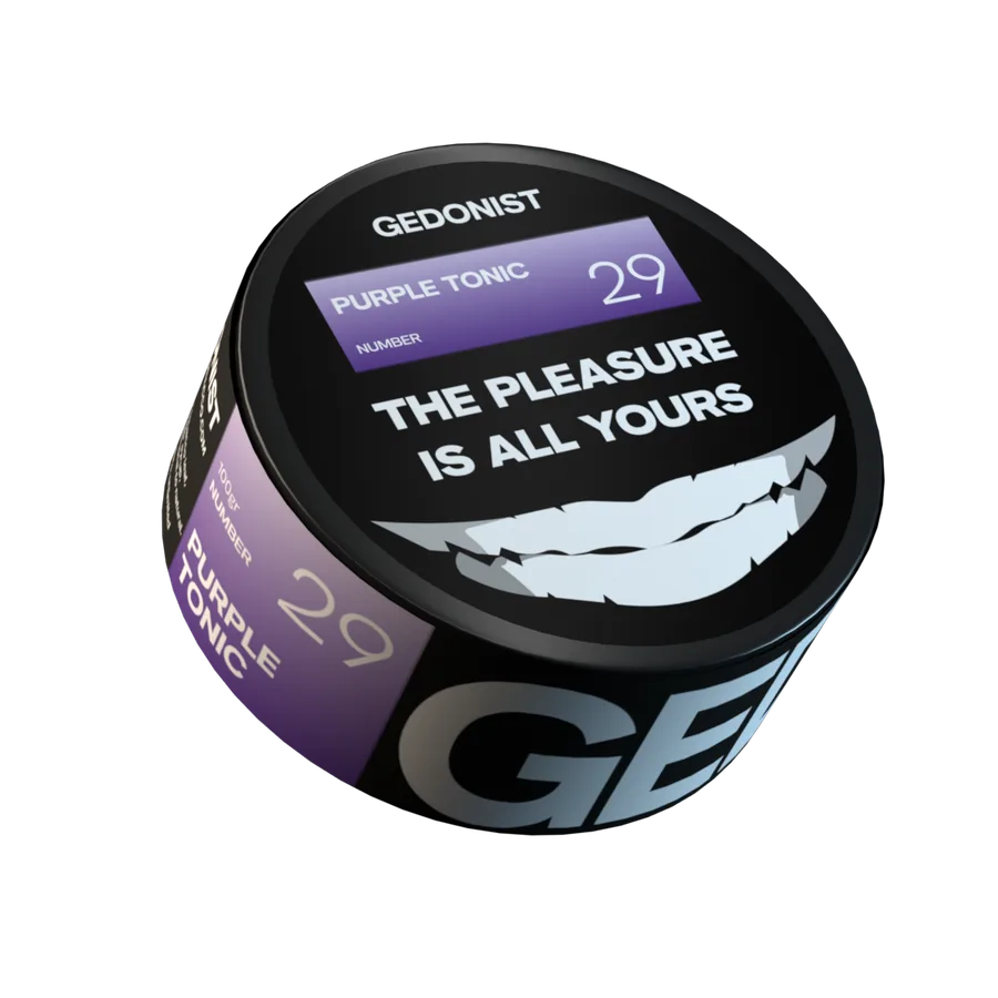
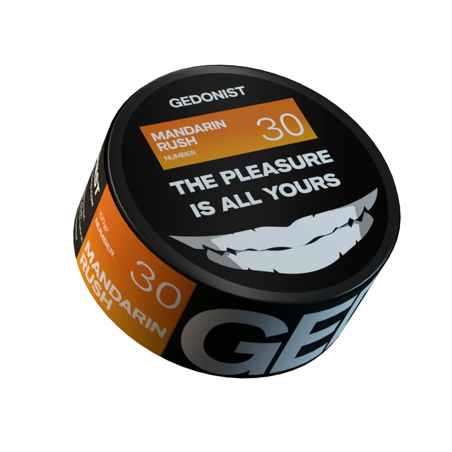
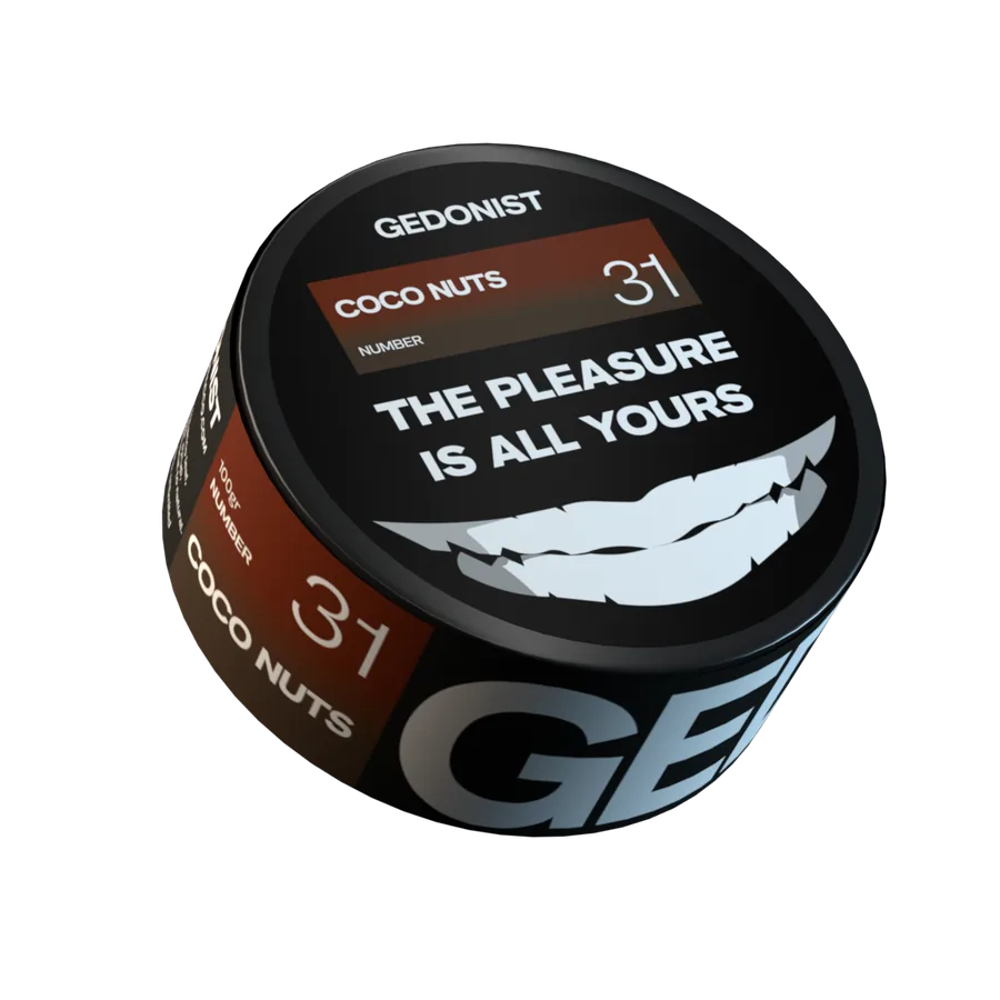
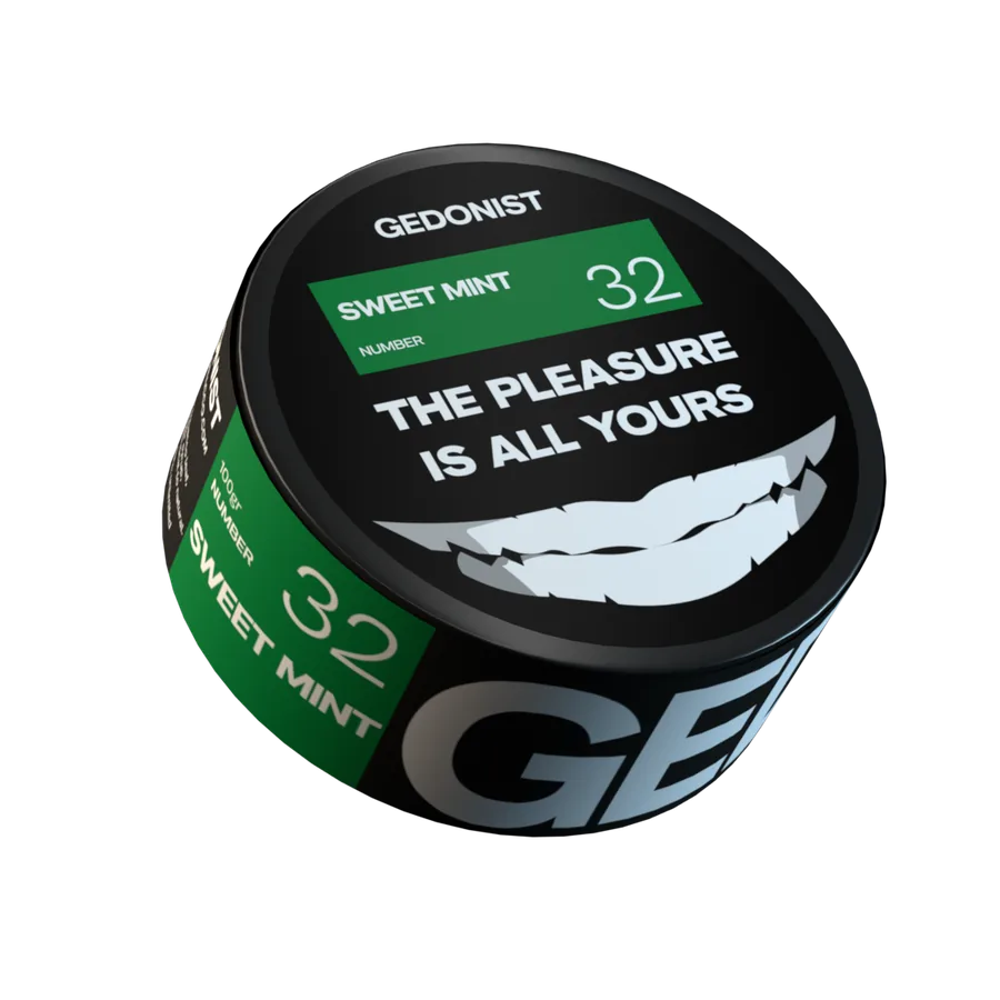
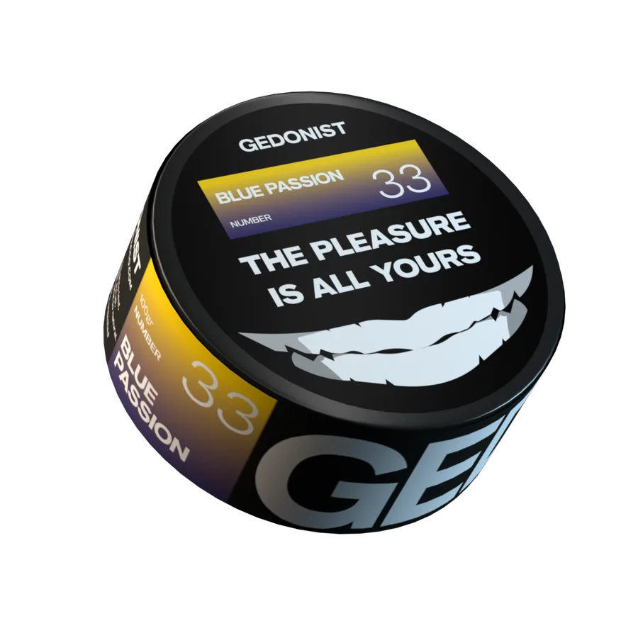
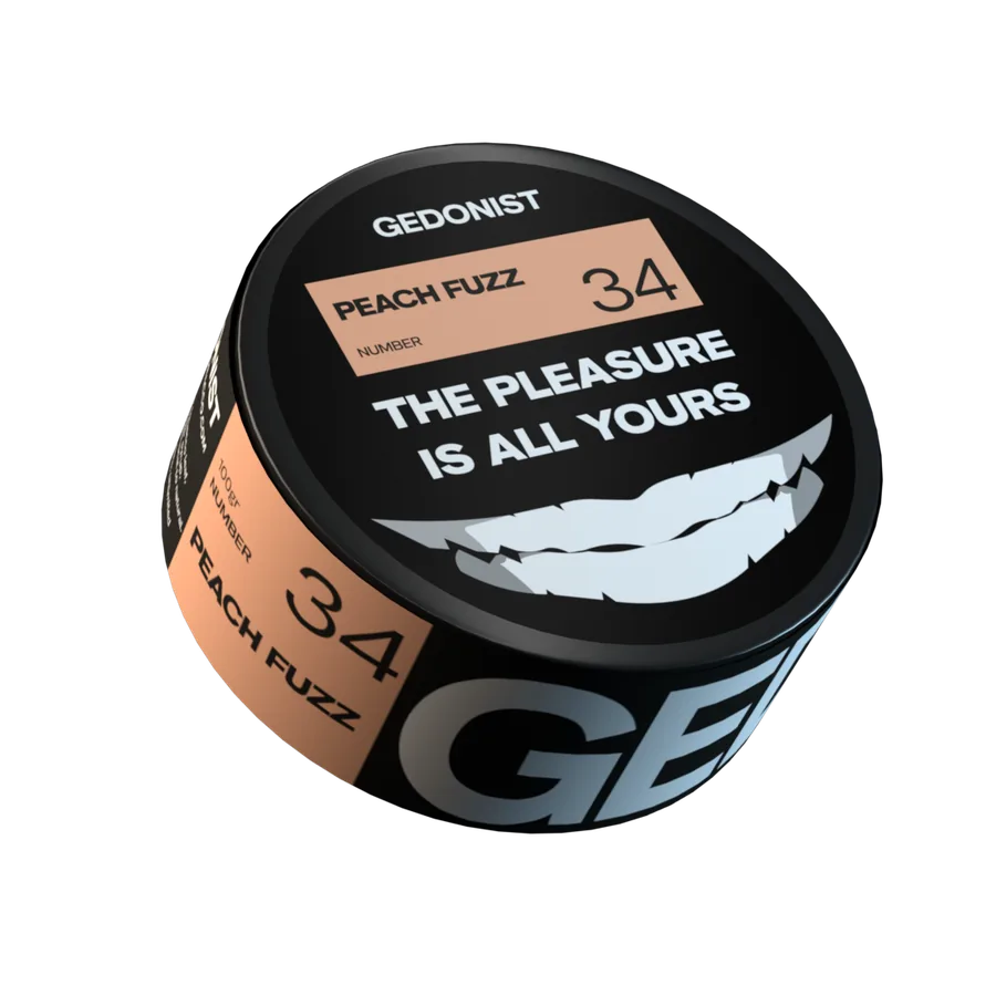
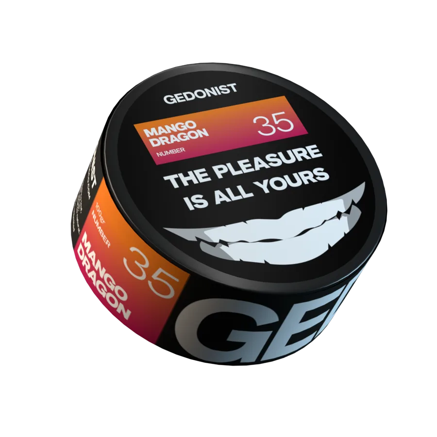
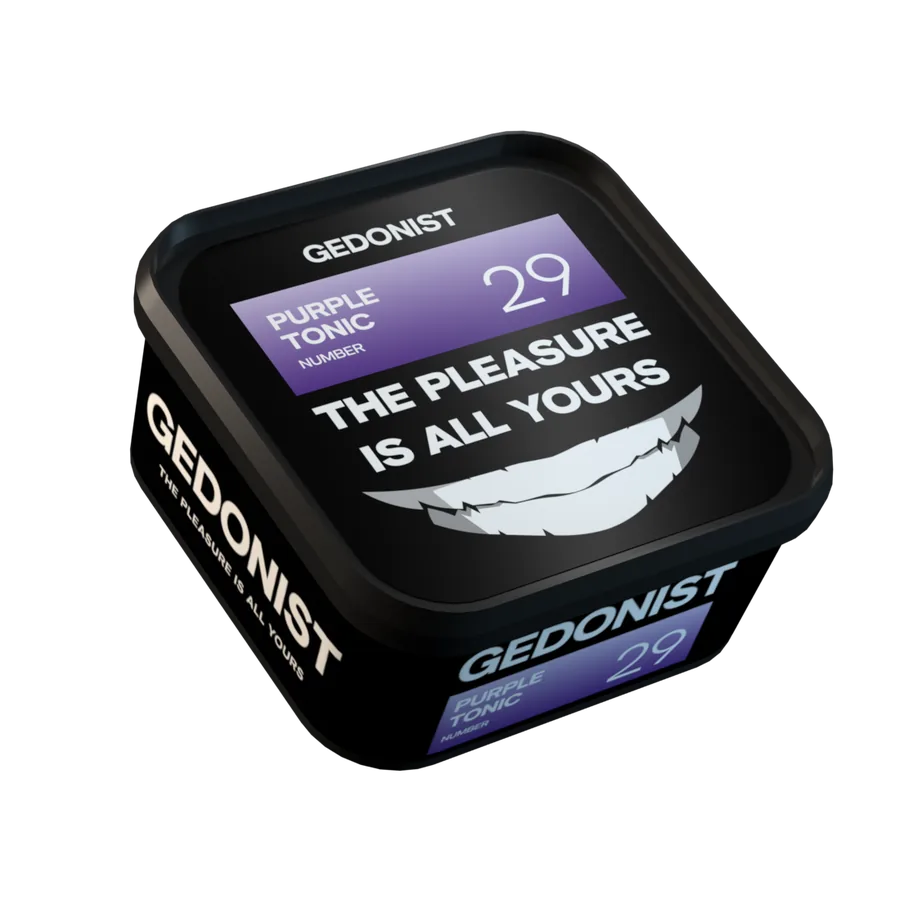
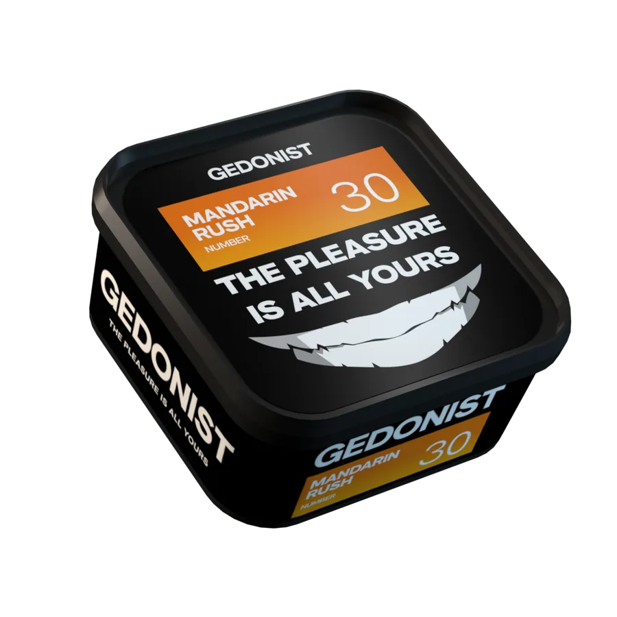
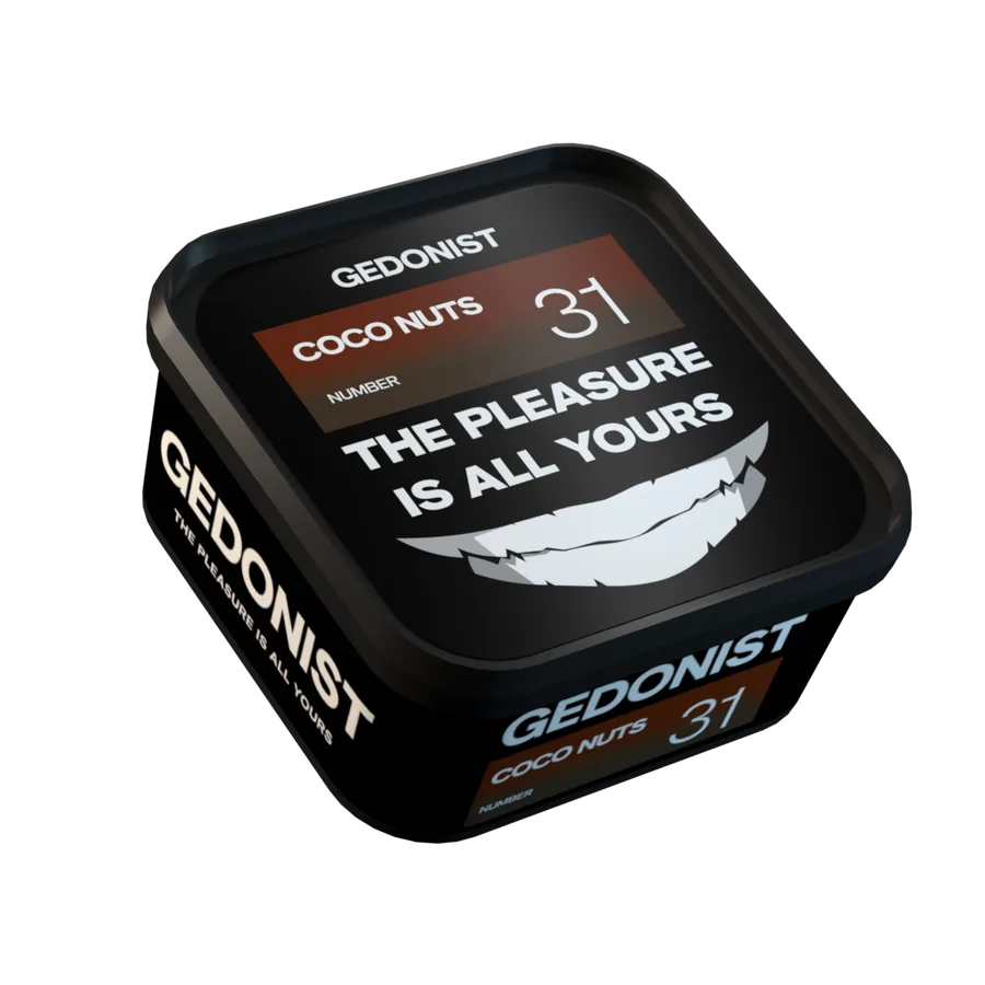
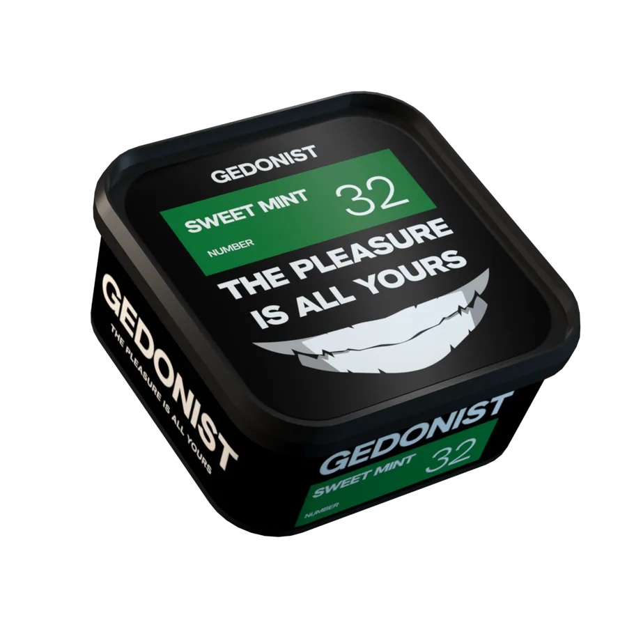
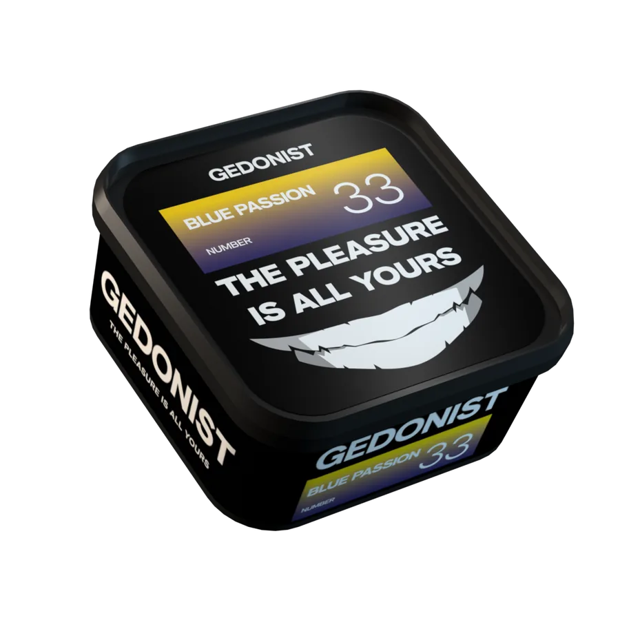
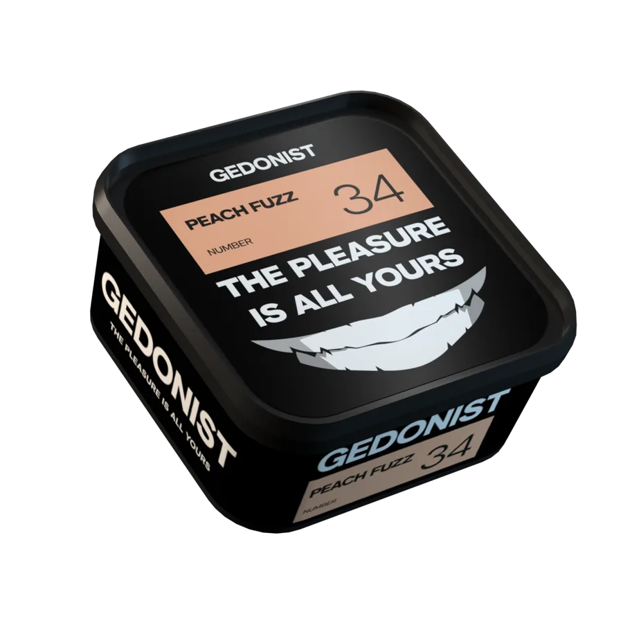
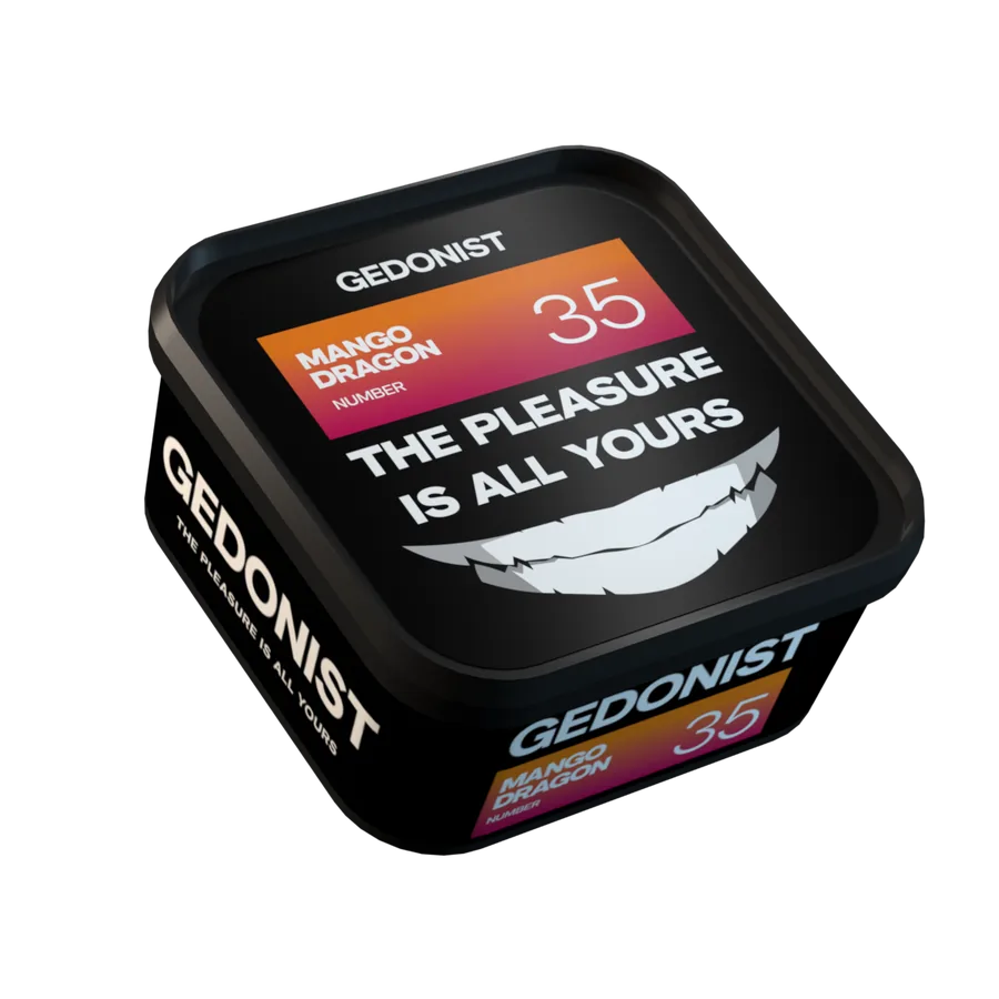
Purple Tonic100 g
- Full-height logofixed
A big GEDONIST wraps around the tin and the box.
- Mark and sloganfixed
The smile and The pleasure is all yours on the lid.
- Flavor numberfixed
One number across every format.
- Flavor color and namevariable
A flavor badge with a gradient.
The system was tested in production: new flavors, 100 g and 200 g tins, boxes, a limited drop and merch all fit in without changing the rules.
Flavors
35 flavors, each recognized from above and from the side
- 01ColorThe flavor code: the color family is visible from the far end of the shelf.
- 02NameShort and cheeky, like the brand’s character.
- 03NumberPeople remember it and say it to the seller: the fastest way to “their” flavor.
- 04BrandGEDONIST on the lid and up the full height of the side: a shelf of tins becomes a brand display.
One grid for the whole line: a flavor badge with color, name and number sits on the lid and on the side, with nothing extra and the focus on flavor. People find their flavor from above, when tins stand in a row on the shelf, and from the side, by the numbered stripe.
Brand slogan
The pleasure is yours alone. The slogan sits on every lid next to the smile, and the big logo wraps around every tin and box.
Packaging
Tins, boxes and sets speak one language
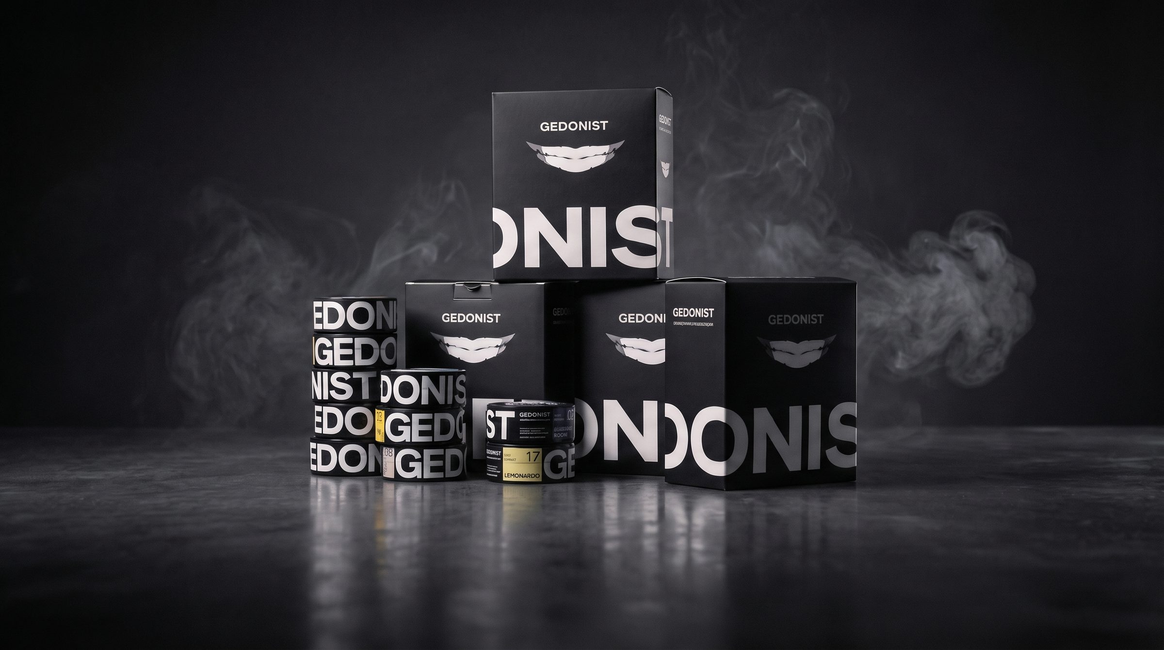
We brought the production photos into one advertising style: graphite background, low light and hookah smoke.
-
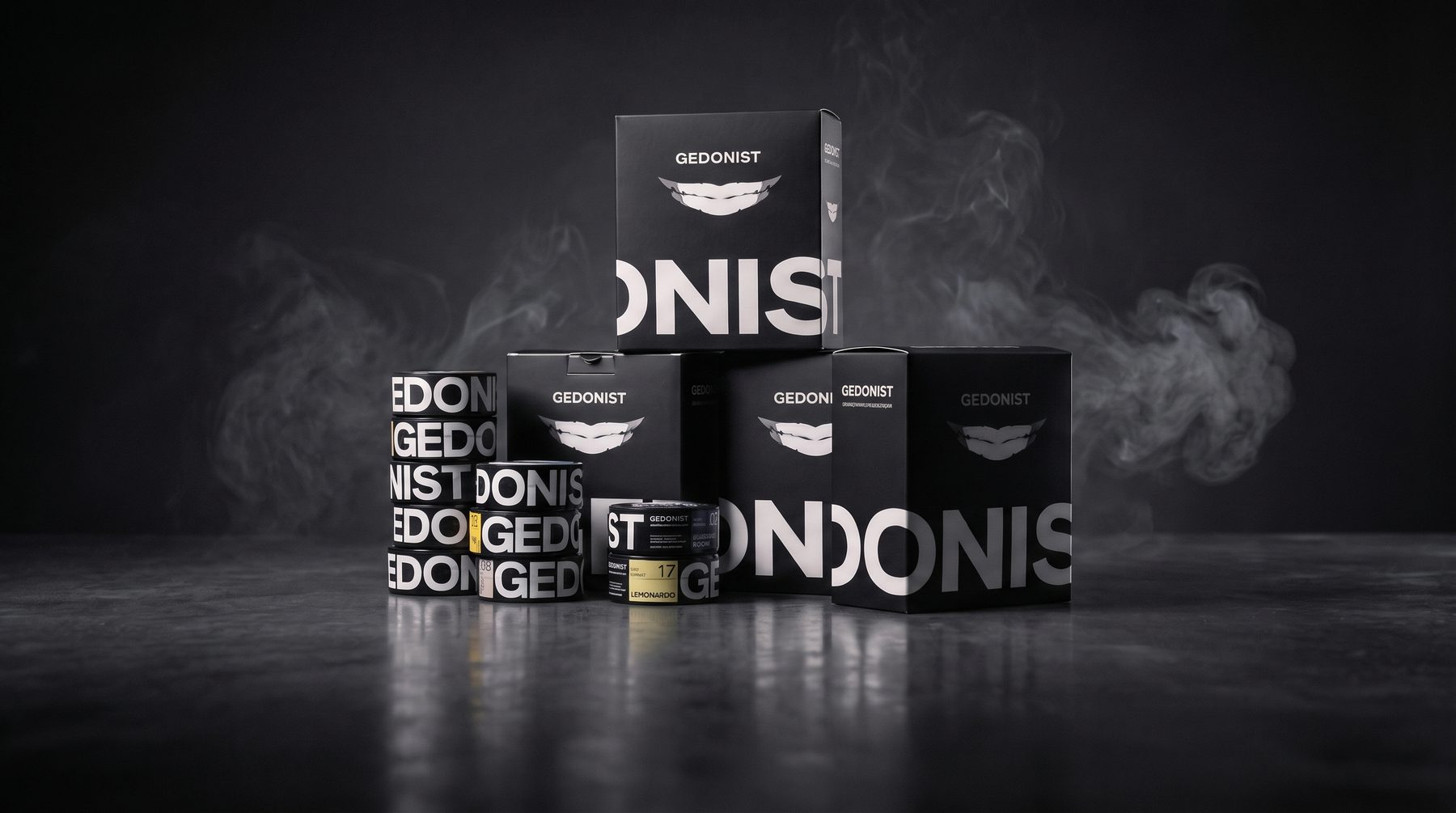
01The lineStacked tins spell out the logo -
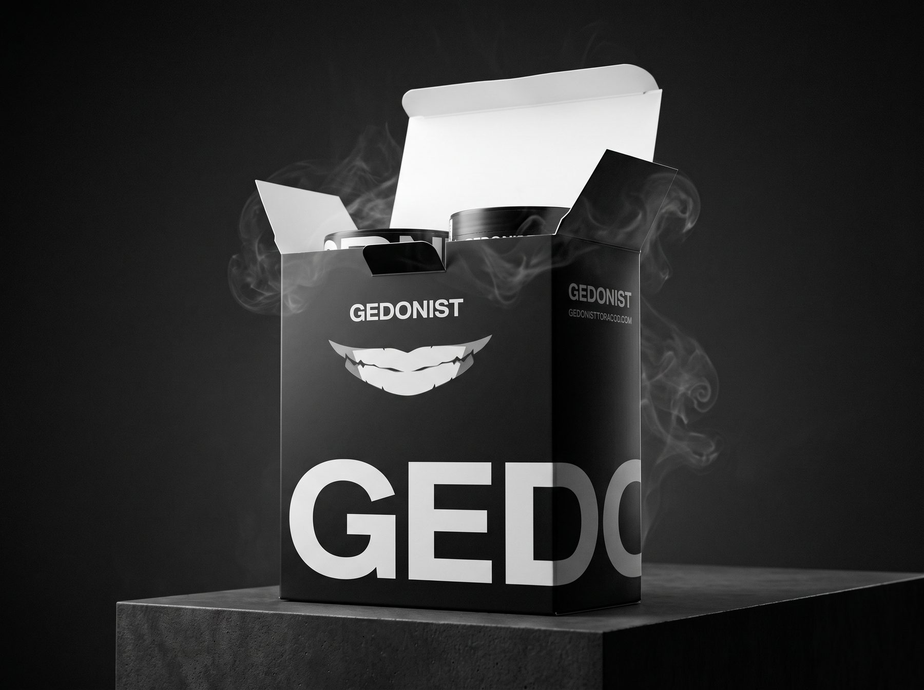
02BoxTwo tins inside, “GE” on the side -
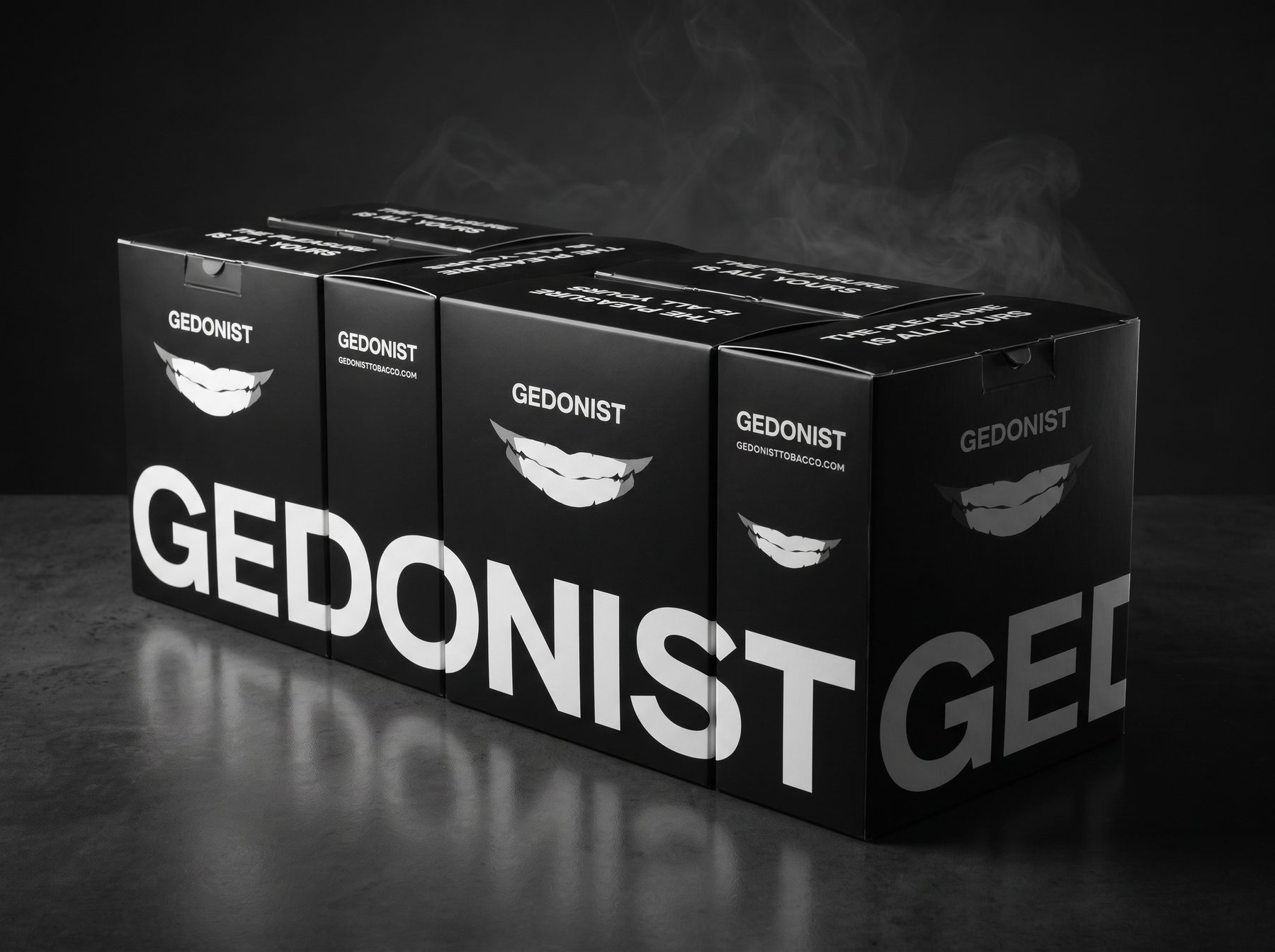
03BoxesLined up, they form the logo
Merch
Merch that extends the packaging
We reviewed the first merch set and carried the packaging rules over: a big logo wrapping around the object, the smile as a standalone mark and clean monochrome.
-
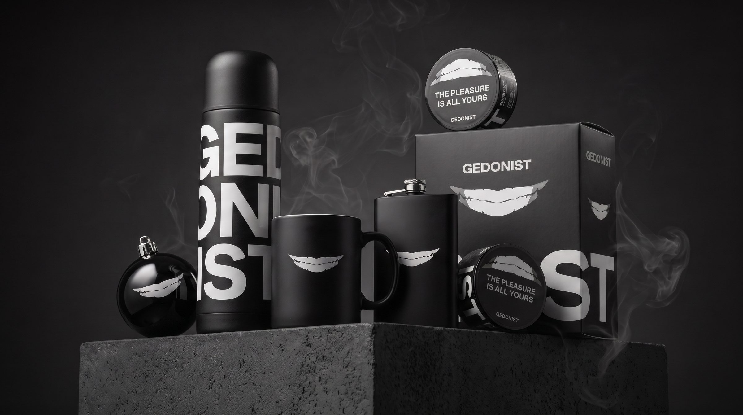
01CollectionThermos, cup, hip flask, Christmas bauble and tobacco in one set -
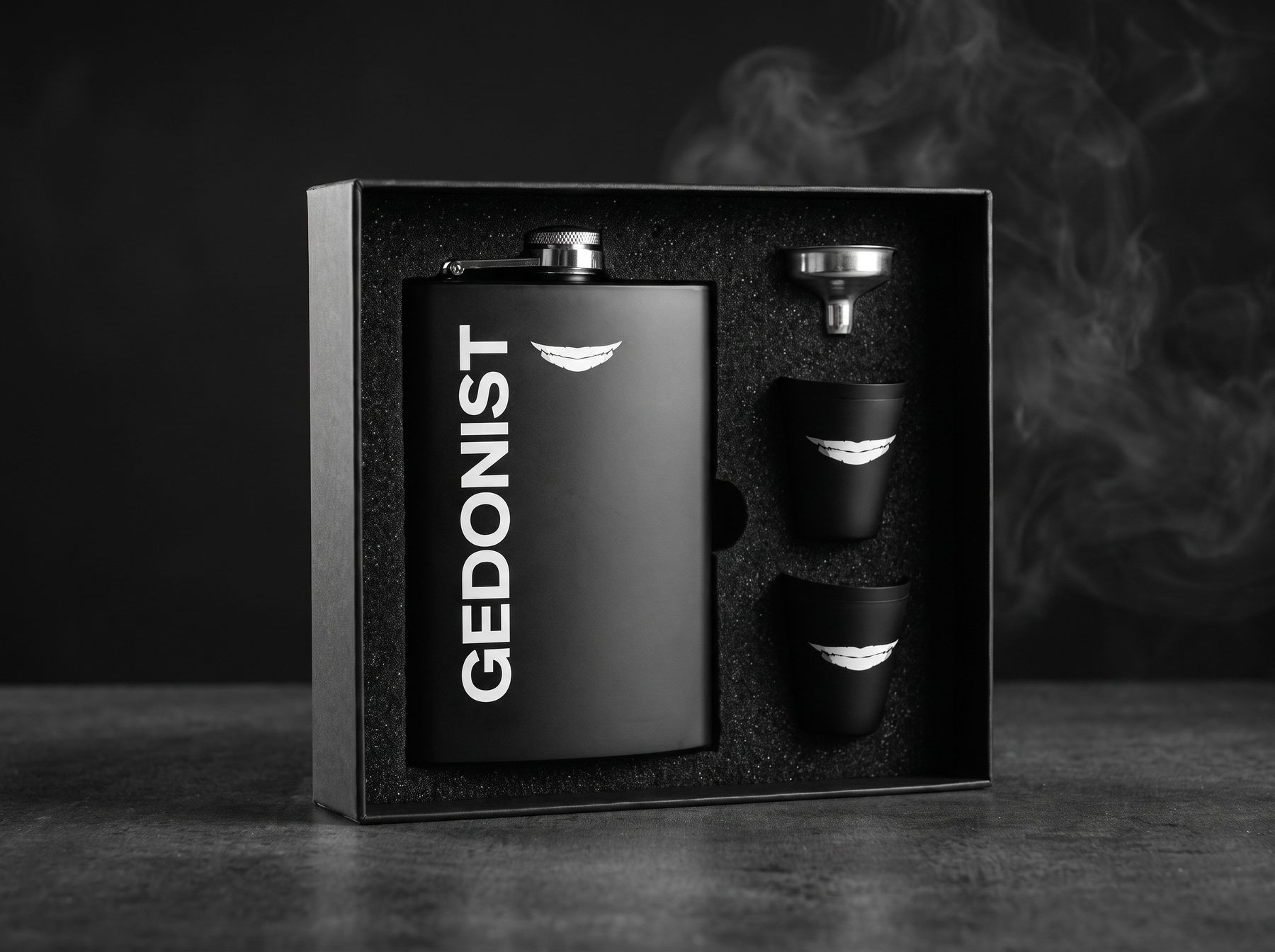
02Gift setHip flask and shot glasses with the smile -
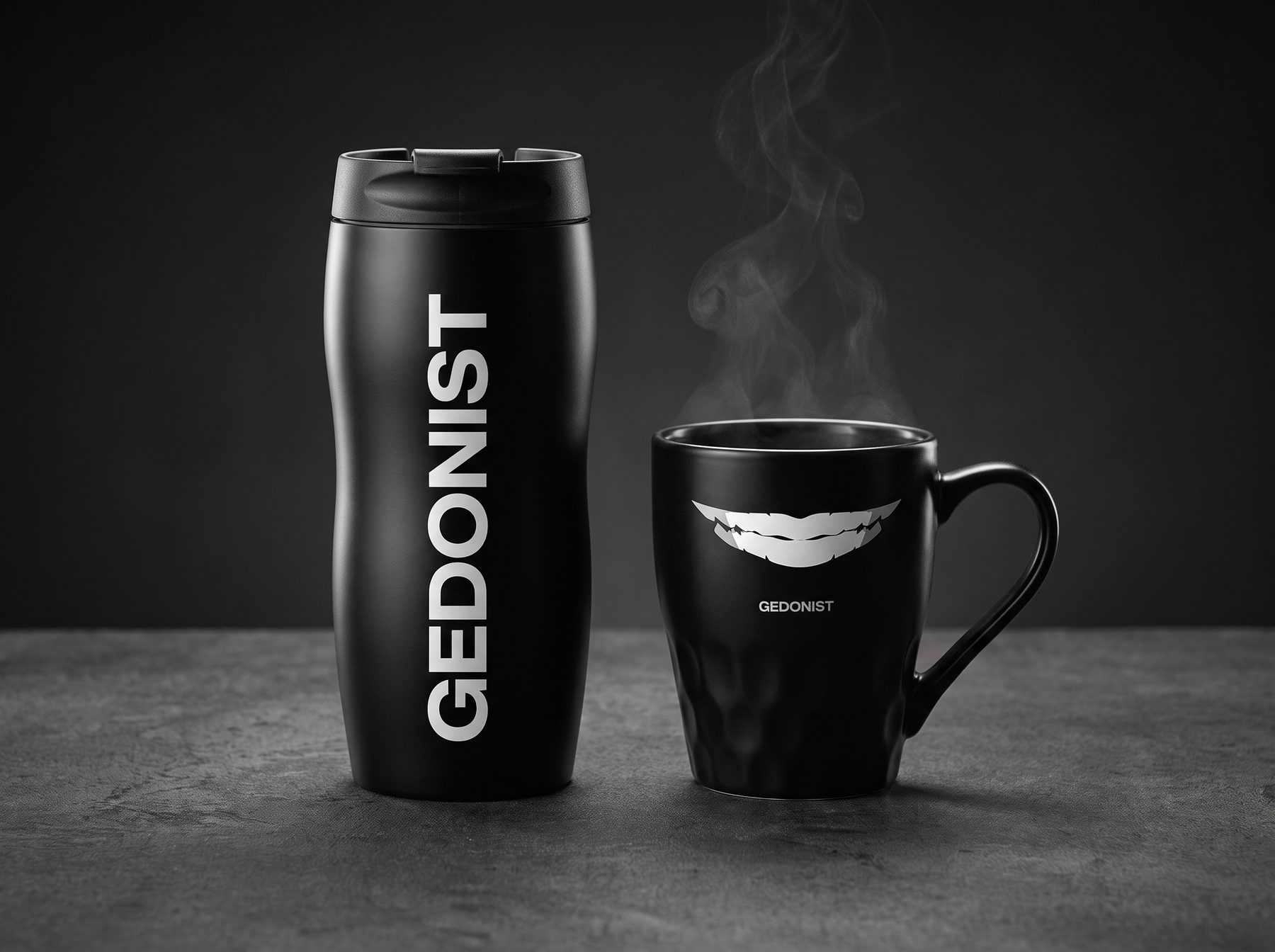
03Travel mug and cupVertical logo, just like on the tin -
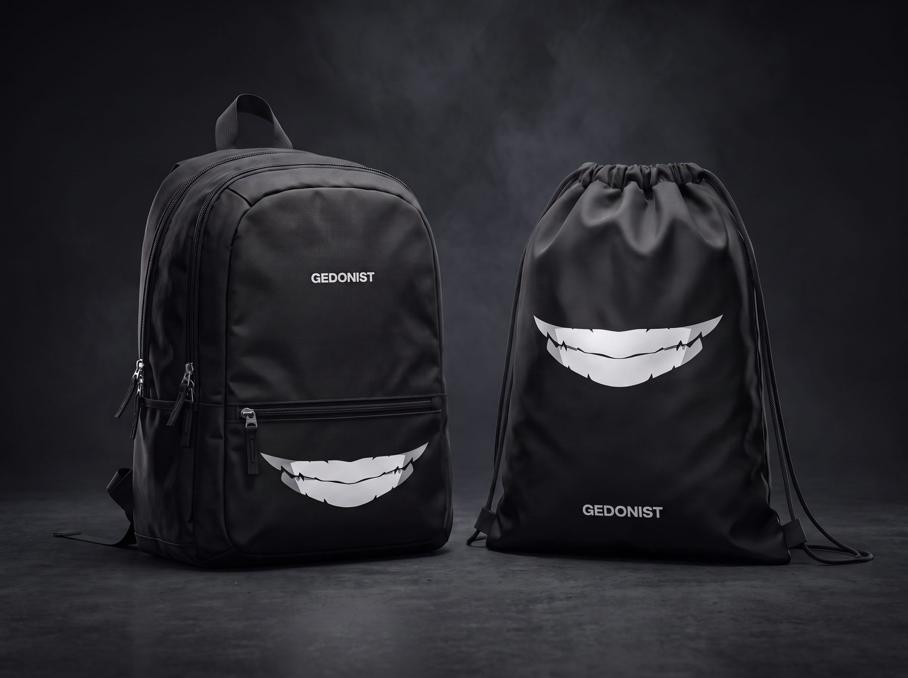
04Backpack and toteThe smile as the print -
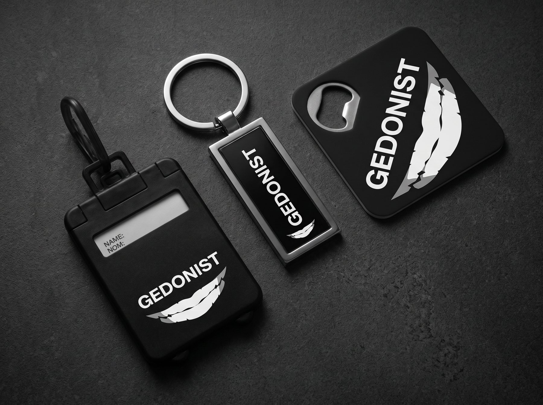
05Small itemsKeyring, bottle opener and luggage tag
Result
Gedonist got a full system: a name and positioning, the smile mark, a wide logo, flavor numbers and rules that assemble packaging for any format, from a 100 g tin to a limited drop and merch.
The system has already been tested by reality: it survived a name change, and new flavors and formats are added without rework.
What we’ll do for you
A brand that scales on the shelf
For products that live in many formats, with more flavors and versions every season. We’ll find what stays constant for the buyer and build a packaging system recognized in any form.
- 01 Brand Identity Name, mark and brand character.
- 02 Packaging system Rules for any format.
- 03 Merch Touchpoints that extend the brand.
Team
- Agency
- DOGMA
- What we did
- New name and positioning, brand identity, packaging system, merch
- Client
- Gedonist