Nonka’s Archive an entrepreneur’s personal media archive, where answers begin with questions
In brief
Nonka’s Archive is an entrepreneur’s personal media archive. Here he collects conversations with podcast guests and his own thoughts and observations on business, books, health and life — across a podcast, a newsletter and a website. The archive keeps growing, so it needed a brand that grows with it.
We built the brand from the name to live touchpoints: naming and brand strategy, a pixel identity with a dynamic logo and a digital portrait of the author, newsletter templates — and we designed, launched and now maintain the website.
Idea
From a single pixel to the face of the brand
- 01 / 05 · Pixel
The smallest unit of digital memory
An archive is memory that keeps growing. We started with its smallest unit: a single pixel on a screen.
- 02 / 05 · Sign
Pixels form an “O”
The pixels give birth to an “O” — an empty cell, a record button and a symbol that lives apart from the logo.
- 03 / 05 · Word
A name built from pixels
NONKA’S is assembled on the same grid: the name reads from afar, like a headline on an old monitor.
- 04 / 05 · Cell
Brackets make room for the new
( ARCHIVE ) is the archive’s cell. Each time it holds whatever the archive is keeping right now: a title, an episode, a voice.
- 05 / 05 · Face
The author in pixels
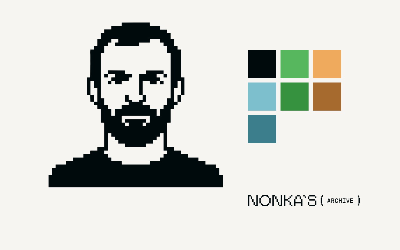
As the last step, we digitized the founder. The pixel portrait became the face of the brand: on the website, in avatars, in the newsletter and inside the logo’s brackets. Hover over it — the pixels scatter and come back.
Logo
The brackets are the archive’s cell: they show what the archive is keeping right now
The pixel NONKA’S is the constant part; the brackets are the archive’s cell. They hold a title, the author’s portrait, a podcast button, a sound wave or the sign: each time, the logo shows what’s in the archive now.
Try typing your own word — the brackets can hold anything.
System
One logo, six forms for different touchpoints
The clear space equals the height of the “O” in the logo — so the mark can breathe on any background.
Color
CRT glow: the palette the archive shines with
The first digital archives lived on screens with a soft green and amber glow. We took that memory as the basis and built a calm, modern system from it: three accents with deep pairs, plus black and white.
-
Green is the color of a switched-on monitor: the archive is alive and growing. It lights up the logo, buttons and key elements; the deep pair holds contrast in text and on light backgrounds.
-
Warm amber, like a highlighter mark: the main idea of a conversation, a quote, a new episode. The brown pair works in the background and in shadows.
-
Cool blue for sections, links and timecodes. It’s calm, so it helps people find their way around the archive and leaves the lead role to the conversations.
-
Black with a hint of green is the color of a switched-off CRT screen. White is air: the archive holds many conversations, and each one needs space.
Typefaces
Pixels for accents, a grotesque for ideas
Tiny5
Answers begin with questions
A pixel font from early interfaces — for captions, markers and short messages. It’s a reminder that the archive is digital memory.
Helvetica Neue Cyr
The archive keeps the conversations that answers grow from.
A neutral, highly readable grotesque for headlines, body text and navigation. It keeps order and lets the pixel accents stand out.
Newsletter
An email you want to read to the end
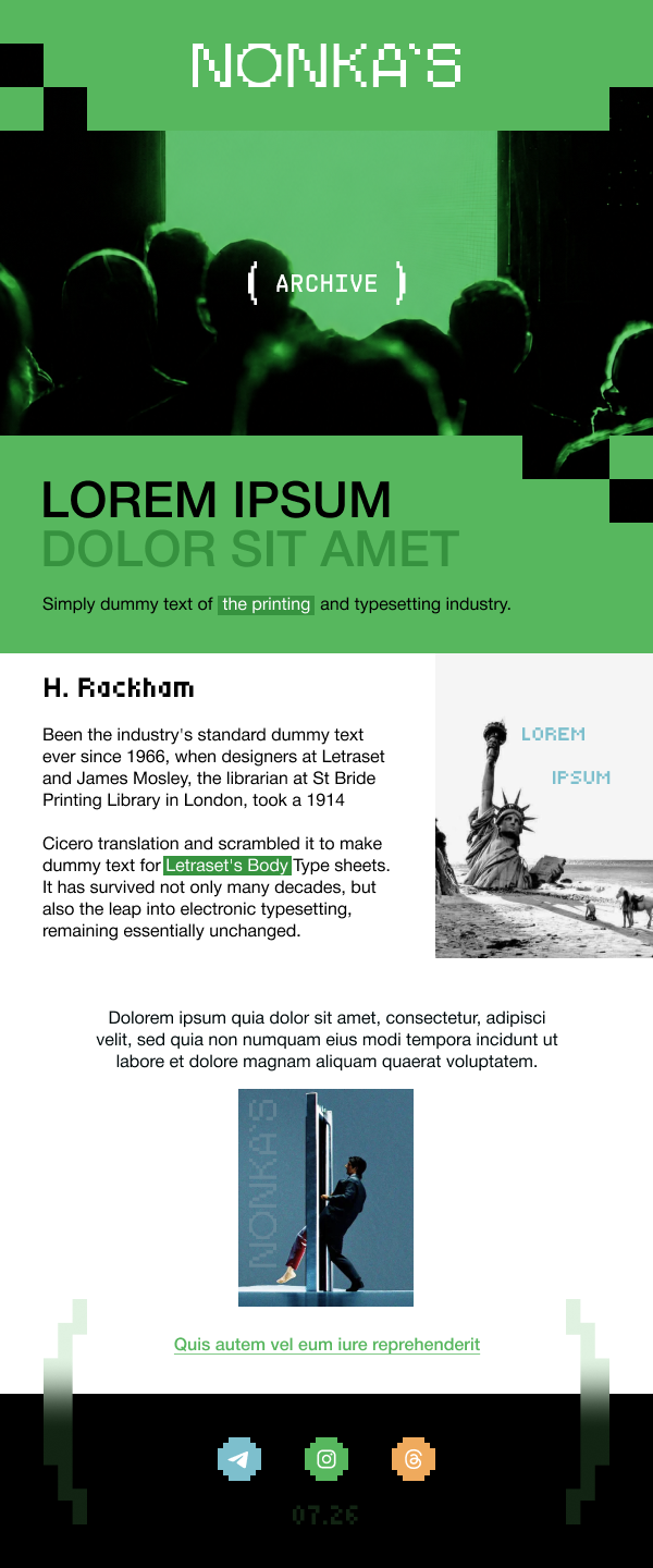
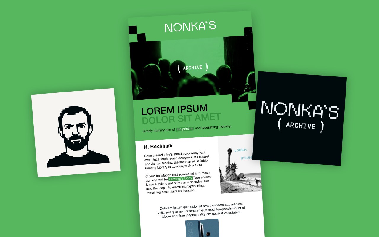
The newsletter template is built from the same brand elements: pixel “steps,” the ( ARCHIVE ) brackets, highlighter marks, a large headline and the green glow.
Each email is structured as a conversation: a question as the headline, the main idea, a quote and a link to the episode. Every new issue is instantly recognizable in the inbox.
Website
A home for the archive: podcast, newsletter and every conversation in one place
Time is the real decision.
On making the first hire with your own money, mistakes in splitting equity, and why the most expensive mistake has nothing to do with money.
When design matters more than code
How a team of two designers reached its first million in revenue — and where that model breaks.
It’s all about focus
Why most teams lose their first round before it even starts — and what “focus” really means at an early stage.
Podcast
Money, risk and the first hire
Time is the real decision.
«Time is the real decision.»
On making the first hire with your own money, mistakes in splitting equity, and why the most expensive mistake has nothing to do with money.
Timecodes
- 00:00Intro and guest
- 12:40Part 1
- 31:15Part 2
- 52:30Part 3 and questions from the archive
Listen onAppleSpotifyYouTubeEmail
2026
Topics
Subscribe
New conversations, straight to your inbox.
Done — you’re on the list. (This is a demo: no email is sent.)
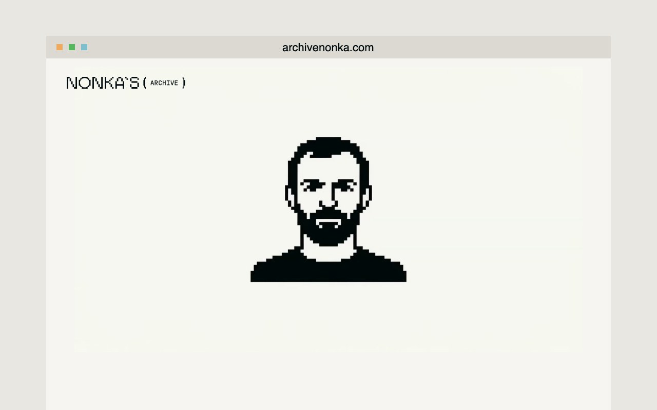
We designed, built and published the website: a home page with new conversations, an episode page with a player and timecodes, the archive and a subscription. The home page features an animation: the pixel “O” turns into a microphone, a sound wave and the author’s portrait.
After launch, we keep running the site: updates, new episodes and support.
Result
Nonka’s Archive got a brand — a face for the product that people recognize in every channel. The name and strategy define what the archive is about and who it’s for. The pixel identity with the author’s portrait makes it recognizable in the podcast, the newsletter and on social media.
The website is live and brings everything together: episodes, the conversation archive and the subscription. Every new episode instantly looks like part of the brand, and the logobook makes it possible to build new touchpoints by ready-made rules — quickly and without losing recognizability.
What we’ll do for you
A brand for your media project, from the name to launch
For when a project has a voice but lacks an image. We’ll come up with the name and strategy, build the identity, design the touchpoints — newsletter and social media — and launch.
-
 01 Naming and brand strategy The name, position and voice everything else grows from.
-
 02 Brand identity Logo, colors, typefaces and a digital portrait of the author.
-
 03 Touchpoints Newsletter templates and social posts in a single system.
-
 04 Launch The brand goes live across every channel — and stays consistent.
Team
- Agency
- DOGMA
- Client
- Nonka’s Archive