Vitam a brand that turned the company’s experience into a promise to the client: more precise every year, and always on time
In brief
Vitam is a Ukrainian freight forwarding company that has been delivering cargo from Europe for more than eight years. The business needed a brand that speaks today’s language and shows the main thing the company has achieved over those years: Vitam delivers more precisely and provides better service.
We went from meaning to touchpoints. First a strategic session, then a prototype where we worked out what to tell the client and in what order, and only then design: the logo, the brand system, office signage, a company presentation, a daily client email and a website.
Everything rests on one idea: Vitam’s superpower is precision. So the letter i in the name splits into two dots — and Vitam becomes a clock display that never misses a minute: v:tam.
Idea
The same time — only more precise
Vitam’s old mark was made of clock hands forming a V. Time had been in the brand’s DNA from the very start.
Over the years Vitam mastered the essential skill: delivering exactly at the promised time. That is their superpower — so we kept the philosophy of time and brought it into the present.
We turned the hands into digits. Vitam keeps the same time — only more precisely, like a display that holds every minute.
The display’s colon became the heart of the logo. The same philosophy, in step with the times: v:tam.
And it is also the letter i. The dot and the stem gather into a colon and back again: time lives right inside the name Vitam.
Strategic session
Before drawing anything, we worked out who the brand is
Outcome: brand platform
- Empathy
- Engagement
- Clarity
Promise“We always deliver on time”
- 01“If the brand were an object, it would be a clock”
- 02A clock’s main symbol is the colon
- 03The colon was hiding in the letter i
Tagline
Two words next to the logo — and a promise in one sentence
-
Descriptor
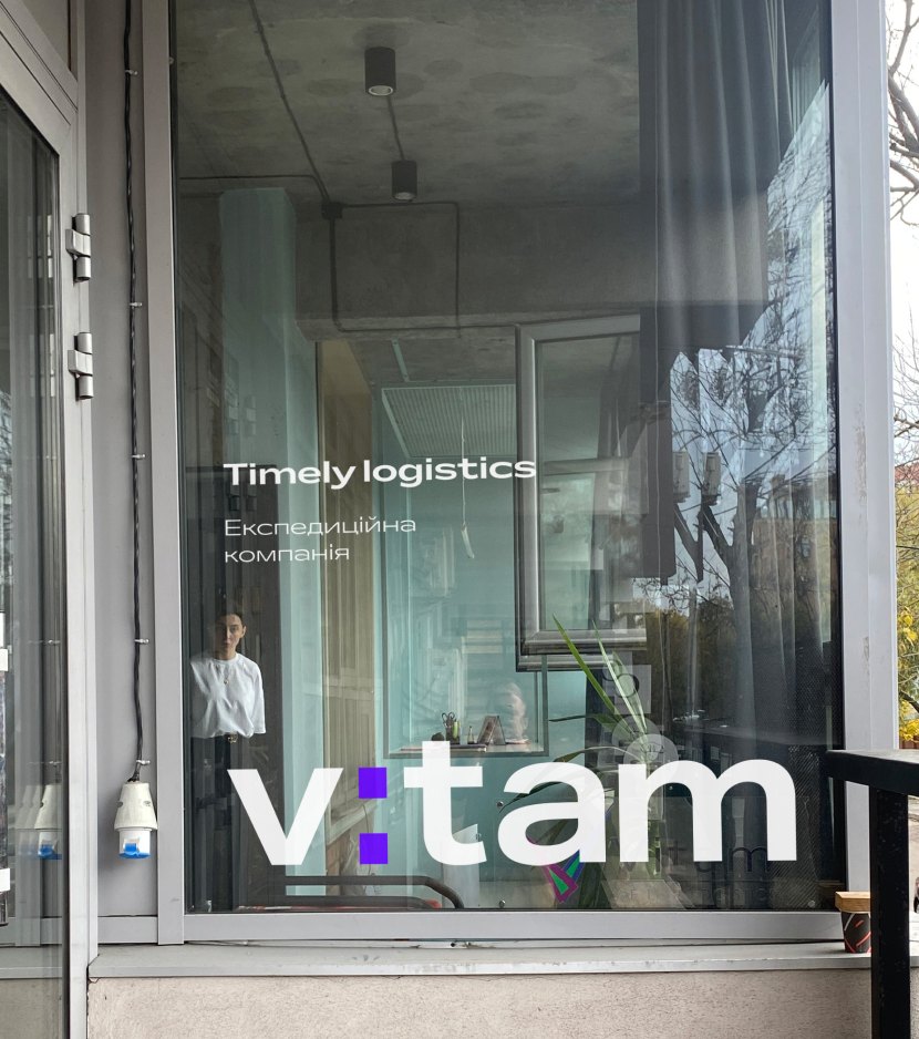
We live logisticsTimely logistics
The old line spoke about a love of logistics. The new one speaks about what the client actually pays for: timeliness. Two words that sit next to the logo on every touchpoint.
-
Tagline
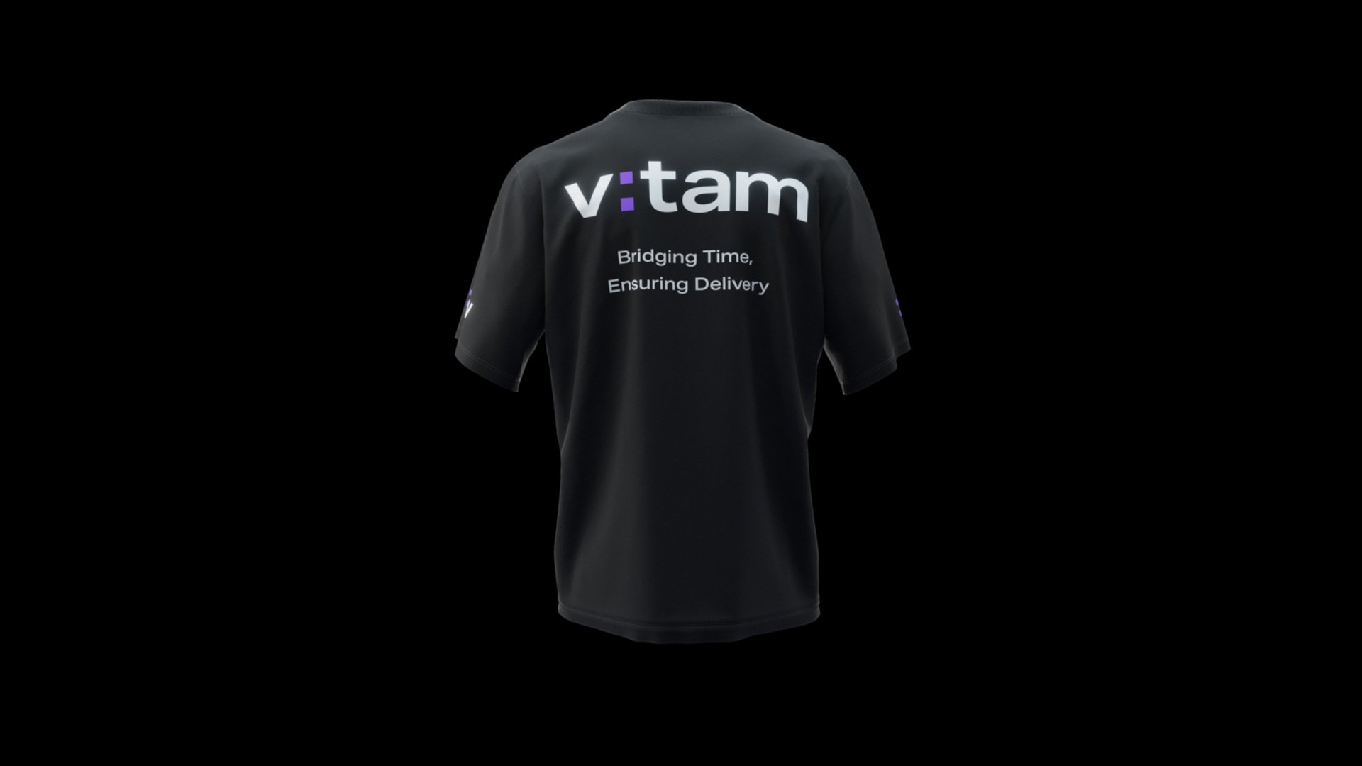
Bridging Time, Ensuring Delivery
The first half is about the colon that joins hours and minutes, the second about the brand promise: “We always deliver.”
We developed both lines together with the identity: they extend the same idea of time as the mark.
System
A wordmark, a symbol and a colon that lives on its own
The colon also works as a standalone graphic element: a bullet in lists, an accent in headlines, a light element in signage.
Colors and type
Indigo for time, deep dark for reliability
- Electric Indigo
#6600FFPrimary accent: the colon, highlights, buttons. Pantone Violet C.
- Indigo Dark +
#0B041BPresentation backgrounds, dark surfaces, text.
- Light Gray
#F5F6F8Breathing room between blocks and light slides.
- Indigo 50%
#B380FFAn indigo opacity scale — supporting colors for the website interface.
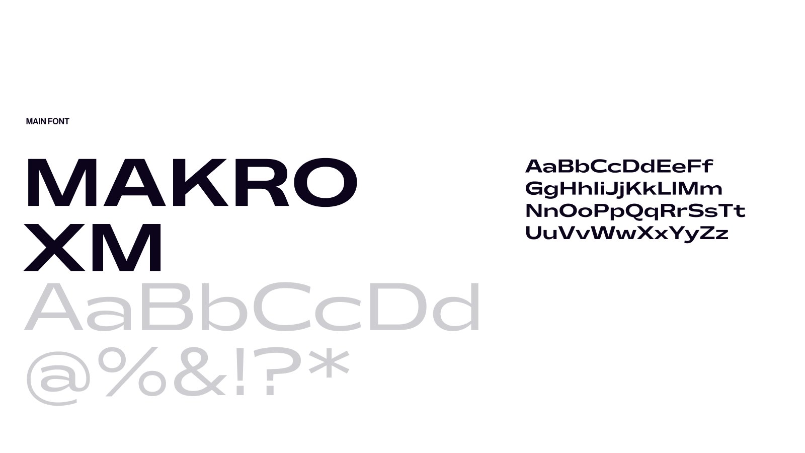
Primary typeface: a wide grotesque with strong character — for headlines and the logo.
Design system
One set of elements — countless layouts
The logo, the V: symbol, the colon bullet, the brand typeface, five colors, 3D cargo and scenes. Pick a color, a format and a scenario — from express delivery to a job opening — and the layout assembles itself by the system’s rules. That is how the Vitam team makes new posts, stories and banners without a designer.
Color
Format
Theme
- Logo
- V: mark
- Colon
- Vitam typeface
- Text and data
- Color
- 3D cargo
- 3D scene
- 12-column grid
Touchpoints
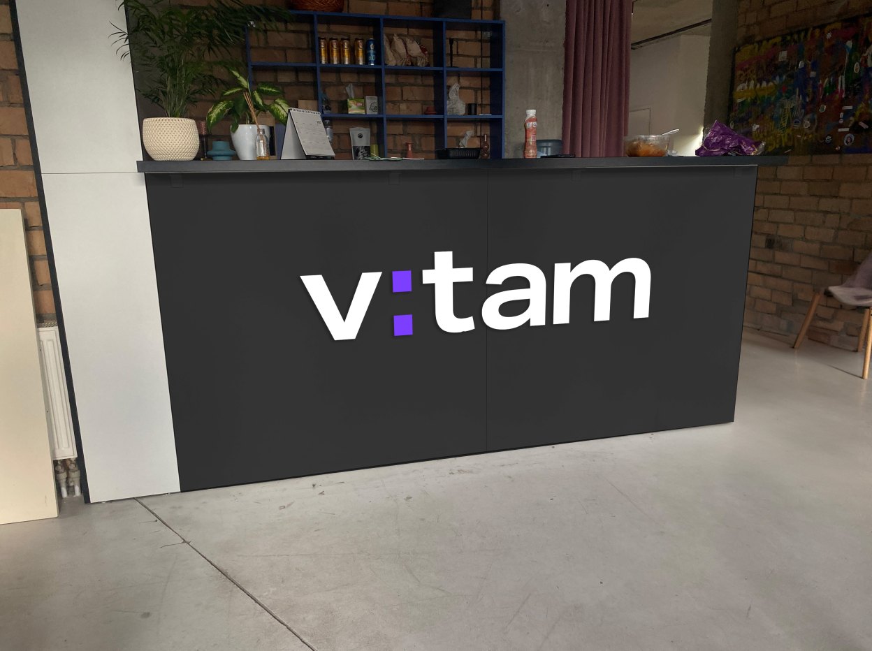
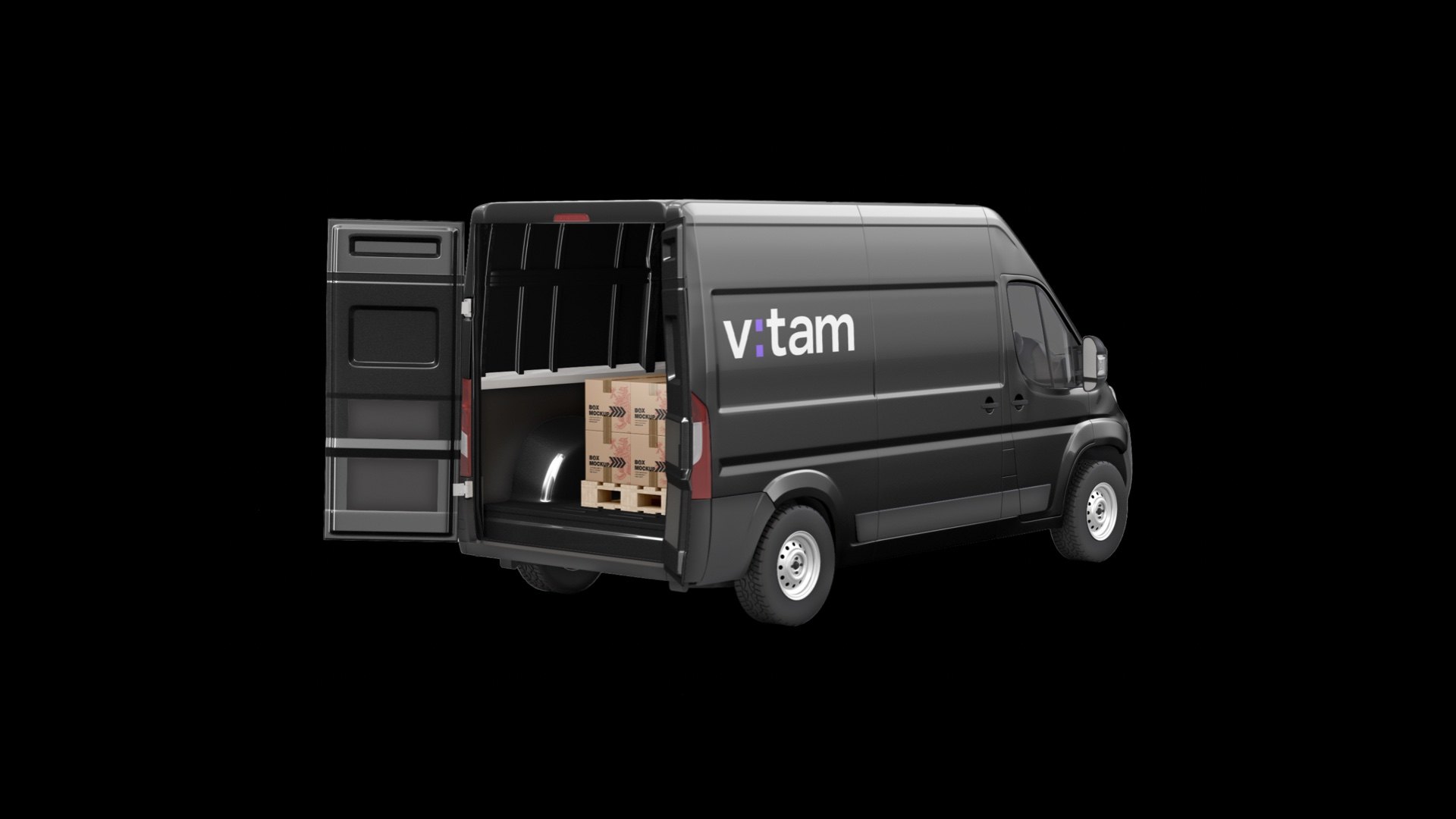
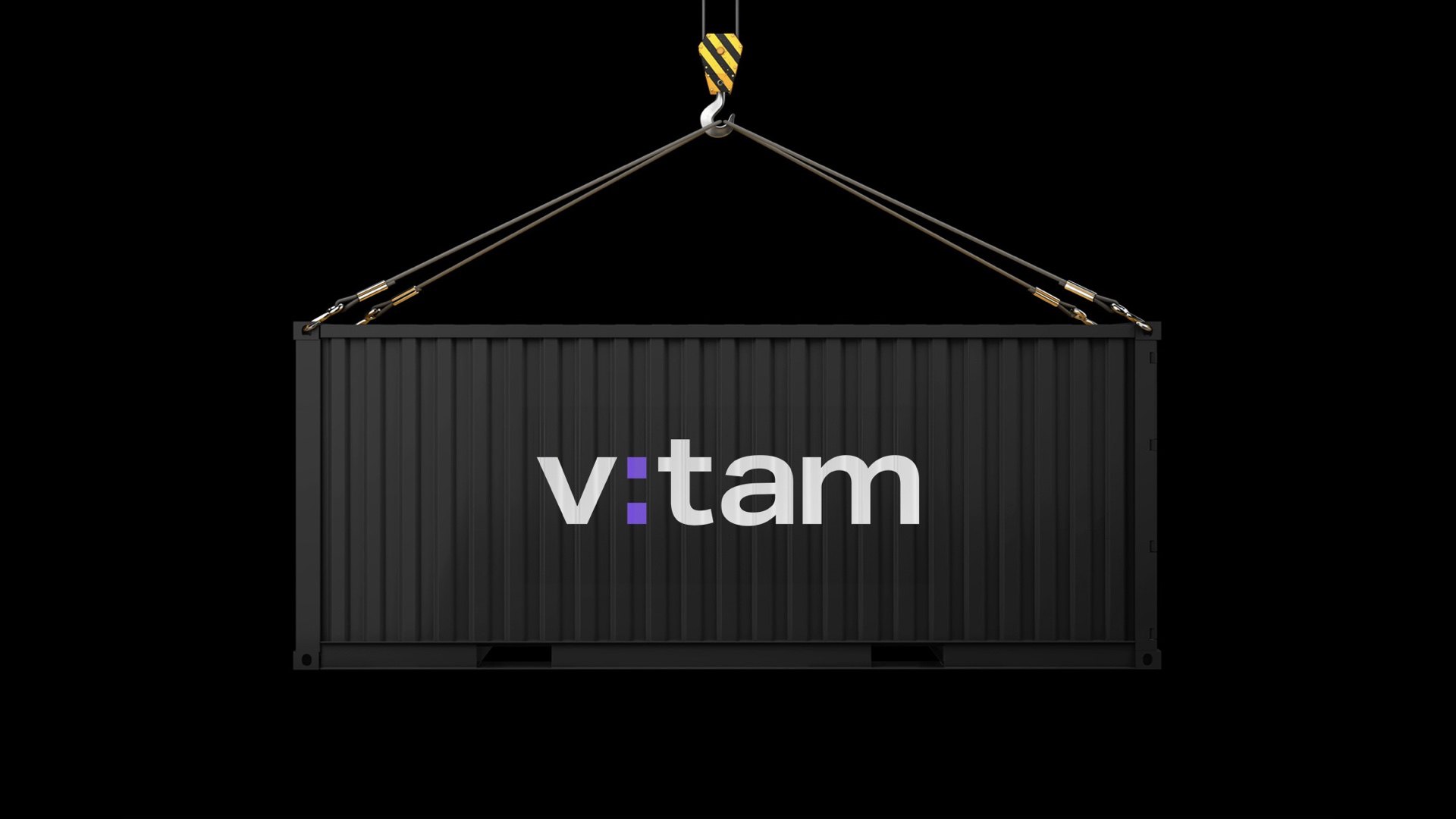
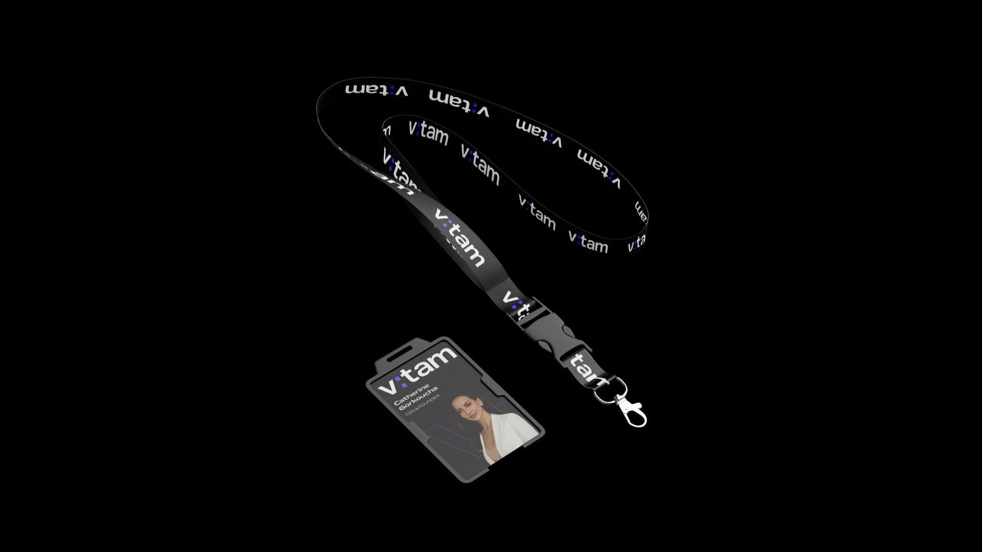
The identity went beyond the screen: the reception desk, window and door decals, vehicles, containers and merch. In the illuminated version of the mark, the colon blinks on a timer.
Visual style
A world without color — only light, shadow and the client’s cargo
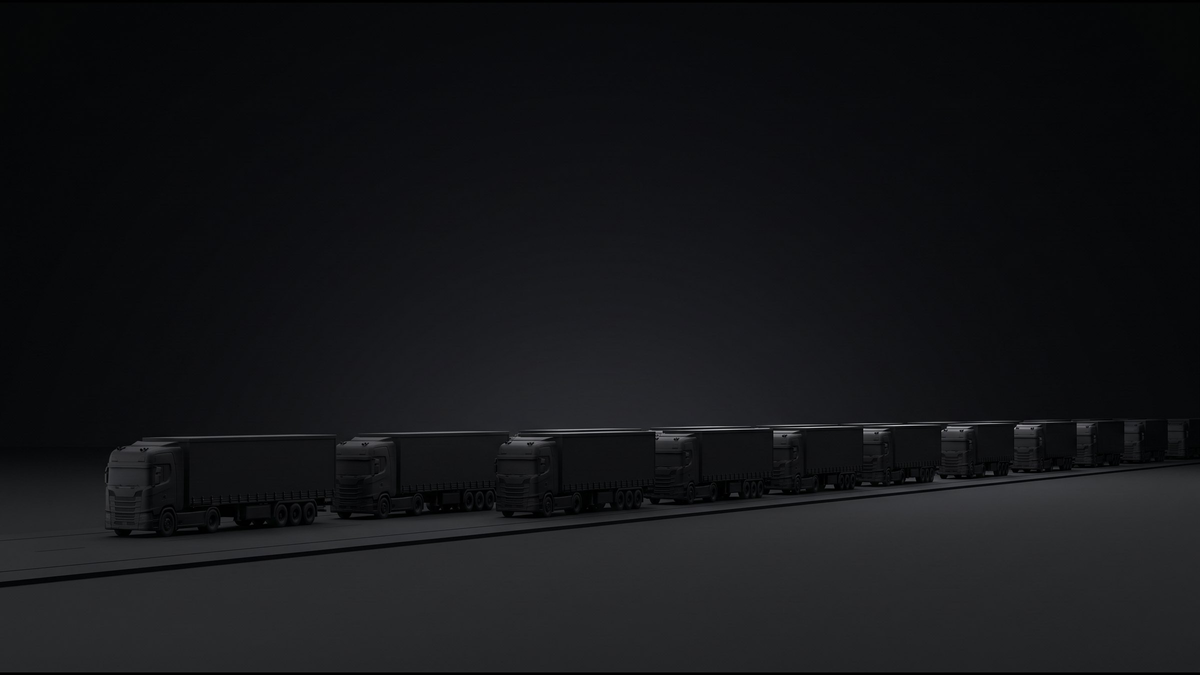
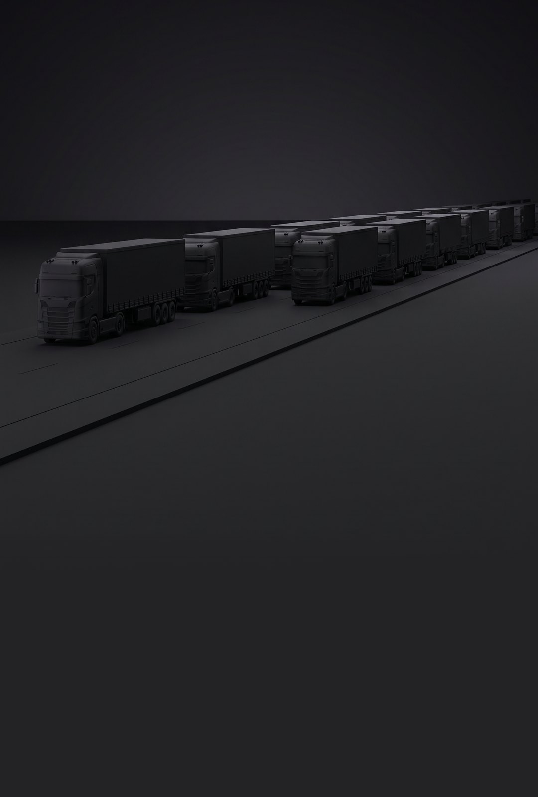
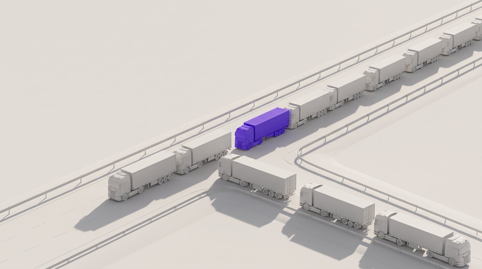
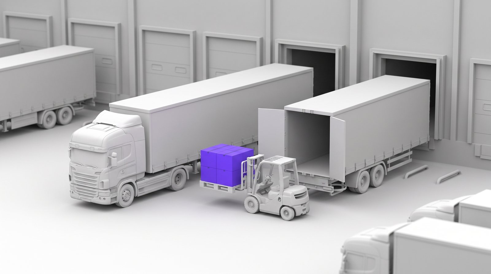
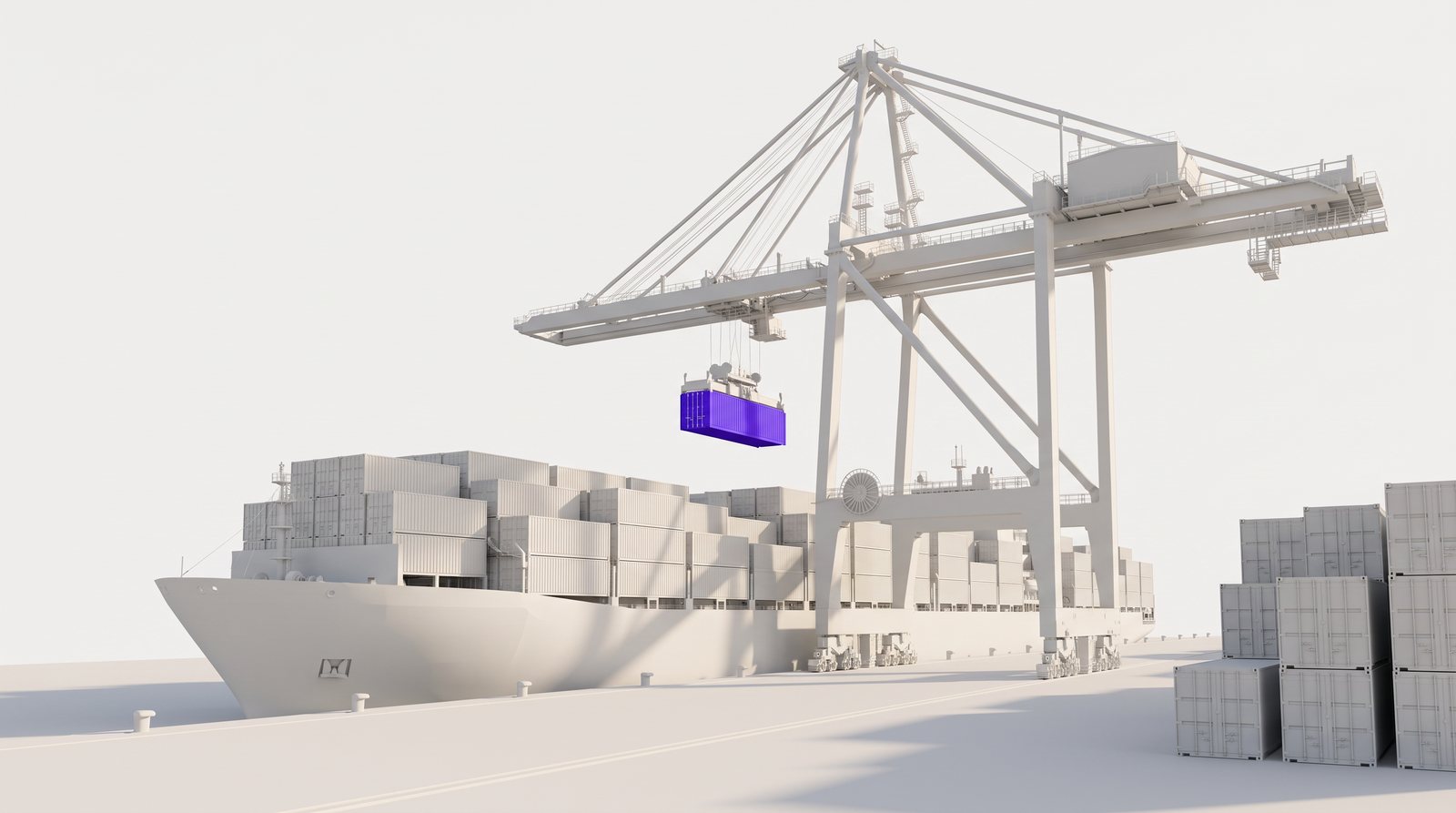
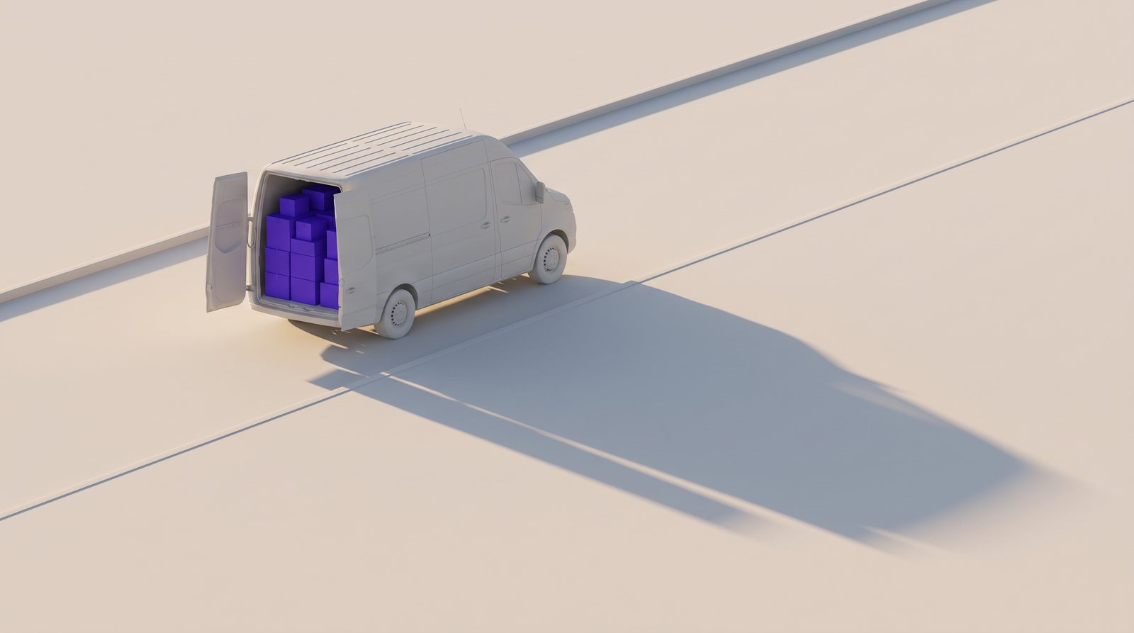
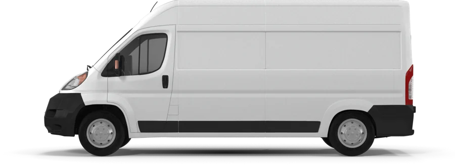
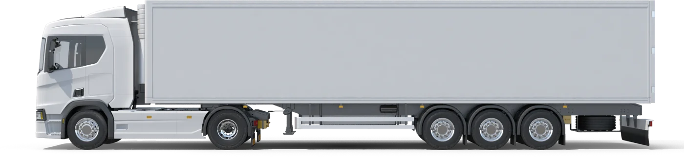
For the presentation and the website we built a separate 3D world: everything in one matte color, form shaped only by light and shadow, and a single accent — the client’s cargo in indigo. For this case we extended the style with new scenes that follow the cargo from the yard to the door.
-
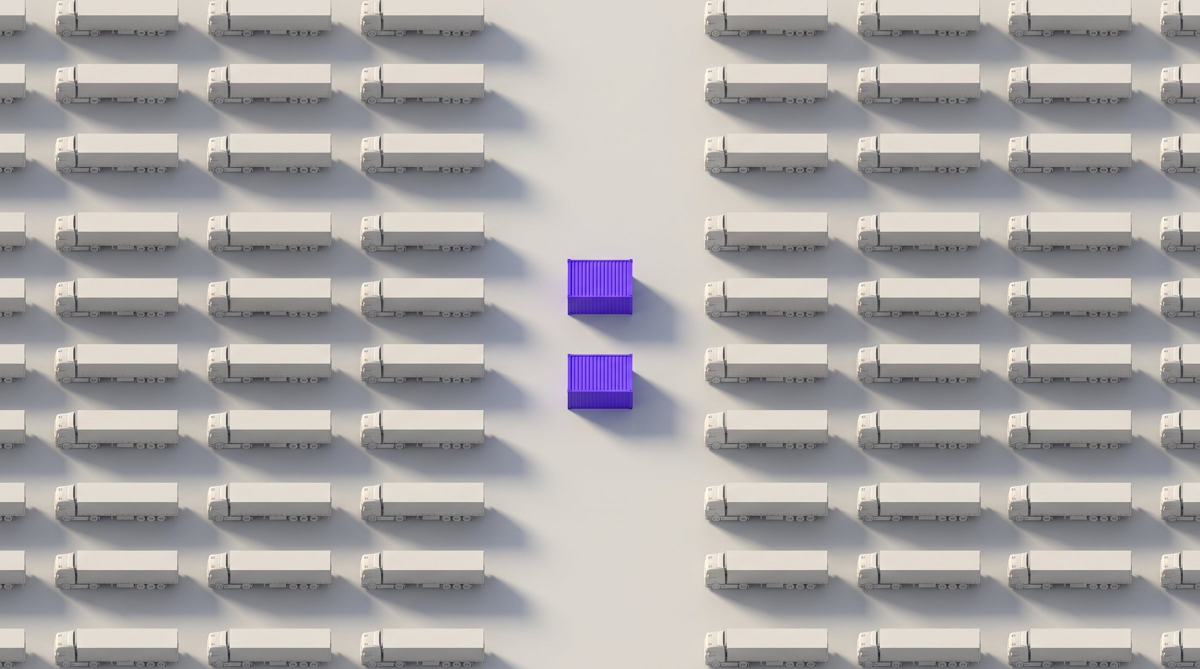
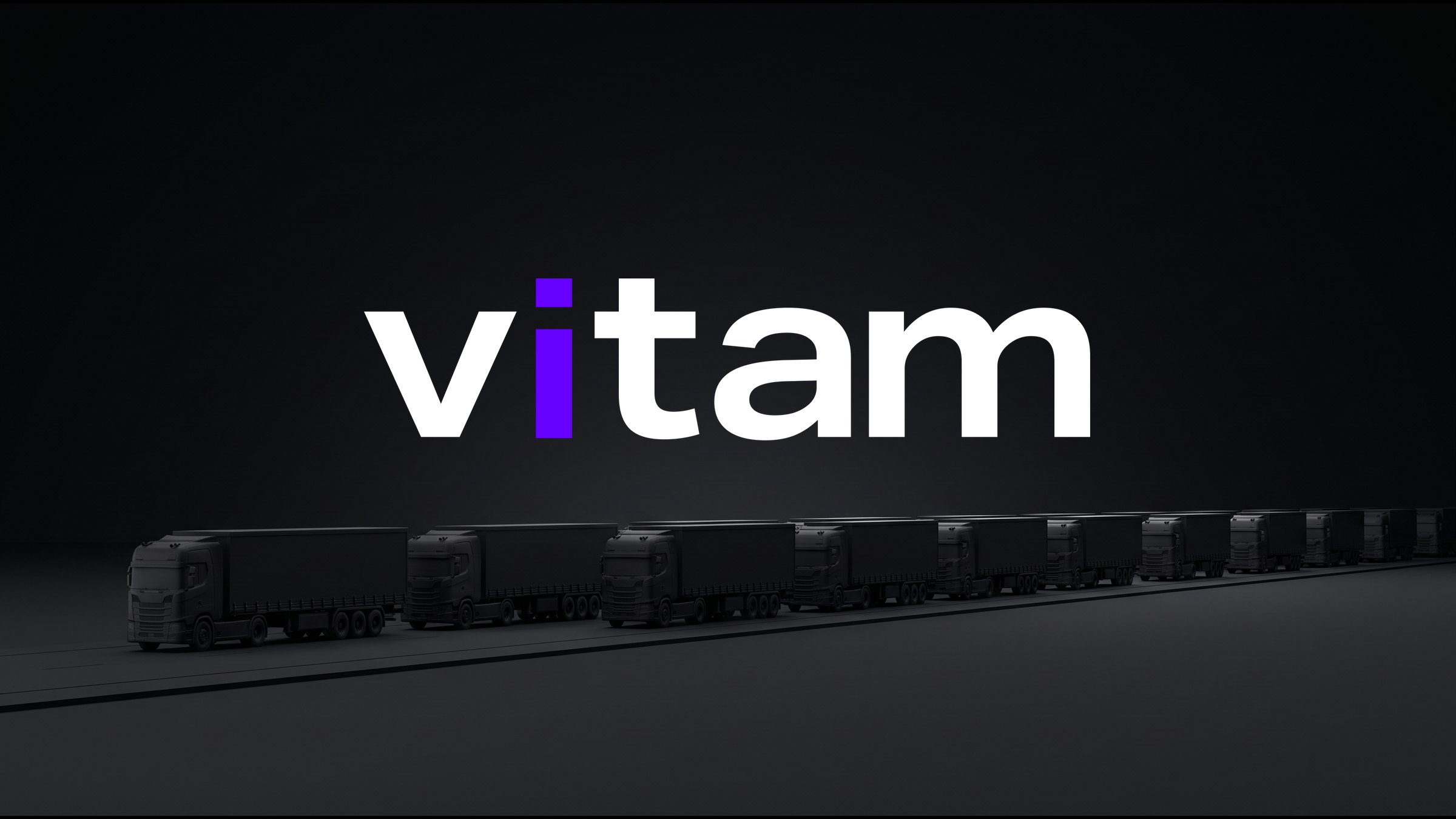
01ColonHundreds of identical trucks — and two indigo dots in the middle. Even on the ground, the mark reads like a display. -
02RhythmThe trucks move evenly, like seconds on a clock. -
03Cross-dockingCargo moves from truck to truck without stopping. -
04SeaOne container among thousands — and that is the one being tracked. -
05DeliveredThe last mile: we always deliver.
Process
Meaning first, then design
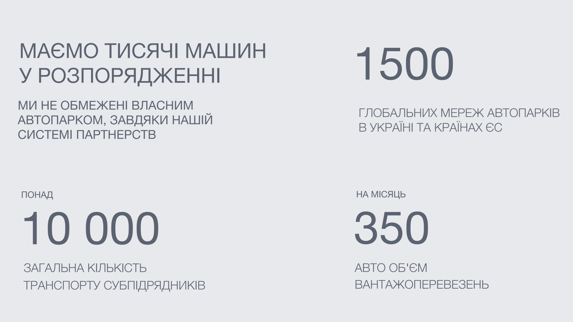
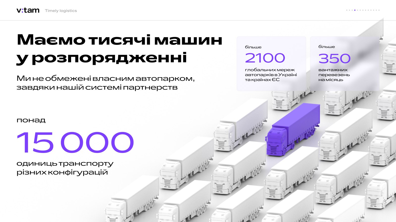 Prototype Design
This is how we work: first a prototype — the structure and meaning of every slide, with no color or decoration. Once it is clear what to tell the client and in what order, design comes in: big numbers, 3D scenes with cargo in the brand color and one thought per slide. Both the presentation and the website grew out of the same prototype.
Presentation
Every slide answers a question the client is already asking
01 / 08Who are you?
The cover holds just the logo and the Timely logistics line. Nothing extra.
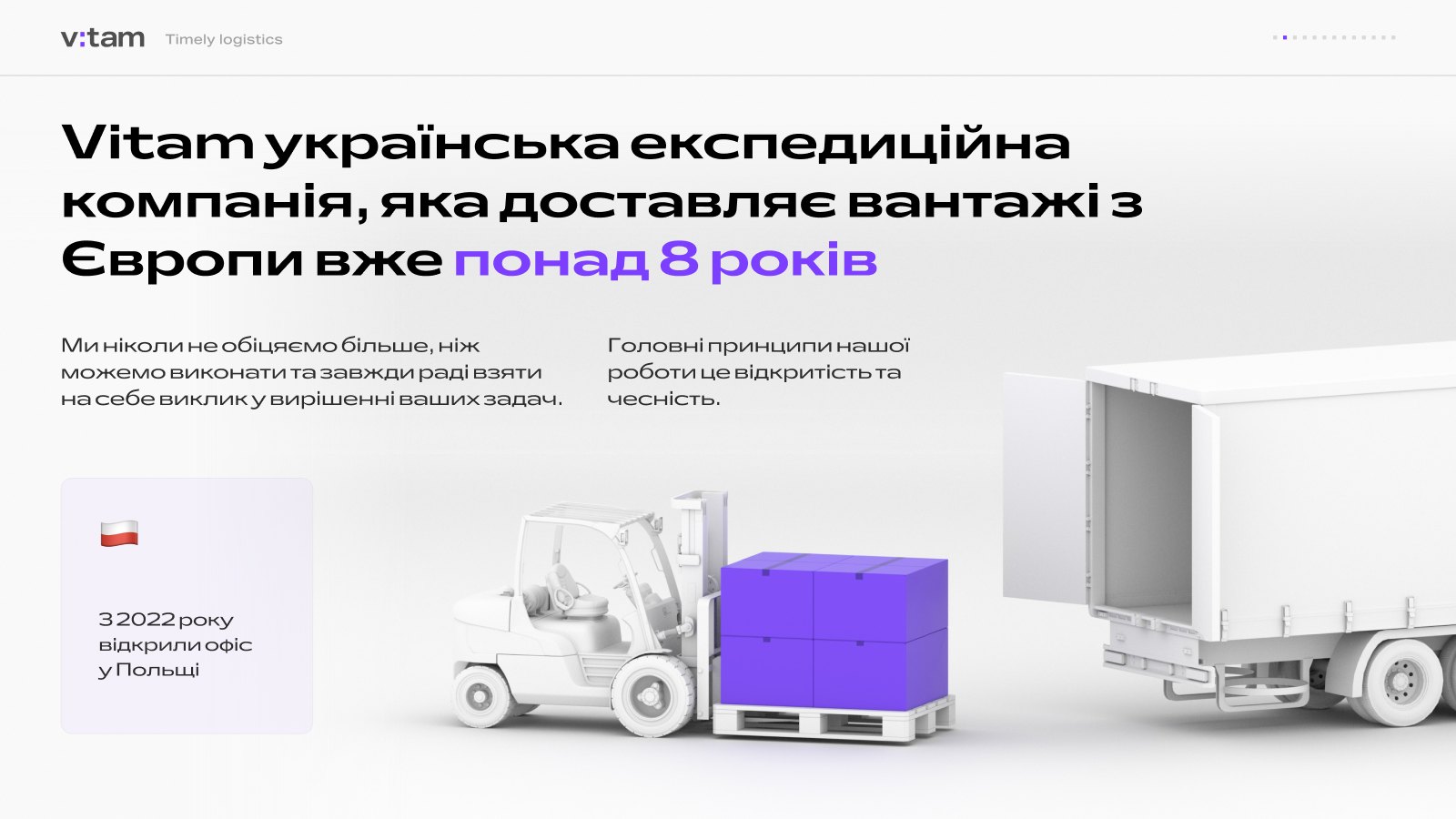
02 / 08Why should we trust you?
More than eight years on the market, an office in Poland since 2022, and principles: openness and honesty.
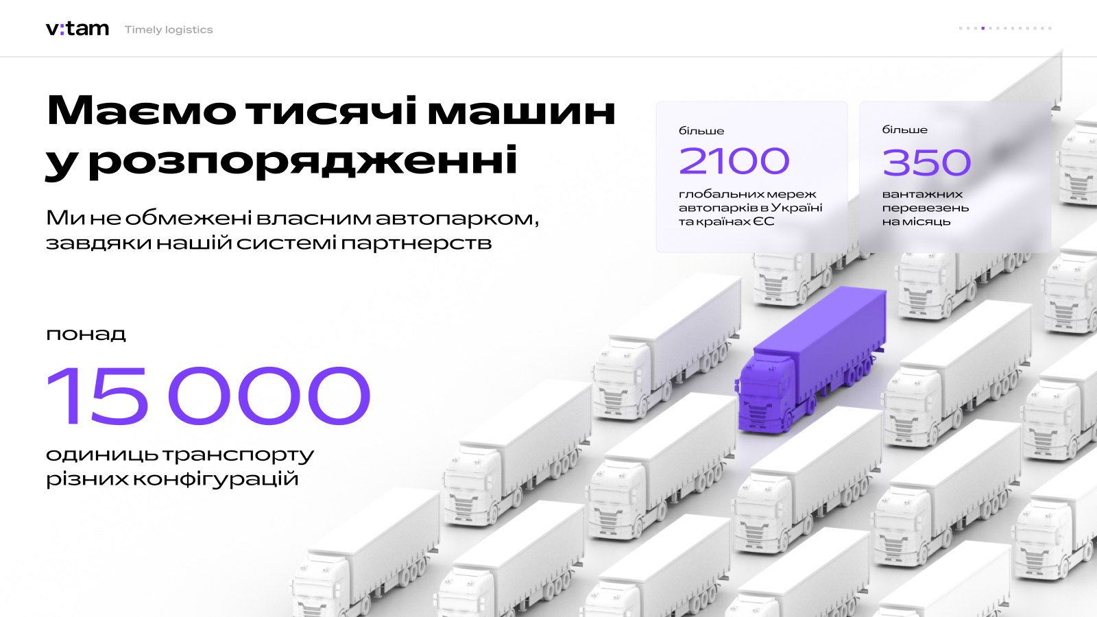
03 / 08Will you have enough trucks?
15,000 partner vehicles, 2,100 fleet networks and 350 shipments a month.
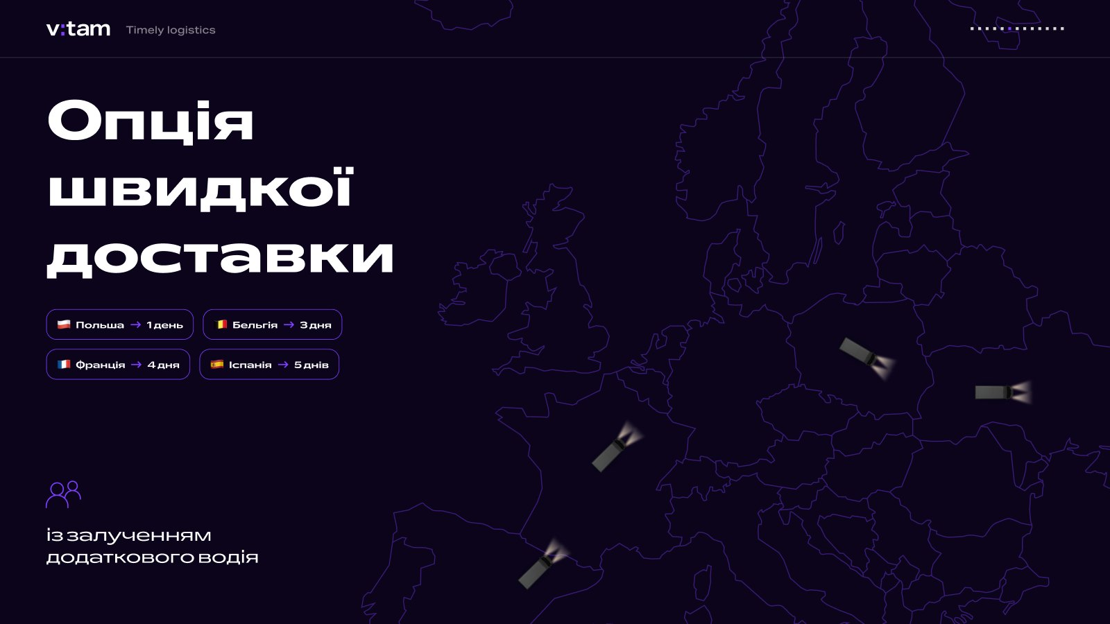
04 / 08How fast?
An express delivery option: Poland in one day, Belgium in three, France in four, Spain in five.
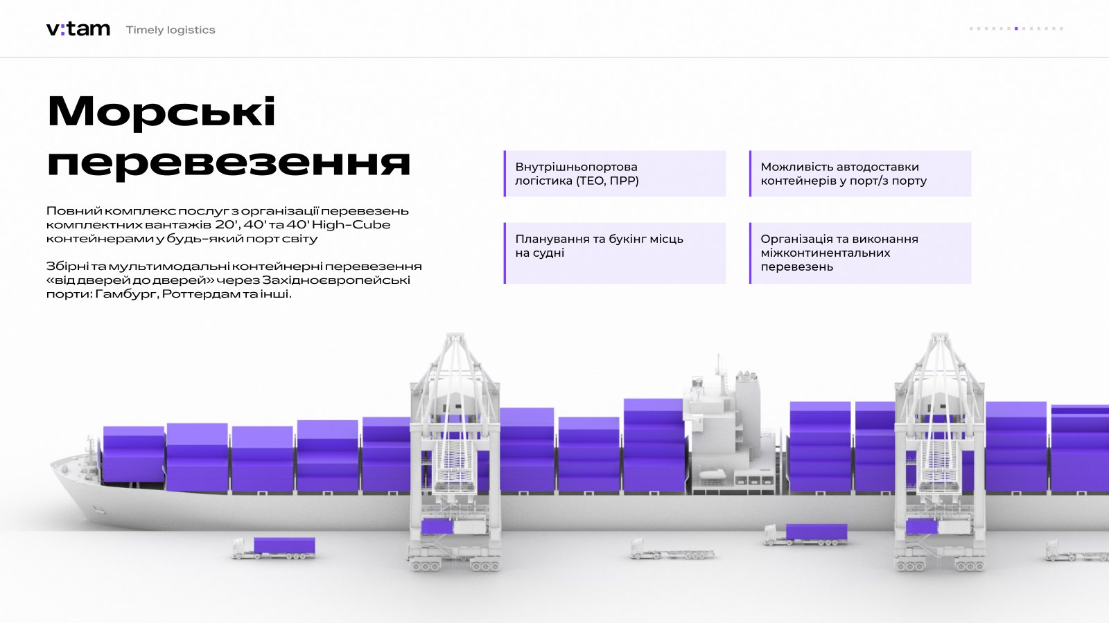
05 / 08What about by sea?
Full-service sea freight through Western European ports.
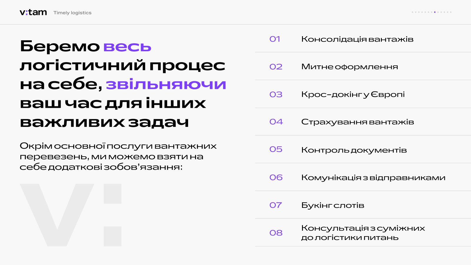
06 / 08What else will you take on?
Eight additional services — from customs clearance to slot booking.
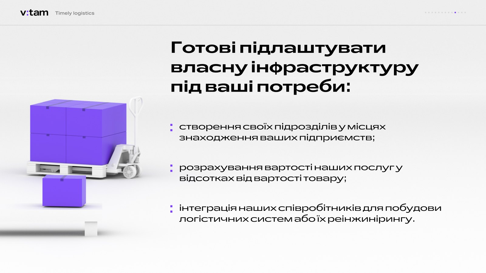
07 / 08Will you adapt to us?
Dedicated units next to the client’s facility and payment as a percentage of the goods’ value.
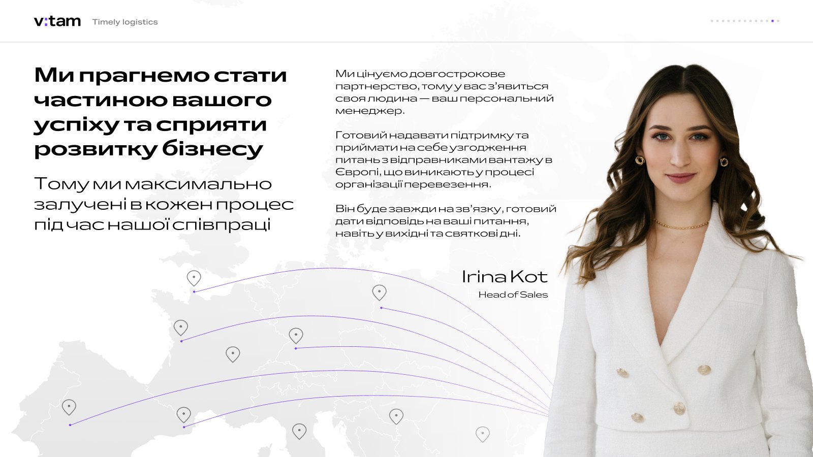
08 / 08Who will be our point of contact?
A personal manager who answers even at weekends.
Daily report
Automation in place of an email template
Every morning by 10:00, the personal manager sends the client a status for every truck. It used to be a large table pasted into an email: dozens of columns, no emphasis — to find their truck and its status, the client had to decode it. So we built an automation: it takes rows from the working spreadsheet and assembles the email itself, with the order, status, route, documents and driver visible at a glance. The data in the example is illustrative.
01Challenge: a huge daily spreadsheet with nothing highlighted
| Status | Order | Shipper | place of departure | Boarder | goods | CMR/TIR | supply date | place of delivery | customs date plan | driver name | tel UA | truck type | truck plates |
|---|---|---|---|---|---|---|---|---|---|---|---|---|---|
| Crossed the border, documents sent. At customs on Monday morning. | VT-2041 | Nordline Home BV | NL · Emmeloord | Rava-Ruska | Home goods | CMR | 11.10 | Kyiv | 17.10 | Oleh Petrenko | 096 000 00 00 | curtainsider (road train) | BC 0000 AA |
| Loaded, in transit. Temperature +4 °C. | VT-2042 | Alpina Foods SRL | IT · Milan | Krakovets | Food products | CMR | 12.10 | Lviv | 16.10 | Andrii Koval | 067 000 00 00 | reefer | AA 0000 BC |
| Awaiting loading, slot confirmed. | VT-2043 | Hanse Tools GmbH | DE · Hamburg | Yahodyn | Tools | TIR | 15.10 | Odesa | 20.10 | Ihor Melnyk | 050 000 00 00 | curtainsider | BH 0000 KA |
| Unloaded, documents signed. | VT-2044 | Baltic Paper AB | PL · Gdańsk | Yahodyn | Paper | CMR | 13.10 | Lutsk | 16.10 | Roman Savchuk | 063 000 00 00 | curtainsider | AC 0000 BK |
| Queuing at the border, about 6 hours. | VT-2045 | Loire Wines SAS | FR · Nantes | Shehyni | Wine | CMR | 10.10 | Kyiv | 18.10 | Taras Lysenko | 098 000 00 00 | reefer | AI 0000 HA |
| Loading moved to tomorrow, 9:00. | VT-2046 | Brno Steel s.r.o. | CZ · Brno | Uzhhorod | Rolled steel | TIR | 14.10 | Dnipro | 19.10 | Viktor Hnatiuk | 095 000 00 00 | flatbed | AE 0000 KC |
03Email to the client by 10:00, status clear at a glance
Good morning, partners!
Here is the status of the trucks:
VT-2041ORDER
Crossed the border, documents sent. At customs on Monday morning.
- Shipper
- Nordline Home BV
- place of delivery
- Kyiv
- place of departure
- NL · Emmeloord
- goods
- Home goods
- Boarder
- Rava-Ruska
- CMR/TIR
- CMR
- supply date
- 11.10
- customs date plan
- 17.10
- driver name
- Oleh Petrenko
- tel UA
- 096 000 00 00
- truck type
- curtainsider (road train)
- truck plates
- BC 0000 AA
VT-2042ORDER
Loaded, in transit. Temperature +4 °C.
- Shipper
- Alpina Foods SRL
- place of delivery
- Lviv
- place of departure
- IT · Milan
- goods
- Food products
- Boarder
- Krakovets
- CMR/TIR
- CMR
- supply date
- 12.10
- customs date plan
- 16.10
- driver name
- Andrii Koval
- tel UA
- 067 000 00 00
- truck type
- reefer
- truck plates
- AA 0000 BC
VT-2043ORDER
Awaiting loading, slot confirmed.
- Shipper
- Hanse Tools GmbH
- place of delivery
- Odesa
- place of departure
- DE · Hamburg
- goods
- Tools
- Boarder
- Yahodyn
- CMR/TIR
- TIR
- supply date
- 15.10
- customs date plan
- 20.10
- driver name
- Ihor Melnyk
- tel UA
- 050 000 00 00
- truck type
- curtainsider
- truck plates
- BH 0000 KA
Website
A landing page that sells the way a manager does
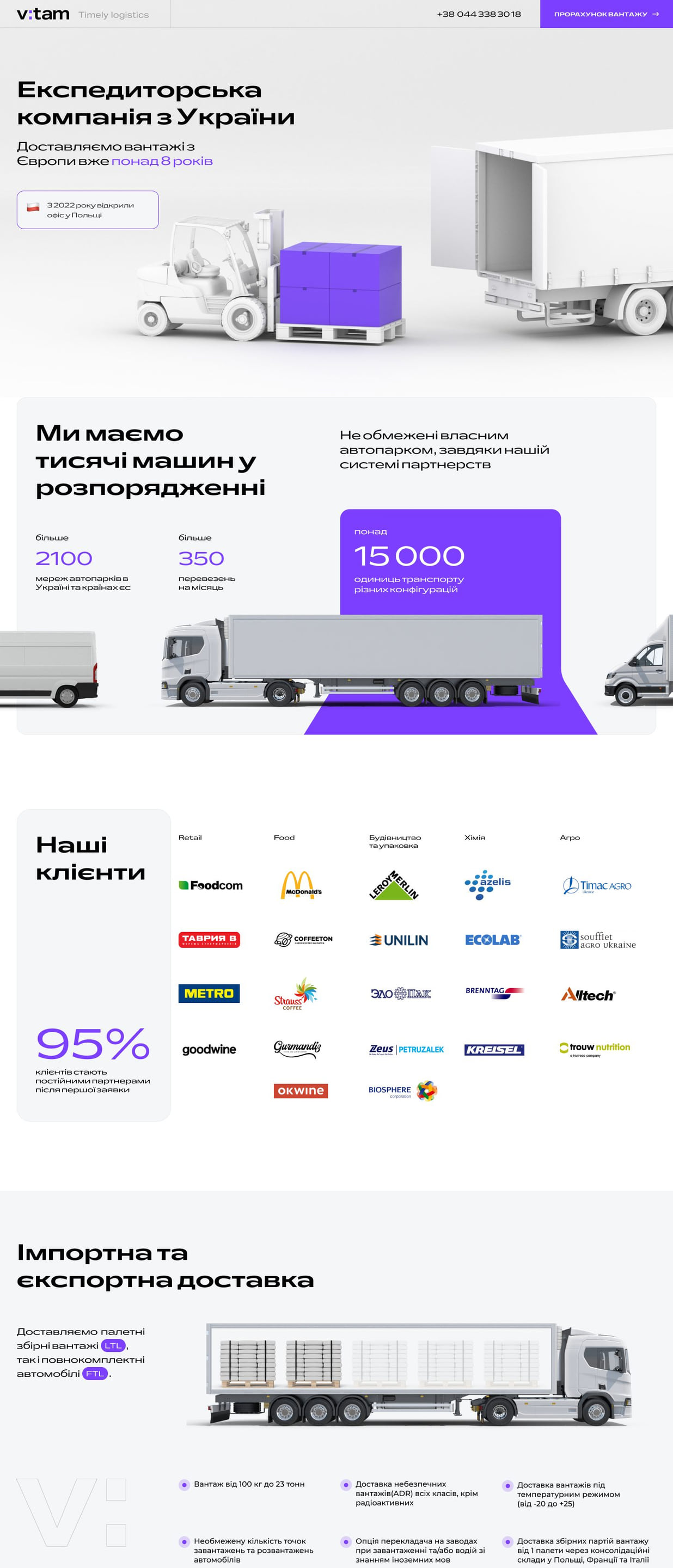
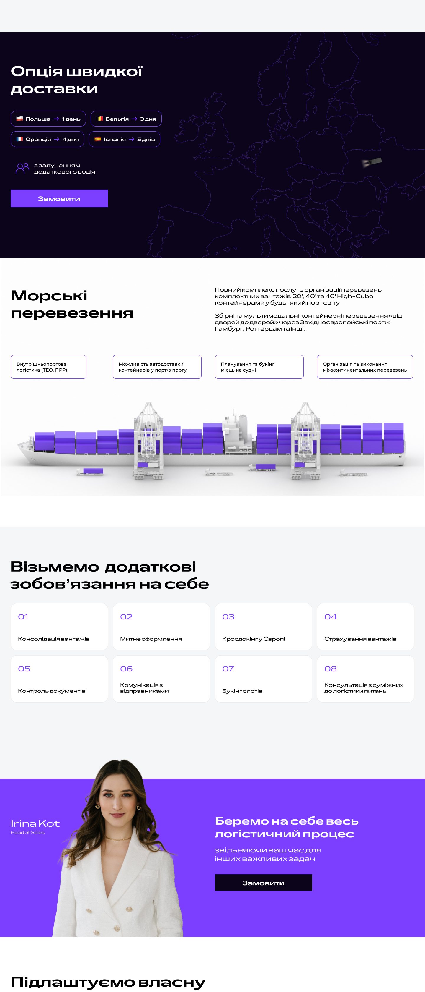
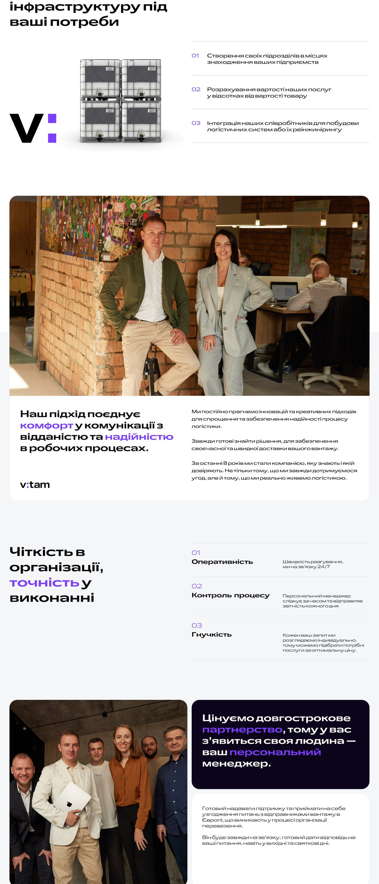
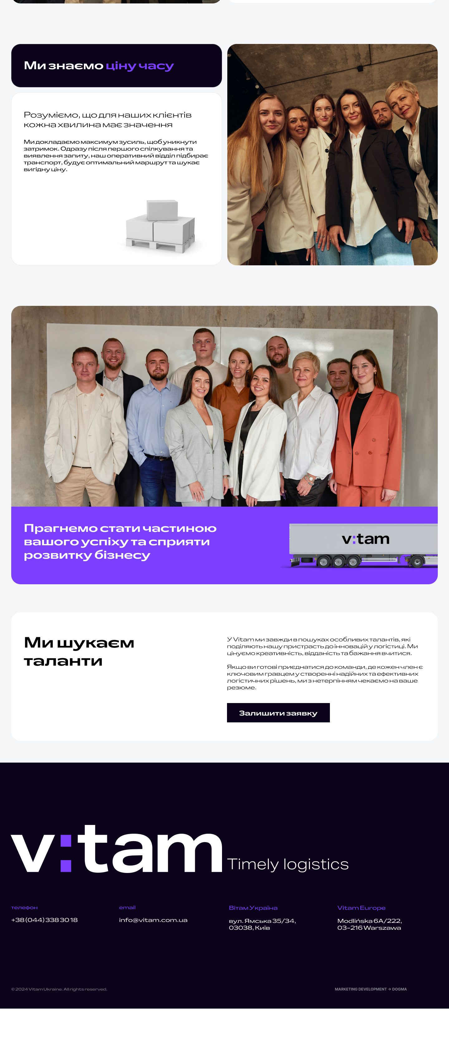
The website grew out of the same prototype as the presentation: meaning and block order first, then design. The whole story on one page: who we are, how many trucks, routes, services, clients and the team. Real photos in place of stock, 3D cargo in the brand color, and the header logo assembles from the name into a display every time. Hover to take a closer look.
Result
Vitam got a brand built around a single idea — and every touchpoint through which the company speaks to its clients: from the office reception desk to the email that arrives every morning at ten.
The vitam.com.ua website sells the way a manager does, the presentation became the backbone of sales, and the colon became a mark recognizable from a single character.
What we’ll do for you
A brand built on one idea — from the session to the website
When a brand needs a refresh that keeps its essence. We start with a strategic session and a prototype of the key messages, find the idea and carry it through every touchpoint — from the logo to daily client emails.
-
 01 Logo and identity Idea, mark, colors, typefaces.
- 02 Presentation A sales tool in the new system.
- 03 Touchpoints Office, vehicles, digital.
Team
- Agency
- DOGMA
- What we did
- Brand identity, design system, company presentation, website
- Client
- Vitam