UtilityTrading a refreshed identity and website for a wholesale electricity trader
In brief
UtilityTrading is a licensed wholesale electricity trader. The company buys power on the wholesale market and supplies businesses across Ukraine.
The business goal was to win inbound requests from companies looking for an electricity supplier. Clients choose a supplier they trust, so within a minute on the site they need to understand who UtilityTrading is, how wholesale buying works and why the company is a safe partner.
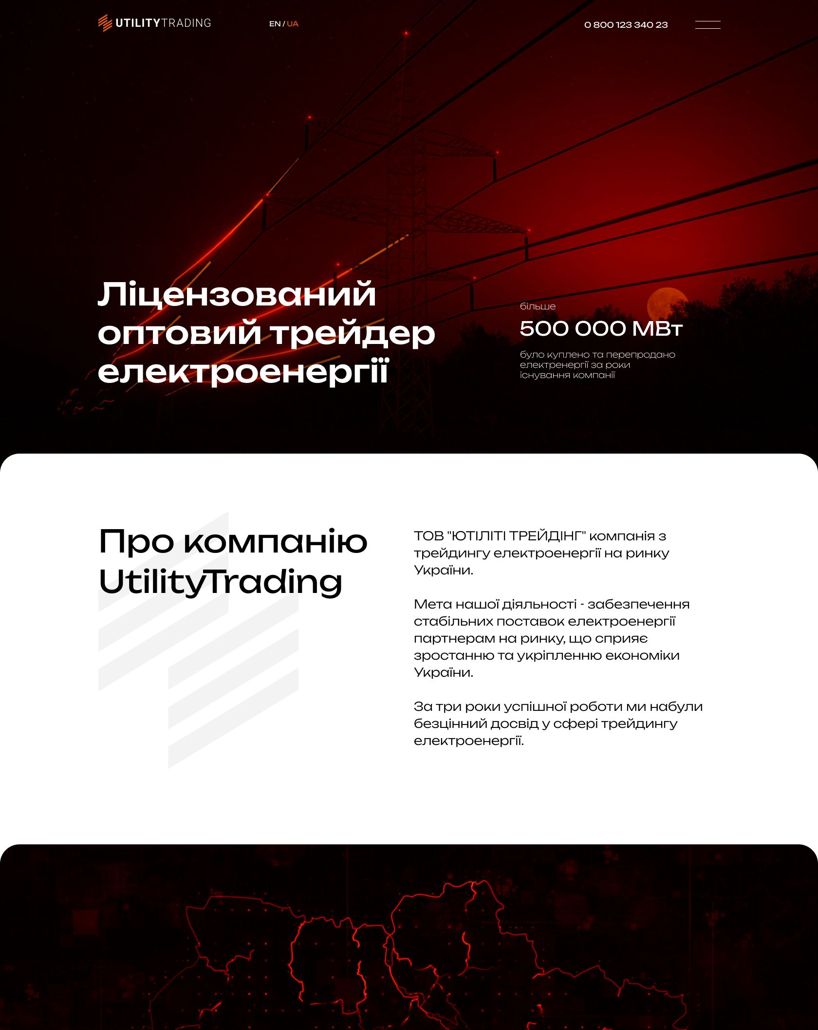
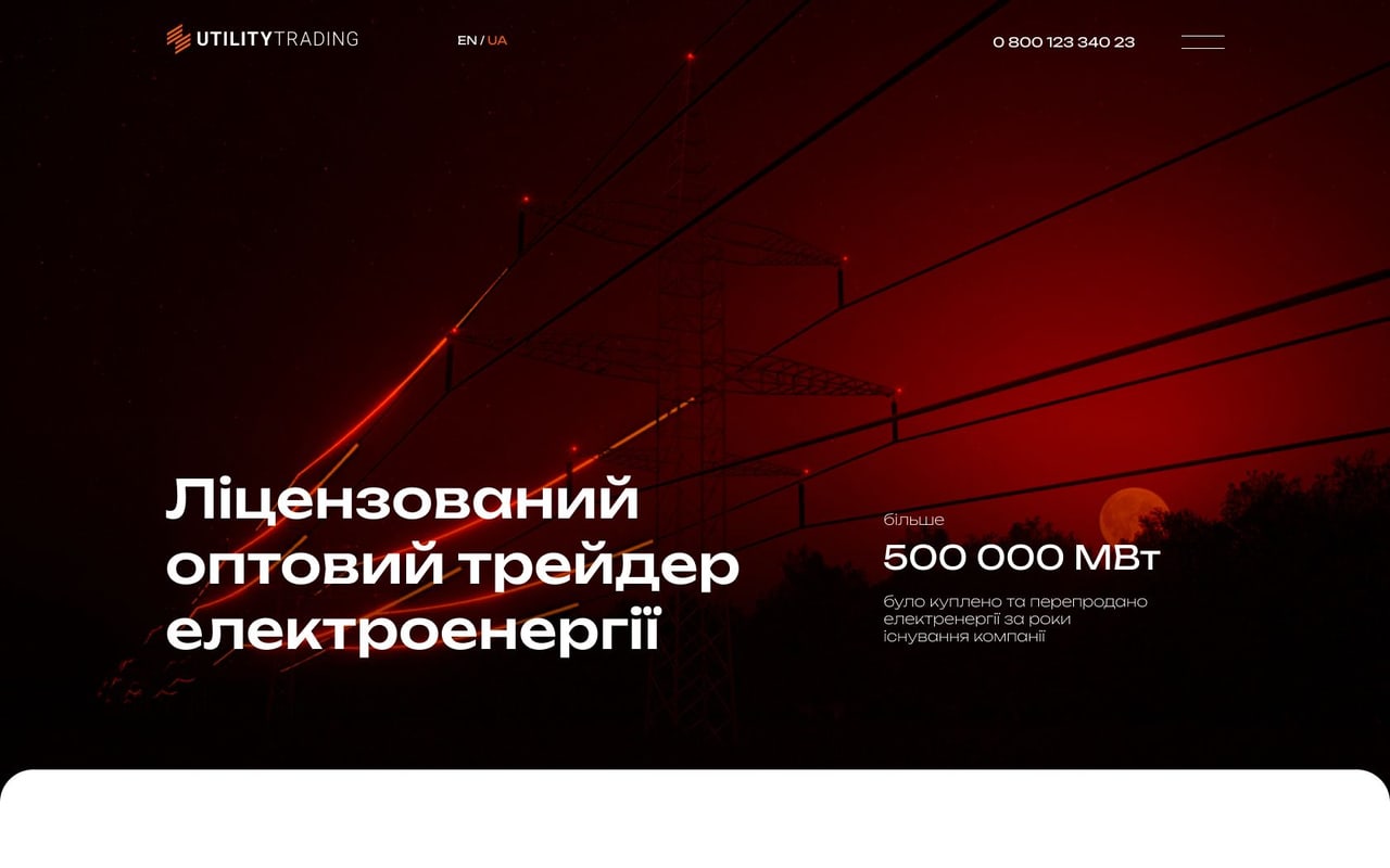
Above all, the identity had to convey the feeling of current. So the site runs on video: power lines, a map of Ukraine and a sunset, all recolored in the brand palette.
Identity
A first screen built layer by layer
-
Meaning and order come first: who the company is, how much energy it has sold, how buying works, where to leave a request. A grey screen with no decoration keeps all attention on the content.
-
Black brings depth and weight, orange brings energy: the mark, accents, buttons. Two colors are enough for the whole site.
-
Unbounded is a wide grotesque with a technological character. Large headlines sound confident, the way a company that deals in megawatts should.
-
The six-stripe mark recalls the wires of a power line. We refreshed the logo and gave the mark volume: the stripes glow like live wires, and in the wordmark UTILITY is set dense while TRADING stays light.
-
The final layer is live video: power lines in the brand color with current running along them.
- Prototype
- Color
- Typeface
- Logo
- Video
Video
Video that speaks in the brand color
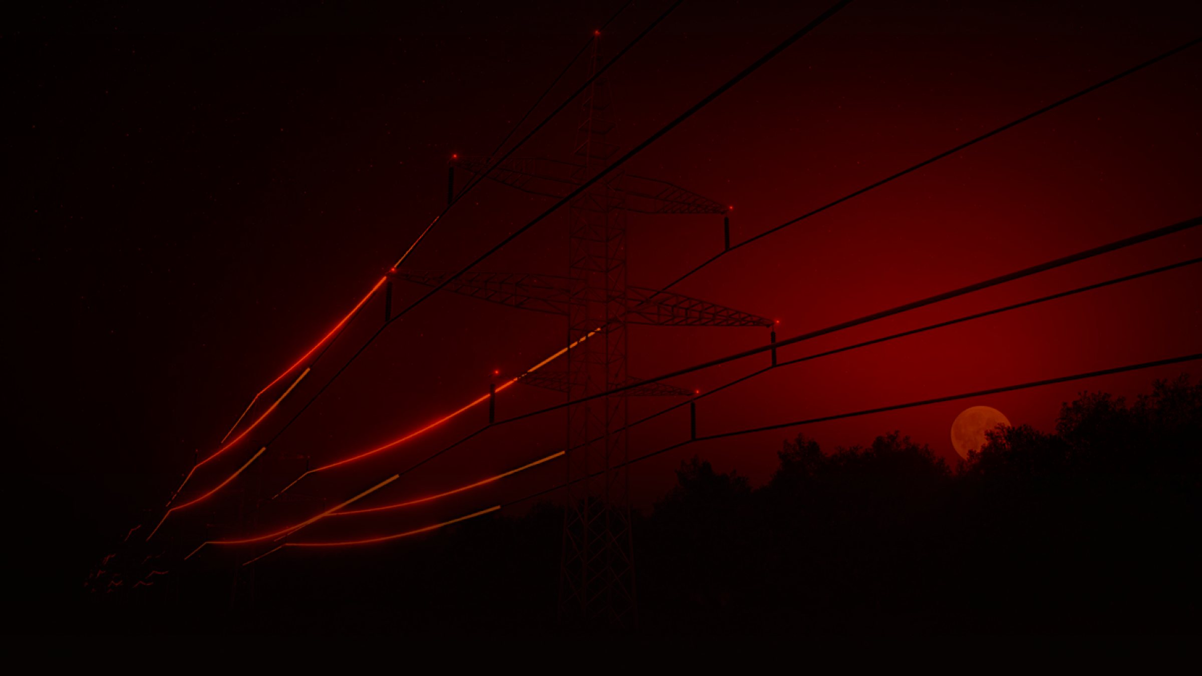
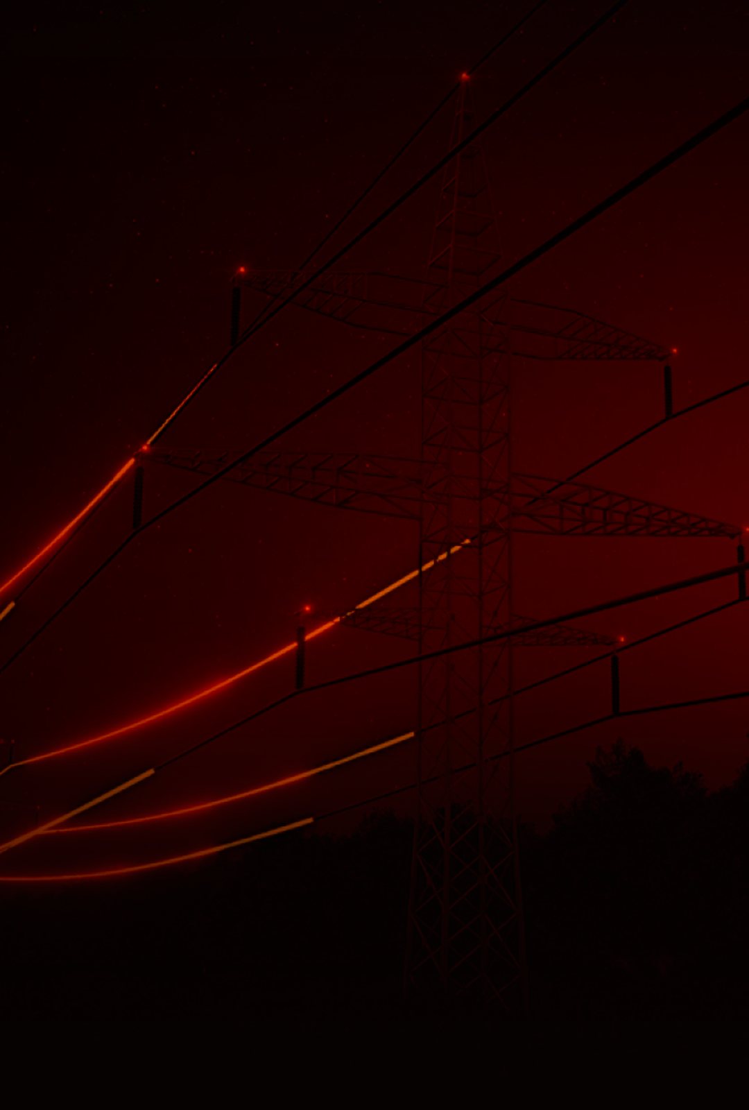
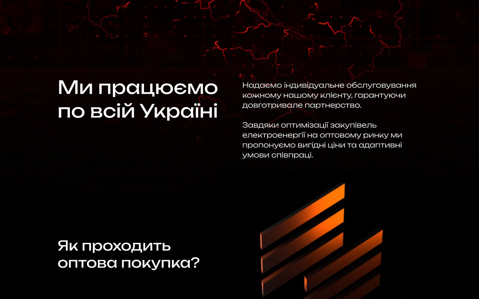
The power lines, the map of Ukraine and the sunset each got a layer of brand orange in Linear Burn mode: blues and teals burn into red, and the light turns orange. A gradient to black at the bottom keeps the text readable. Drag the slider.
3D video+ #FF4F00 · Linear Burn+ Gradient to black= Website frame
Power lines at night with pulses of light: current running through the wires.
3D video+ #FF4F00 · Linear Burn+ Gradient to black= Website frame
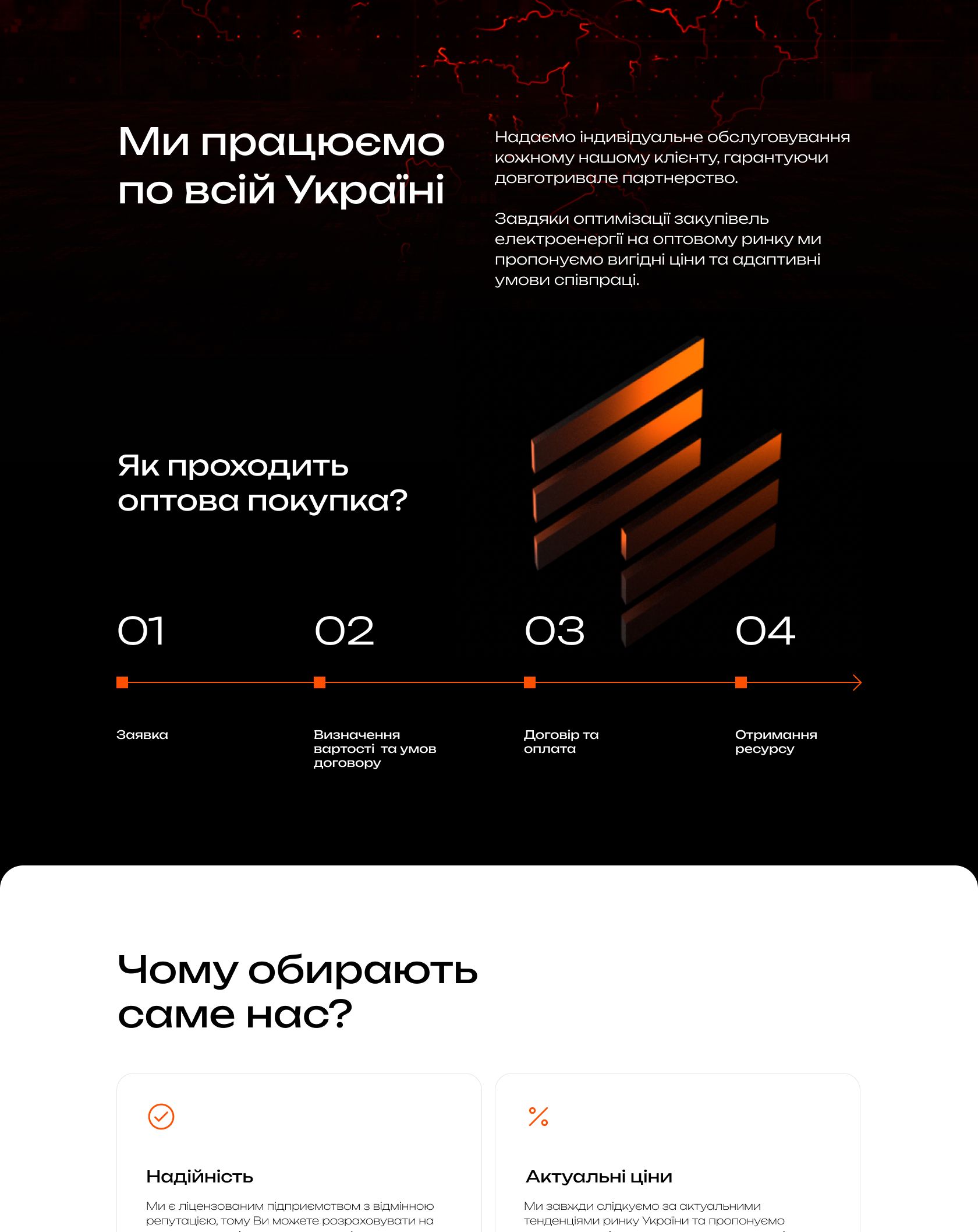
A map of Ukraine with glowing regional borders sits under the section about nationwide supply.
3D video+ #FF9445 · Linear Burn+ Gradient to black= Website frame
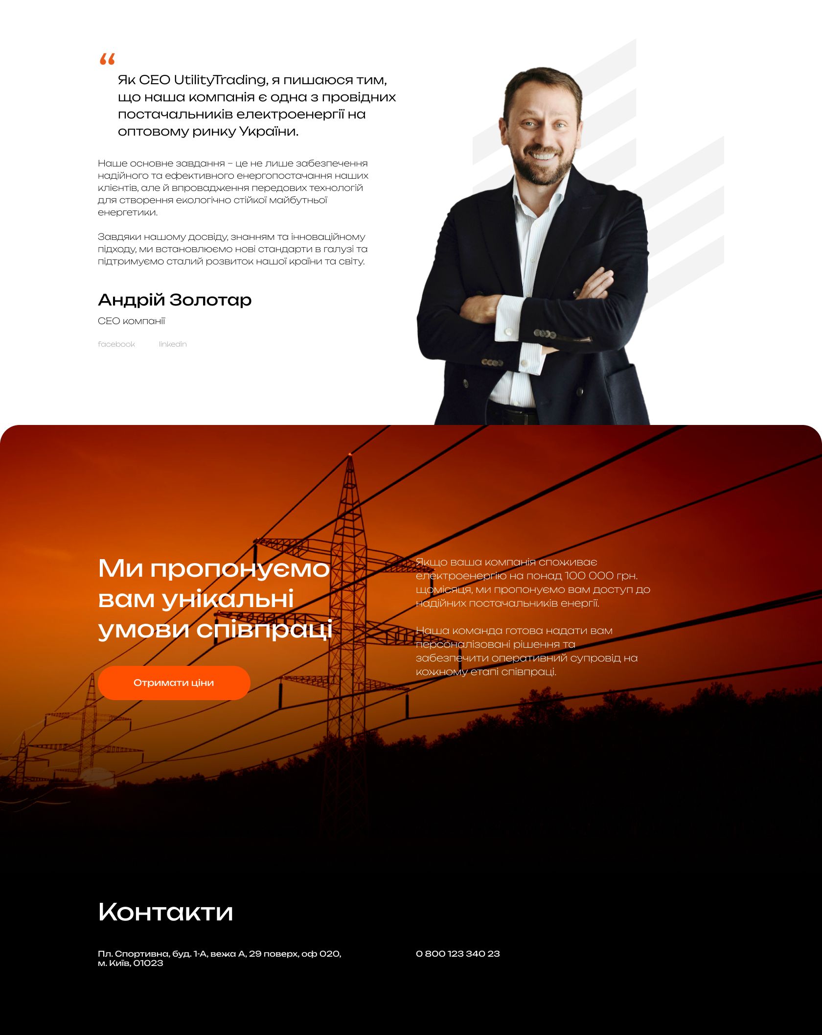
A sunset over the pylons gives a warmer tone to the final offer and request form.
Website
One page holds the whole company
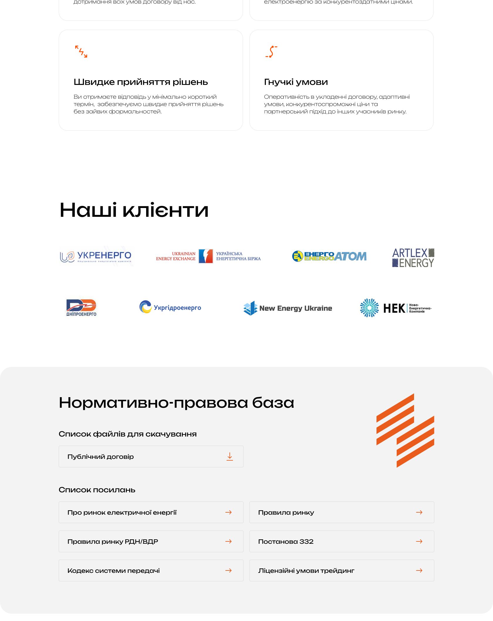
Dark energy blocks alternate with light ones built for reading the details: the company, four steps of wholesale buying, advantages, clients, regulatory framework, a word from the CEO and the request form. The six-stripe mark recurs in the buying steps and the regulatory section, and the mobile version keeps the same rhythm. Hover to take a closer look.

Result
UtilityTrading got a website that leads a client from the first screen to a request: in a minute it explains who the company is, how to buy electricity wholesale and why clients trust it.
The refreshed identity, charged with the feeling of current, makes the company recognizable from the first frame and adds weight in conversations with large businesses. Website: utility-trading.com.ua.
What we’ll do for you
An identity and website that bring in requests
For a company that needs to explain itself to the market fast and turn client interest into requests. We’ll take the same path as with UtilityTrading: from meaning to a page that leads to a conversation with your sales team.
-
 01 Meaning and prototype What a client must understand in a minute, and in what order.
-
 02 Refreshed identity A logo, typeface and color that convey the character of the business.
-
 03 A page that leads to a request One clear path from the first screen to the form.
Team
- Agency
- DOGMA
- Scope
- Prototype, logo, typeface and color refresh, website design, Webflow development
- Client
- UtilityTrading