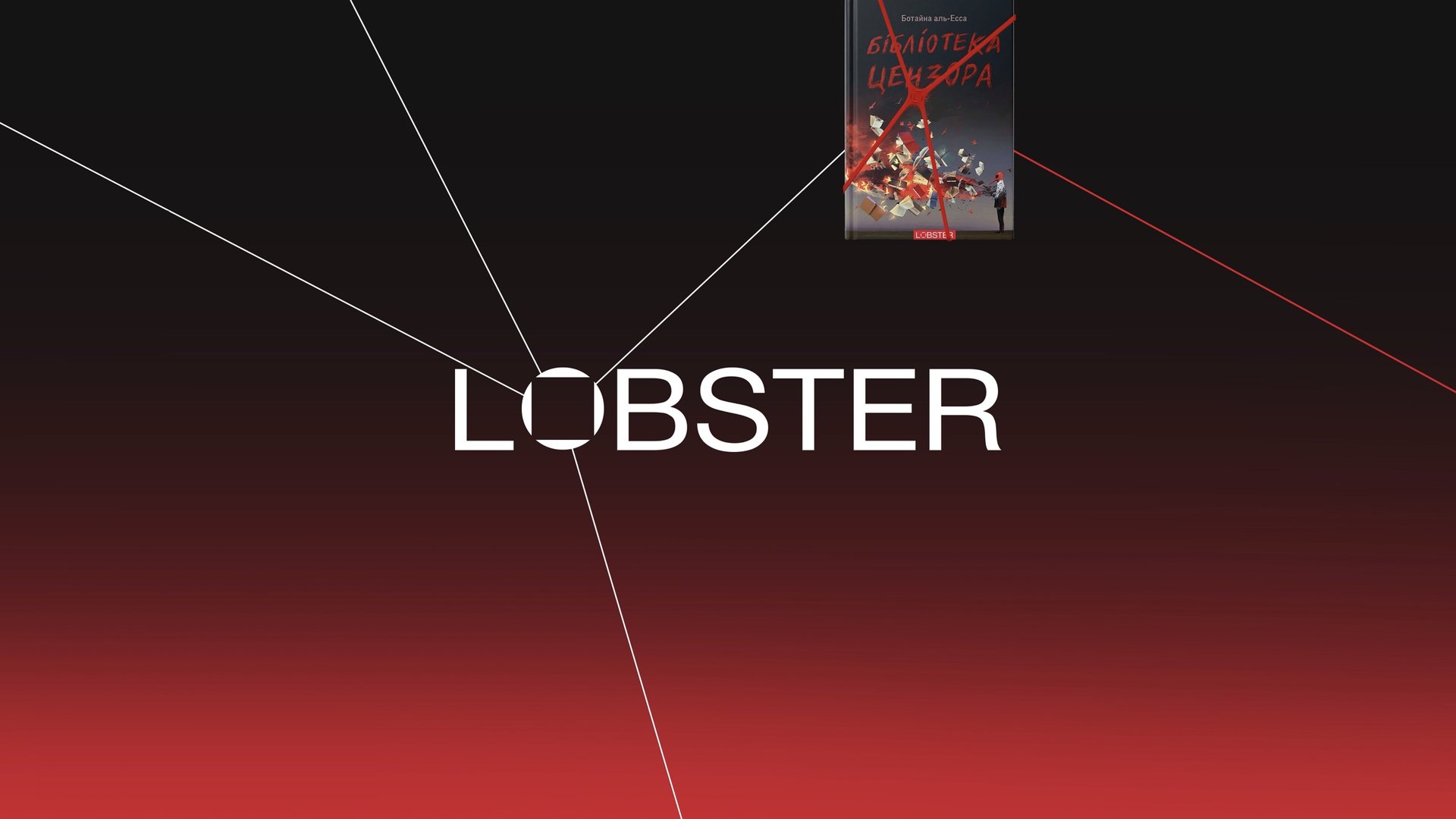
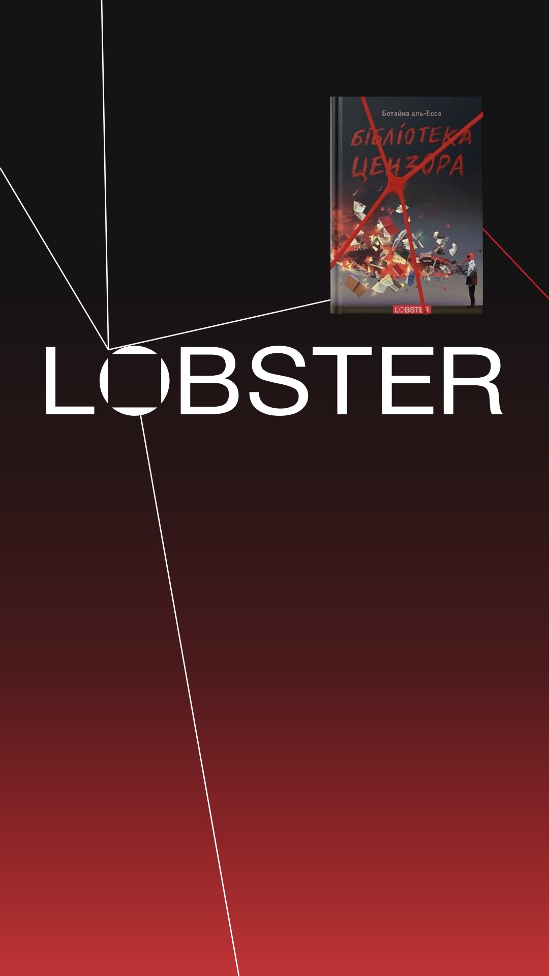
Lobster a publisher that looks at the world through two lenses
In brief
Lobster is a curated publisher of science fiction and historical nonfiction. We found the idea that connects two very different genres, defined the positioning and a slogan-descriptor, and built an identity that works everywhere from a book spine to a banner.
Rebrand
From a name to a brand that explains what it publishes
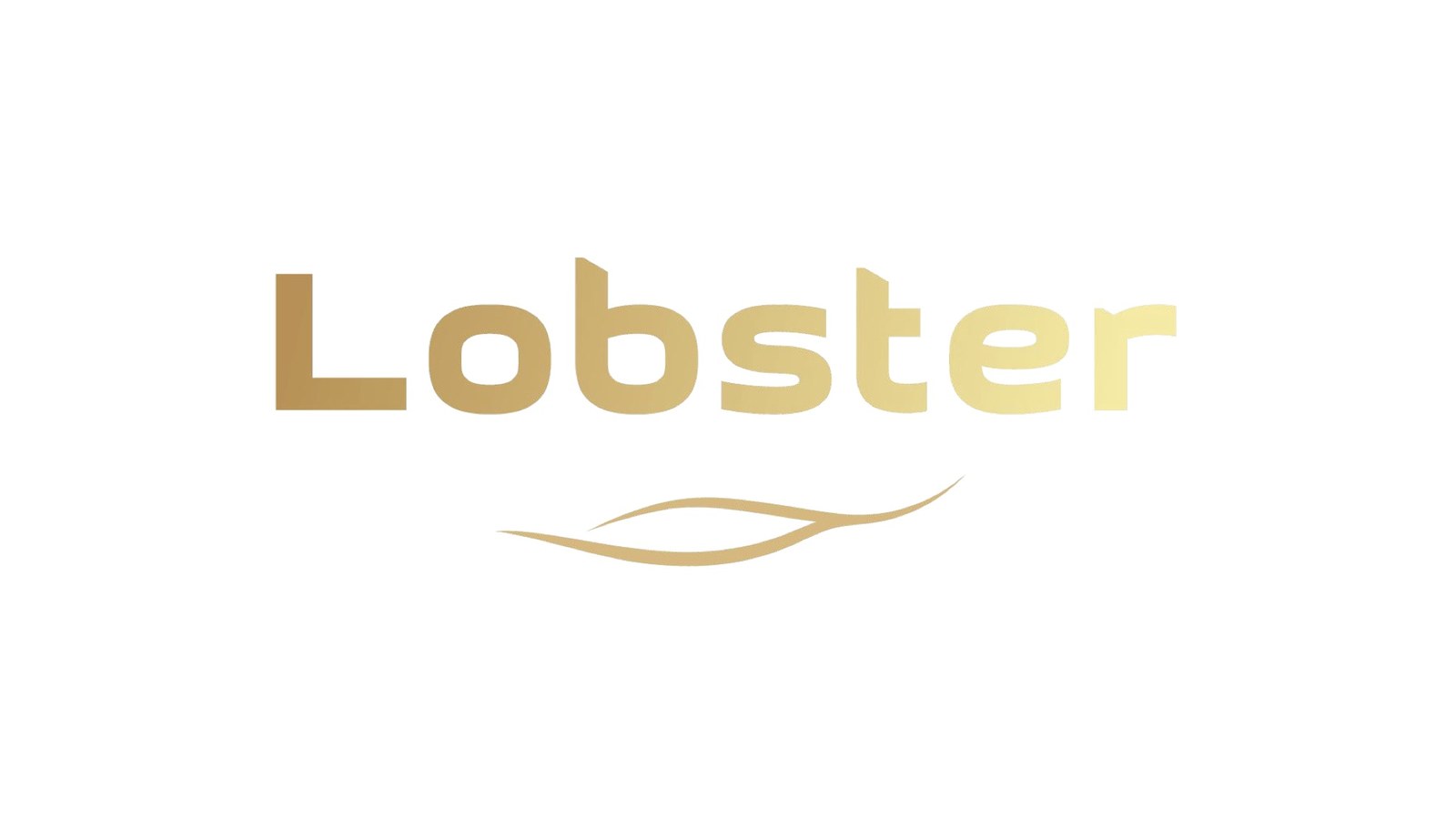
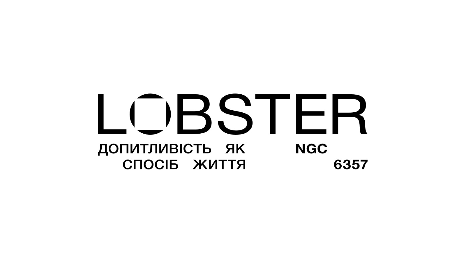 Before After
The publisher needed answers to three questions: what we stand for, who we are for, and why readers should trust us. The logo came last — as a consequence of the strategy.
Brief
A new publisher of two genres — and a brand that explains why they belong together
Positioning
Find the idea that puts science fiction and historical nonfiction on one shelf.
Creative platform
Build a creative platform that scales from cover and spine to social media, events and merch — one idea for every format.
Brand Identity
A visual language for covers, spines, social media and banners.
A brand is a foundation that a slogan stands on
- 01 “More mischief”
The team wanted the brand lighter, livelier, with a sense of humor.
We separated liveliness from mischief: mischief fits neither the readers, the team nor the books. The focus is curiosity with a light touch of irony.
- 02 A new player
A new publisher has to explain at first glance what it publishes.
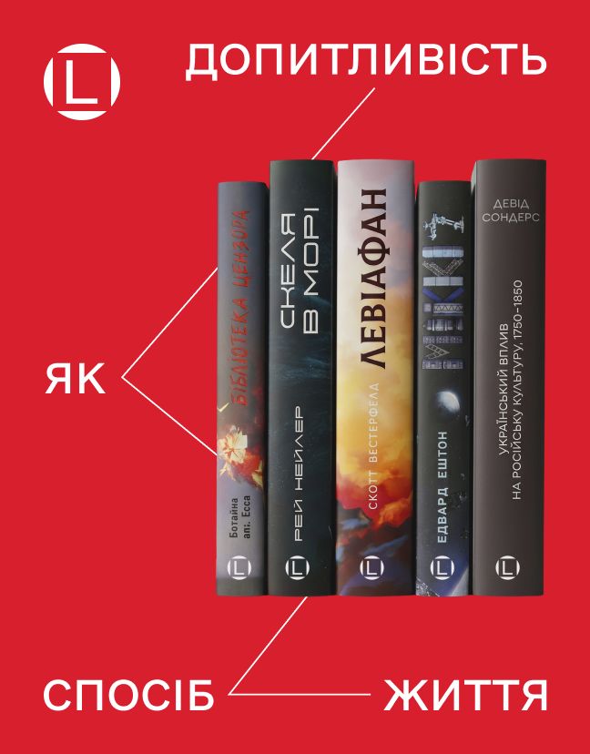
A slogan-descriptor: the idea plus the genres — “Curiosity as a way of life. Science fiction and history.”
- 03 Two genres
Science fiction and nonfiction sit on different shelves and have different readers.
One idea that unites them: two lenses on one process — humanity’s past and future.
Market
The shelves are packed with bestsellers — while the niche for intelligent sci-fi and history is almost empty
The market throws readers into an “ocean” of bestsellers: shelves and recommendation algorithms are filled with mass releases. Science fiction often looks shallow, nonfiction academic and heavy. Readers looking for ideas and answers have to wade through the chaos on their own.
Insight
People look to books for more than gripping stories. They look for answers — to understand their place in the big story of the world
-
I saw Lobster, saw it was sci-fi, a few books — and knew I had to remember the name. There isn’t that much quality science fiction published here.
Reader, in-depth interview -
Science fiction, or nonfiction for that matter, answers hard questions — futuristic or social. But in an accessible, literary form.
In-depth interview -
When you read, you live many lives. You get a lot of ideas — and can take something from them for yourself.
In-depth interview -
I got a little scared that artificial intelligence could wipe out humanity. So I decided to explore “the future” for myself — to feel calmer.
Reader, in-depth interview
Idea
Humanity looks in two directions at once: back at its history and forward into an unknown future
Explains how the world came to be.
Imagines where it might go next.
Two perspectives on one process
Science fiction asks questions about the future. History gives the context for the answers. Together they help readers see themselves as part of the grand story of civilization — in other words, understand themselves.
Slogan
How “curiosity” went from a word in interviews to a way of life
-
Readers
They look for answers first, genre second
In the interviews nobody said “I love sci-fi” or “I read history.” They said something else: I want to understand how the world works, why it became what it is and what happens to it next. For them, a book is a way to figure things out.
-
Common ground
Both genres ask the same question
History asks “how did this happen?”, science fiction asks “what if?”. Beneath the two shelves lies one driving force: curiosity. That is why these books stand side by side.
-
Search
We needed a line about the reader
We went through formulas about the audience, about the two lenses, about the brand’s character. All of them were true, yet all of them described Lobster. We were looking for something readers would want to say about themselves.
-
Decision
Curiosity is a character trait
People carry it with them: on a T-shirt, a notebook, a profile. So the slogan becomes a sign of belonging, and the descriptor “Science fiction and history” instantly explains what Lobster publishes.
Campaign slogan
Science fiction and history.
Brand platform
A curated shelf for readers tired of endless choice
- 01
Positioning
A curated publisher of intelligent science fiction and historical nonfiction for people curious about how the world works and what it could become: from its history to possible scenarios of the future.
- 02
Audience
Intellectually curious readers aged 20–40. For them, books are a way to build their own picture of reality, to think about the future through the past, and part of their cultural identity.
- 03
Brand function
We explain the world through its past and future — by publishing quality books the market is missing. Every book is part of a wider conversation about civilization, technology and the future of humanity.
- 04
Character
The friend you can always ask: “What’s really worth reading?” A genuine, curious intellectual who speaks plainly.
- 05
Reasons to believe
Curated selection: contemporary titles nobody else publishes. Two perspectives on one process. Cultural ambition — an intellectual brand with a publishing house at its core.
Logo
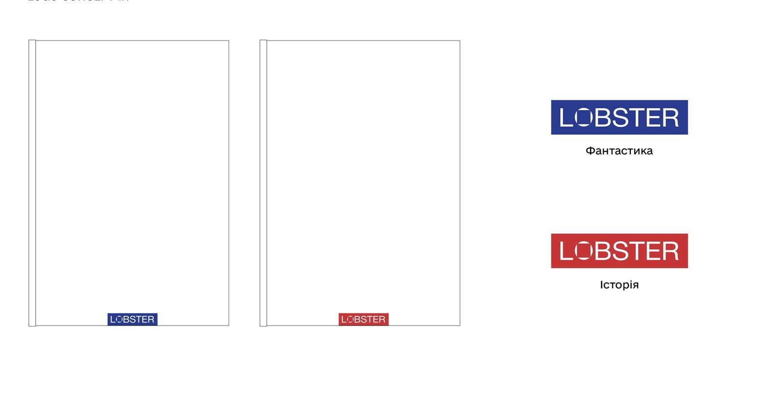
Every detail of the mark comes from the same idea

- 1 The “O” — circle and focus
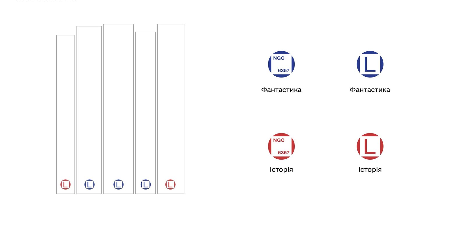
The circle stands for the environment, the space of ideas and the community. The inner sign is focus, exploration and curiosity. This “O” becomes the brand mark: it holds an “L” or the index NGC 6357.
- 2 NGC 6357
Lobster is also the Lobster Nebula in the constellation Scorpius, listed in the catalog as NGC 6357. The index links the name to space and science fiction.
- 3 Large-size grotesque
A clean, confident typeface free of “bookish” ornament — like the masthead of a science journal.
- 4 Technical marks
Indices and numbers, as on a technical drawing: the identity speaks the language of science and precision.
 Primary wordmark
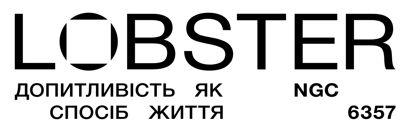 With descriptor
 Brand mark — a stamp on the spines
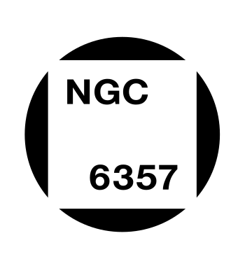 Mark with index
Graphics
Vectors are the connections between ideas, words and marks
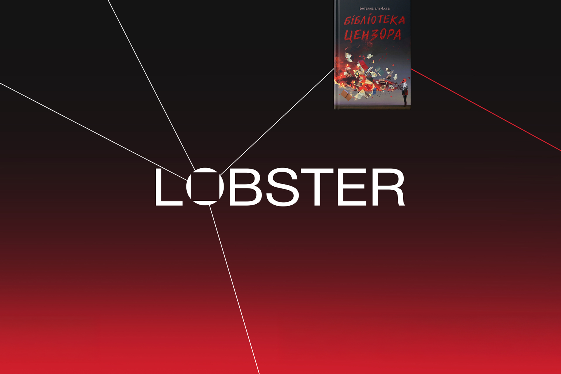
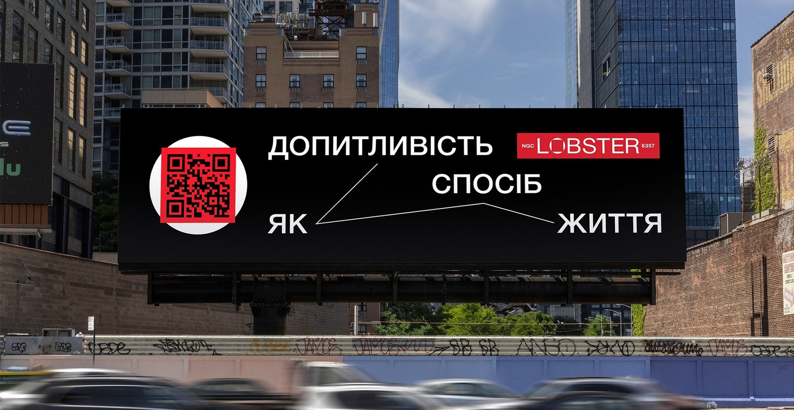
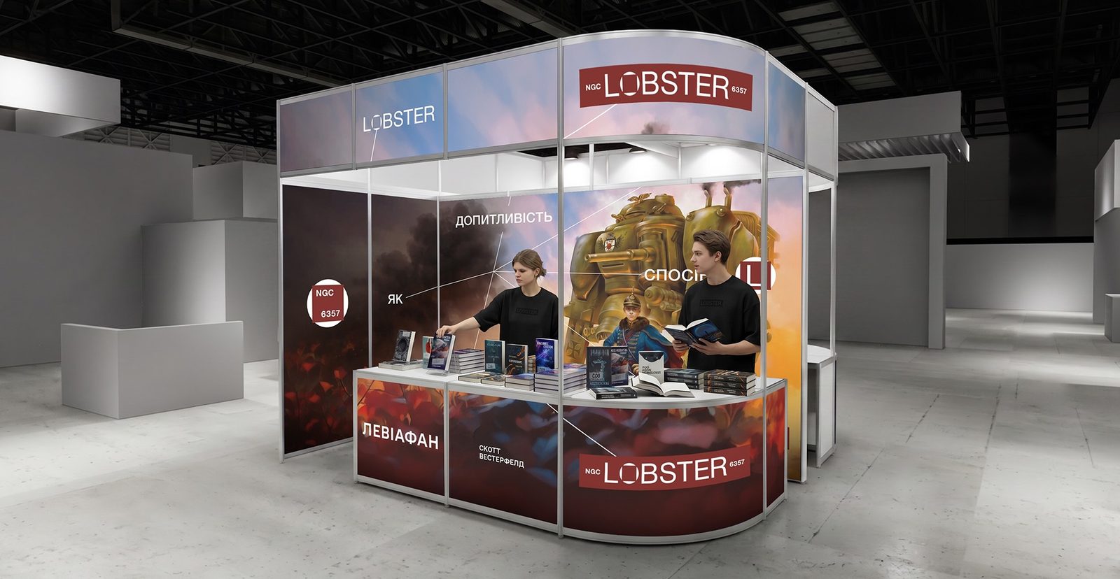
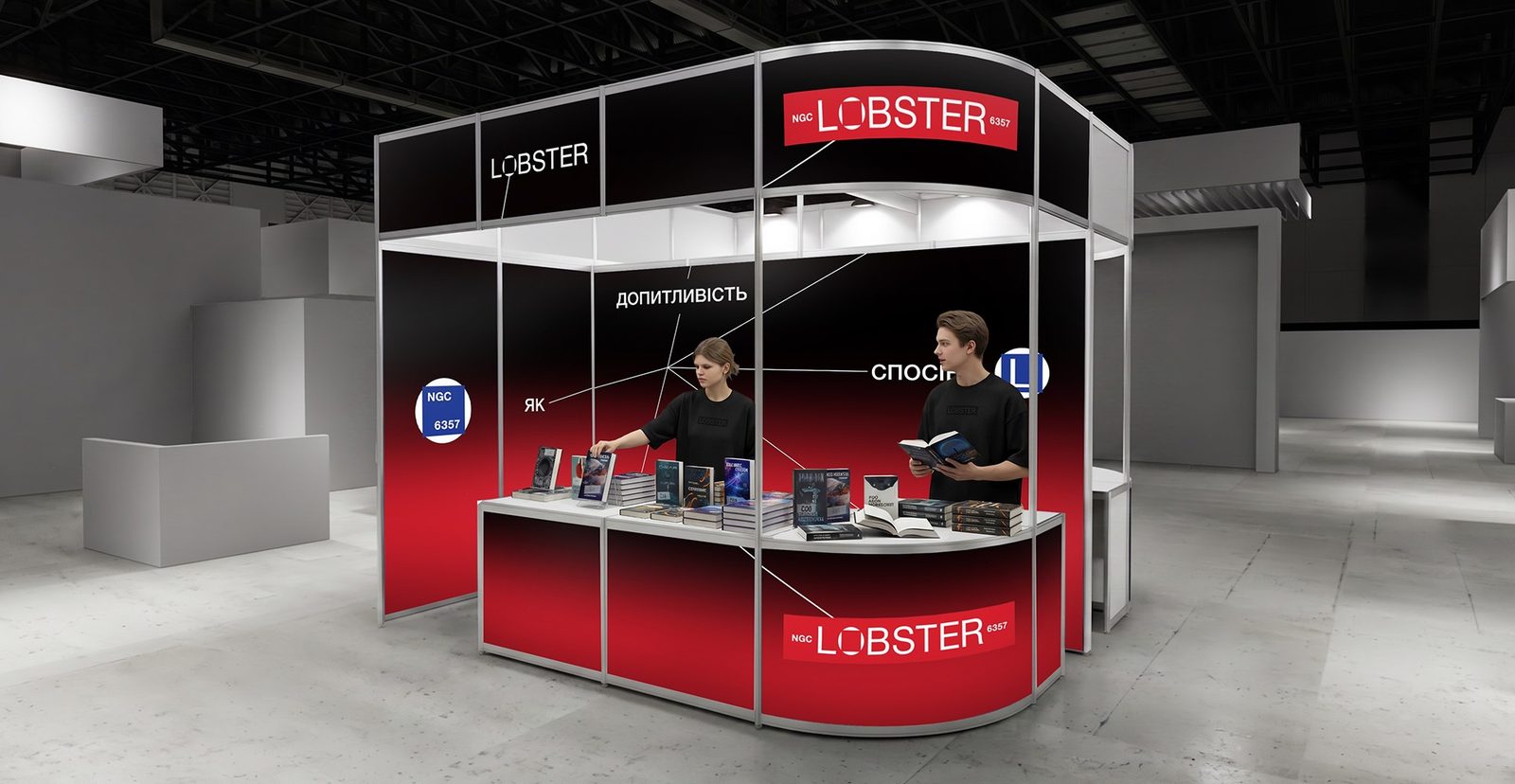
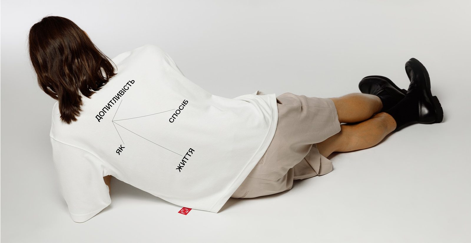
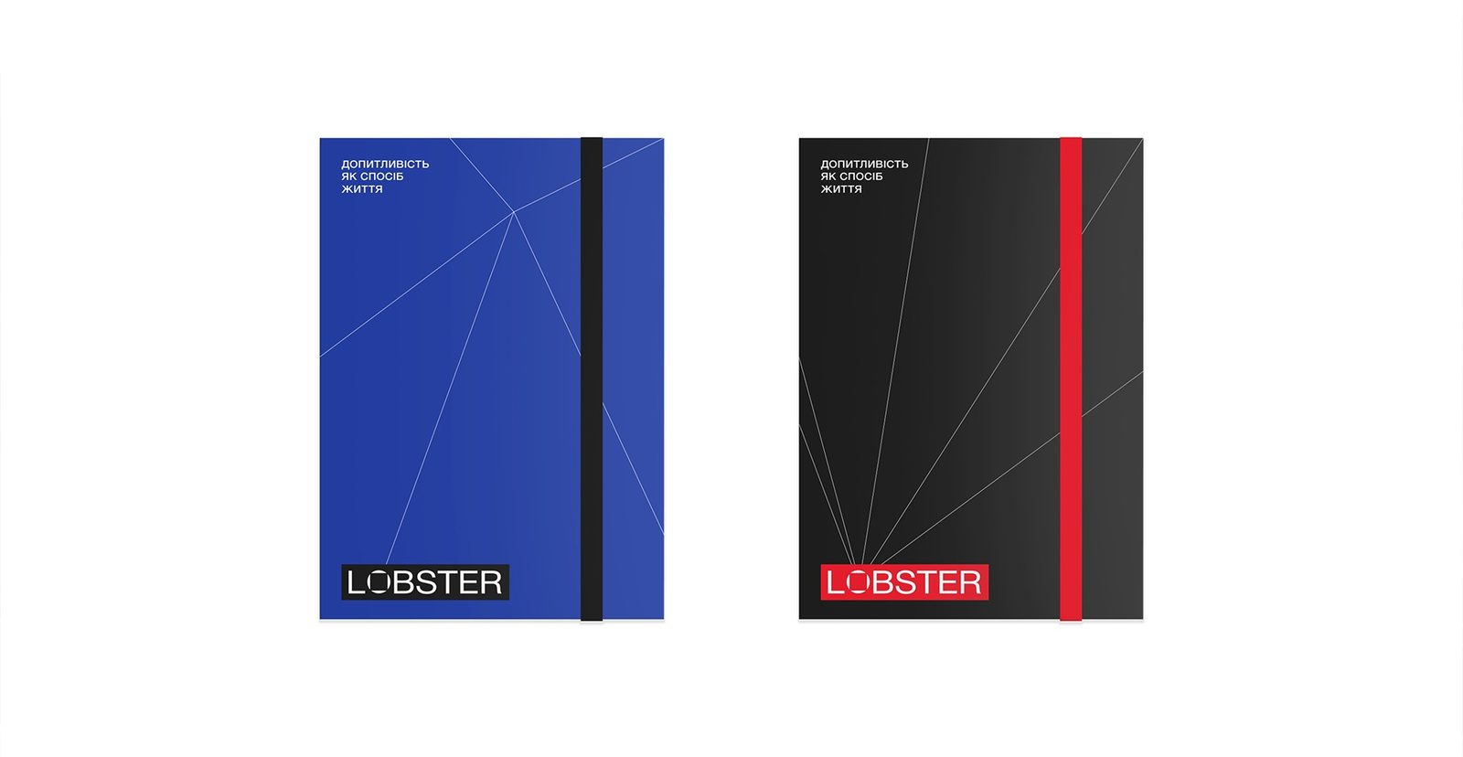
LNGC6357 The identity is built on a modular grid, like a technical drawing. Vectors start from a single point and connect words, books and marks into one thought — this is how the slogan “Curiosity as a way of life” lives on a billboard, a stand, T-shirts and posts. The composition is never static: every point is the start of a new connection. Try it yourself — drag a node or a word.
The mark is a window for stories
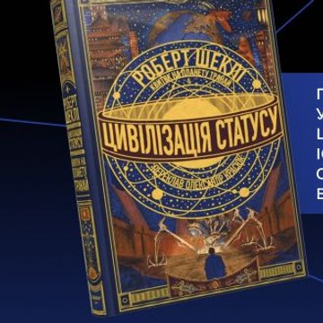
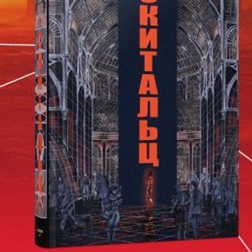
The brand mark is the “O” from the logo. Its window holds an “L” or the index NGC 6357, and on social media — stories: new books, events, audio and reviews. Whatever the window shows, the mark stays recognizable.

Colors and type
Colors separate the genres — like the brand’s two lenses
- Black
#141414The base environment for high-contrast typography and the technical grid.
- Red
#D81F2DAccent and logo. In the genre system — history, books about the past.
- Blue
#213B95Technology and structure. In the genre system — science fiction, books about the future.
- White
#FAFAFAClean space, readability, an editorial feel.
A contemporary Ukrainian grotesque with clear geometry and a neutral character: large display settings sound expressive, while body text stays clean and easy to read.

The lobster
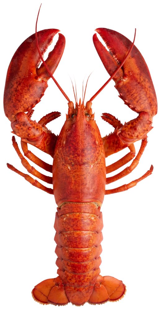
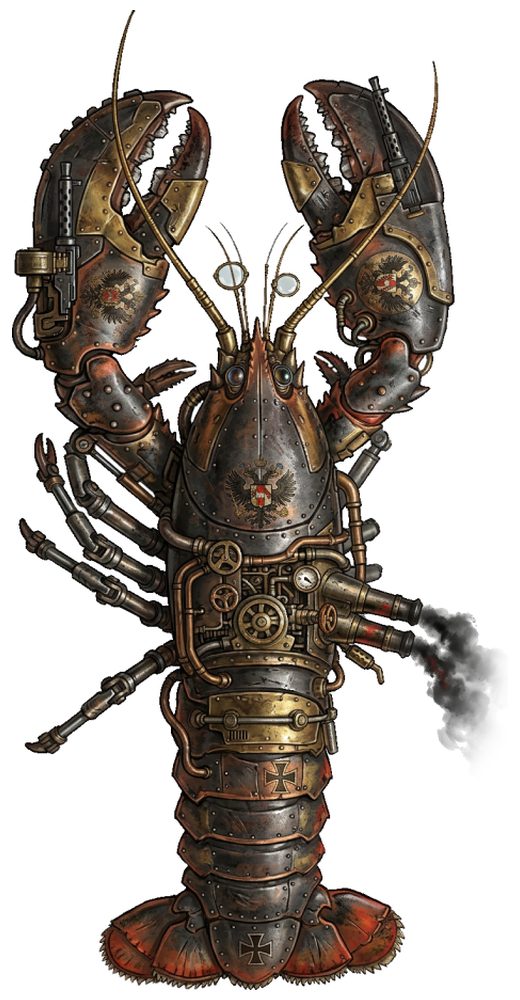
One hero for any genre
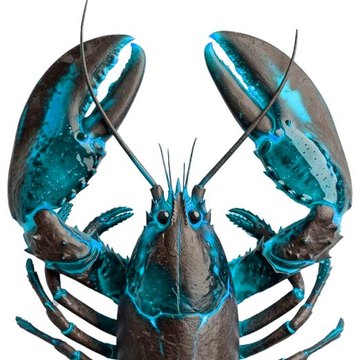
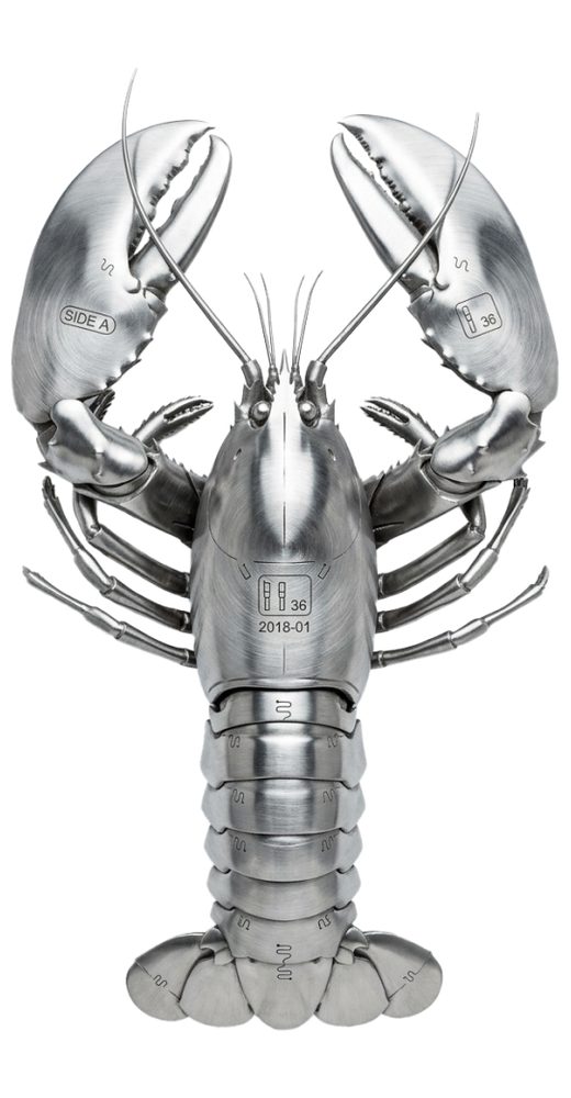
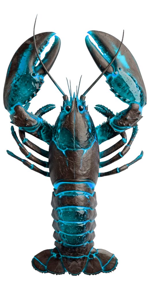
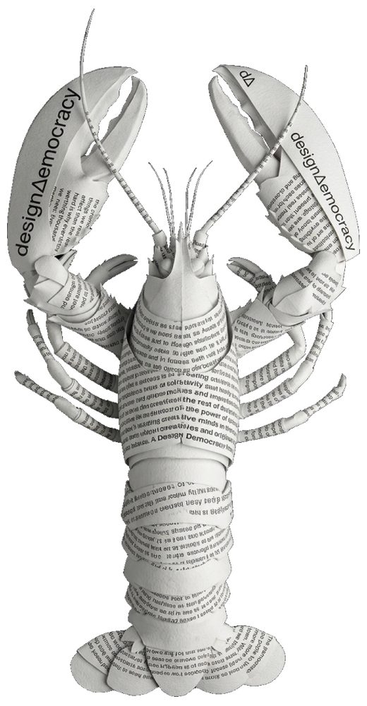
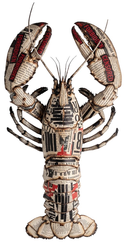
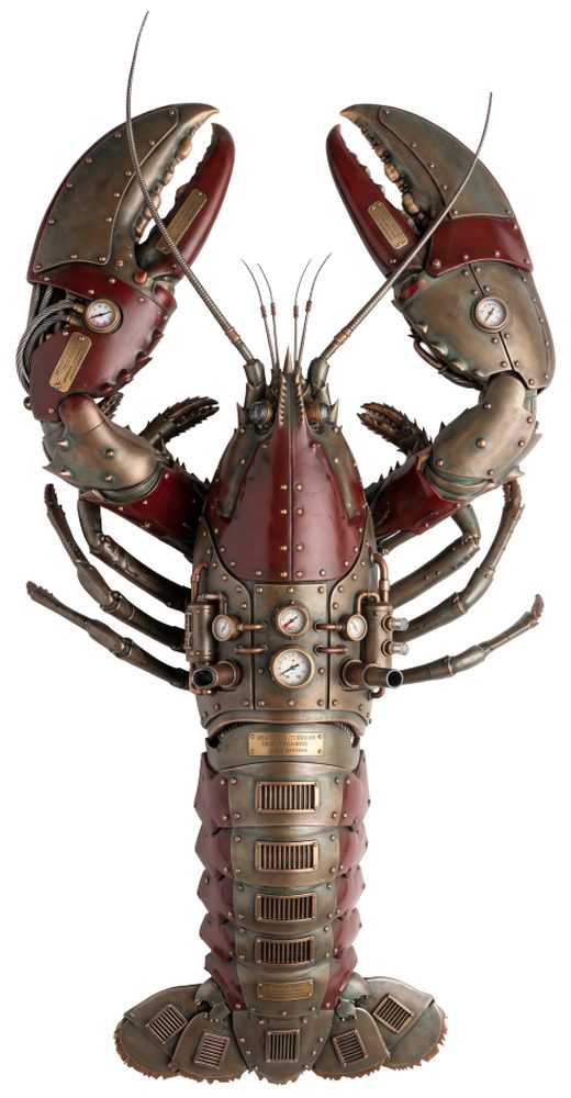
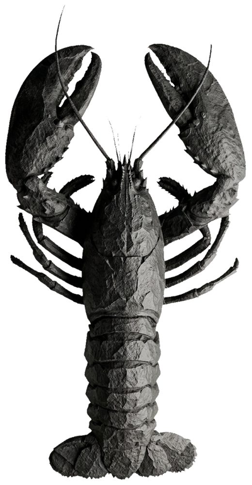
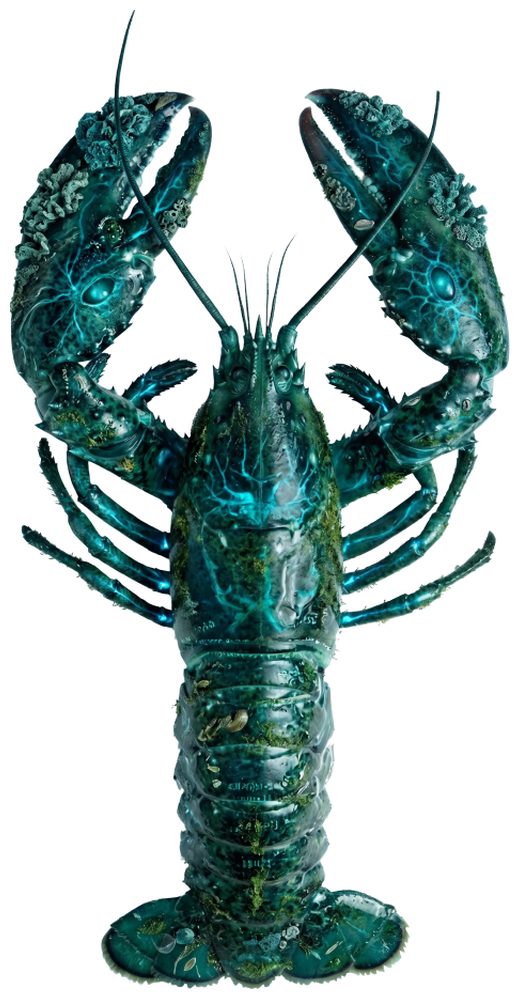
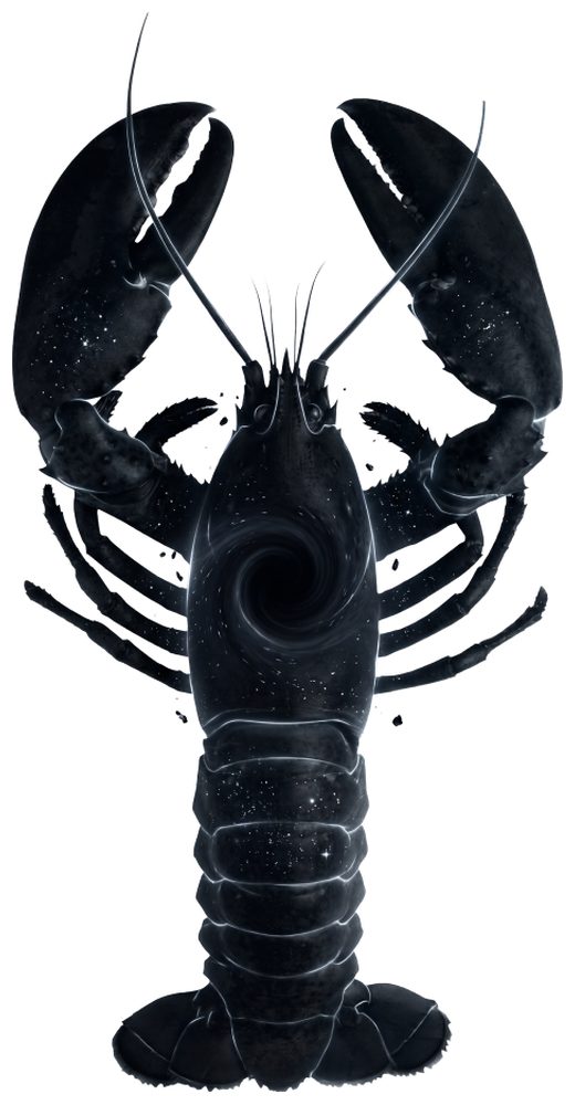
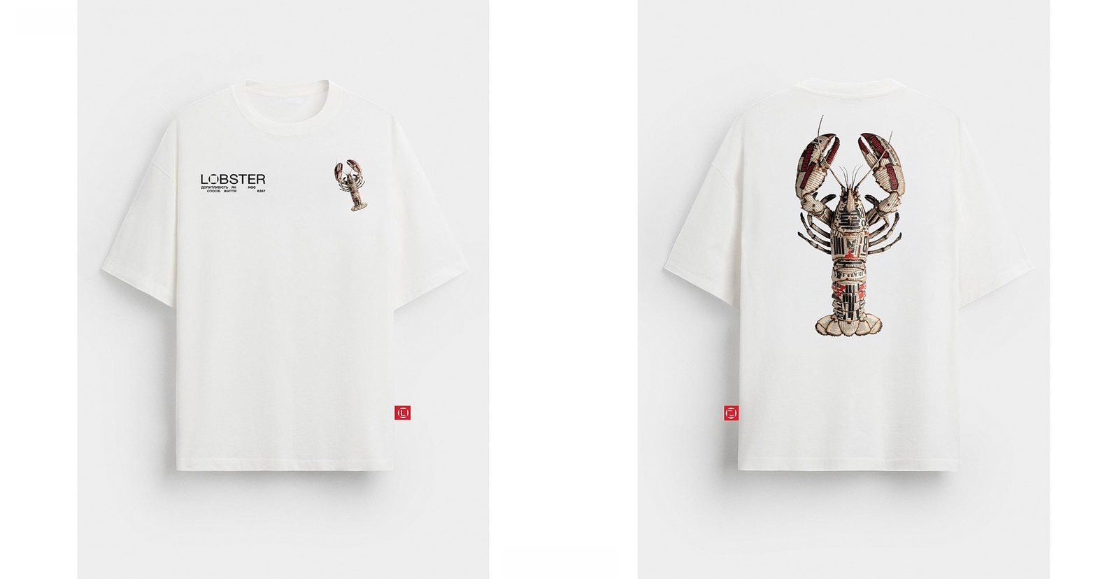
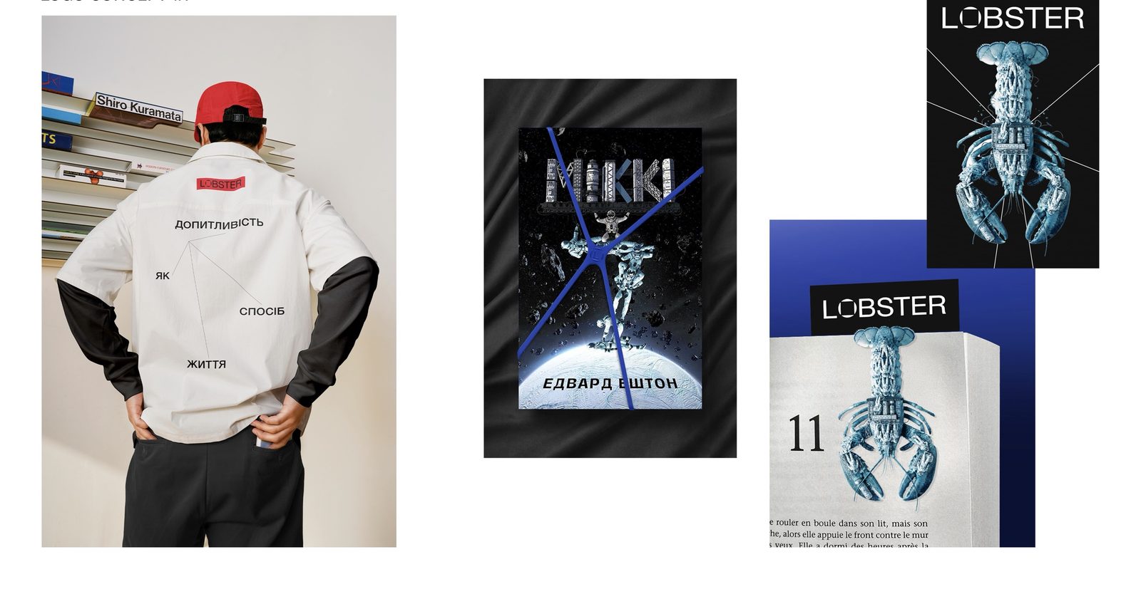
The classic lobster silhouette runs through a neural network as a base and transforms to match the book’s theme: proportions and shape stay, while material, color and texture change. So one recognizable symbol lives naturally in both history and science fiction.

Identity in use
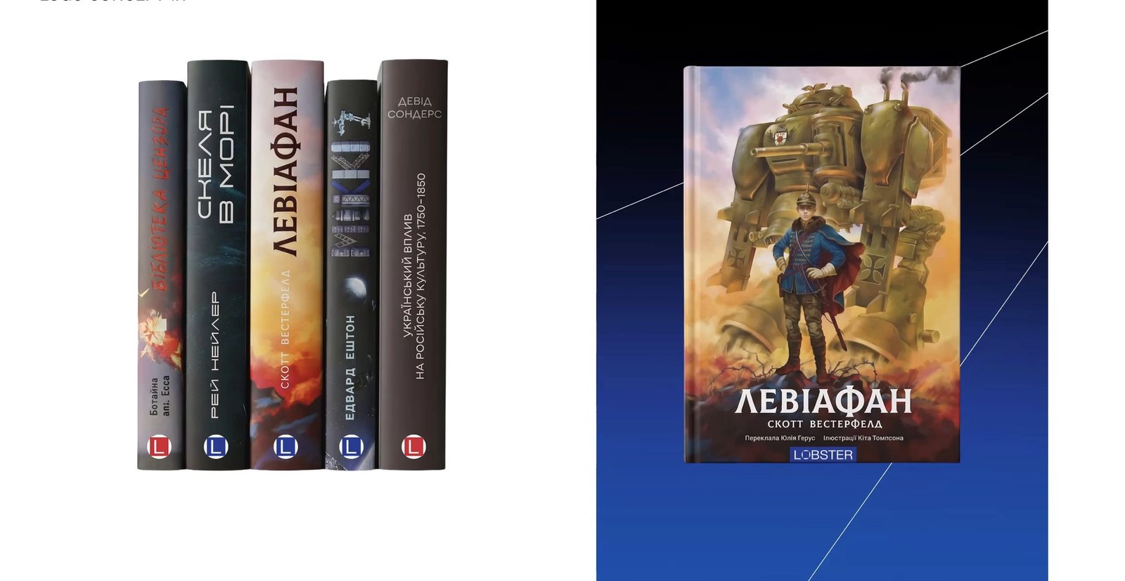
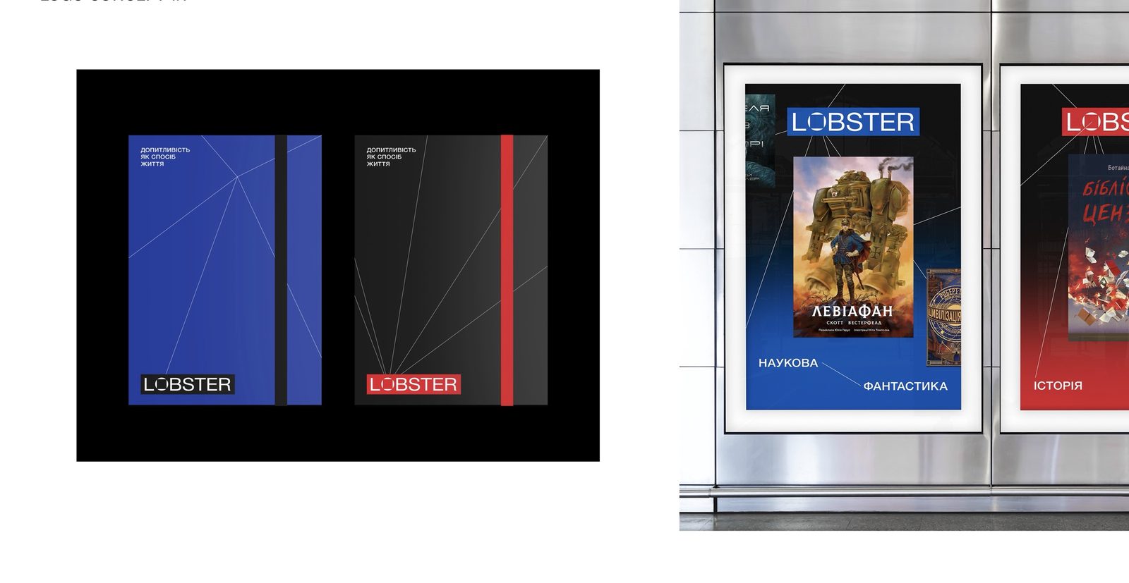
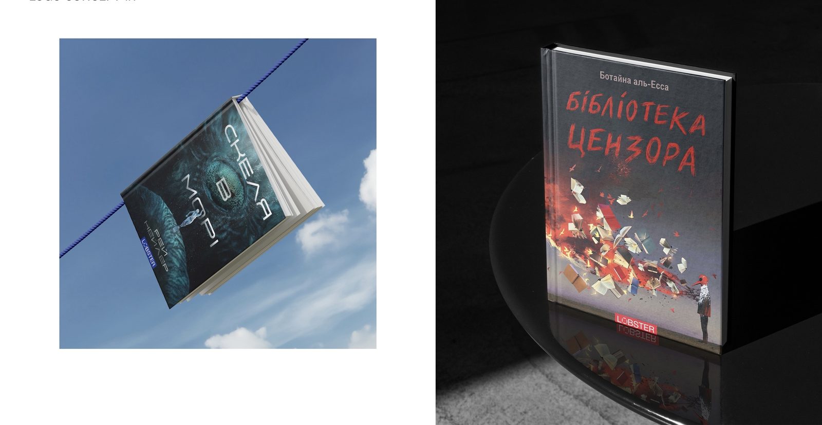
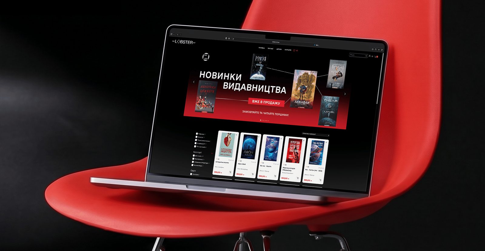
From book spine to exhibition stand: covers, website, billboard, merch and space all follow the same rules.
Social media
Posts, stories and banners: the book at the center, vectors “stitching” the composition together, large grotesque type in the corners.
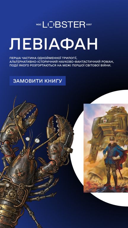
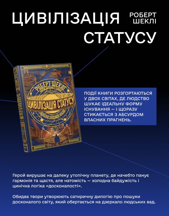
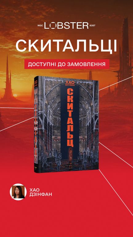

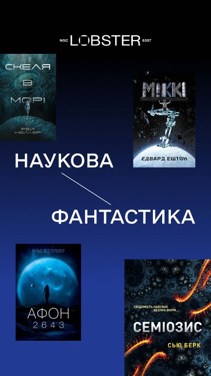
The world is far more interesting than it looks in your news feed.
Result
The publisher received a brand platform — positioning, function, character and a slogan-descriptor — plus an identity with a design system. The visual language is already working on social media and in banners, and it scales to every new book without chaos.
Market position
From “just another publisher” to a niche of its own between mass market and academia
- Place on the shelf Just another publisher among mass releases, bestsellers and fantasyA curated shelf of intelligent science fiction and historical nonfiction — in a niche with almost no players
- Two genres Two separate shelves with different readersTwo lenses on one process: history explains the past, science fiction imagines the future
- What the reader gets Wades alone through an “ocean” of bestsellers and recommendation algorithmsA curated shelf and an answer to “what’s really worth reading?”
- First contact The name tells a new reader nothingThe descriptor “Science fiction and history” — clear at first glance
- Reasons to believe No argument for what makes the publisher differentCurated titles nobody else publishes; two perspectives on one process; cultural ambition
- Voice A request for “more mischief”Curiosity with a light touch of irony — smart and approachable
We mapped the market on two axes — mass market or niche, bestsellers or intelligent books — and saw that most publishers compete for the same mass-market basket. Lobster took the opposite corner: it offers what the shelves are missing and stays out of the bestseller race. Every identity decision — from the descriptor to the genre colors — works for this position.
What we’ll do for you
A brand people read at first glance — from positioning to identity
For when the product is strong, yet the brand fails to explain what you do and for whom. We’ll start with the audience and the idea — and finish with a system your team can run on its own.
- 01 Audience and market research In-depth interviews and the insight the brand stands on.
- 02 Positioning and platform What you stand for, who you’re for and why people should trust you.
- 03 Slogan and tone A line that can last for years, and the brand’s character.
-
 04 Identity and design system Logo, graphics, colors and rules for every format.
Team
- Agency
- DOGMA
- Client
- Lobster